How to Draw Fall Art: Step-by-Step Techniques That Capture Autumn’s Best
Master fall art drawing with step-by-step techniques for beginners. Learn materials, color theory, and seasonal composition to create stunning autumn artwo
What draws you to autumn imagery more than any other season—is it the riot of warm colors, or the way falling leaves seem to tell a story all their own? Fall art drawing combines the simplicity of seasonal subjects with the deeper satisfaction of creating something genuinely beautiful. Whether you’re sketching a single leaf, painting a landscape, or composing a cozy autumn still life, the approach remains rooted in observation and practice. This guide walks you through the entire process of creating fall drawings, from choosing materials to mastering composition, so you can build confidence and skill no matter your current level.
Quick Questions and Answers
Question: What are easy fall drawing ideas for beginners?
Beginners should start with simple subjects like single leaves, pumpkins, apples, or acorns before attempting complex landscapes. Drawing a single detailed leaf or a stack of pumpkins with facial expressions are charming and easy autumn projects. These simple subjects effectively capture the fall atmosphere and build confidence for more detailed work.
Question: Why do fall drawings use warm colors like orange?
Fall drawings use warm yellows, oranges, and reds to accurately capture autumn’s natural foliage colors. Layering these warm tones while observing actual fall foliage helps artists achieve realistic autumn colors in their artwork. Colored pencils, watercolors, and pastels are particularly effective for rendering these specific warm hues.
Question: Can kids draw fall art with simple steps?
Yes, kids can start by drawing falling leaves, pumpkins, and acorns using simple step-by-step instructions. One fun project is drawing a fall wreath by sketching a circle and adding leaves, berries, and other elements around it. Another beginner-friendly idea is drawing a cozy fall scarf with playful tassels and different patterns.
Step 1: Gather Reference Images and Observe Real Autumn
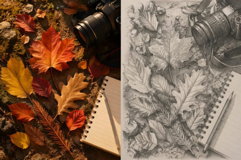
The foundation of any strong fall drawing is direct observation. Spend time outdoors during autumn collecting actual leaves, photographing tree silhouettes against golden light, and noticing how colors shift across a single landscape. Real foliage teaches you more than any tutorial can—the irregular veining in leaves, the way branches taper, the exact shade of rust that appears on specific trees.
Collect reference photos on your phone or print them out. Include close-ups of individual leaves, full trees, fallen leaf piles, pumpkins, and autumn landscapes. Pay attention to lighting. Golden hour—that low-angle sunlight in early morning or late afternoon—creates the most dramatic shadows and brings out the warmth in fall colors. This is when you’ll see the richest oranges, deepest reds, and most luminous yellows.
Step 2: Sketch Your Composition Lightly
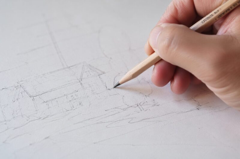
Begin with a light pencil sketch using an HB or 2B pencil. Sketch so gently that your marks are barely visible—you want to be able to erase or adjust without damaging the paper. Start by establishing the basic shapes and placement of your main subjects. If you’re drawing a landscape, use a diagonal line to indicate the foreground, leaving space around the paper edges to avoid cramping your composition.
Block in large shapes first: tree trunks as simple rectangles, foliage masses as ovals or rounded forms, and individual leaves as basic leaf shapes. Don’t worry about details yet. This stage is purely about spatial relationships and proportions. Squint at your reference image—when you squint, details vanish and you see only the large value masses. Use this trick to check your composition.
Step 3: Build Tree Structure and Foliage Masses
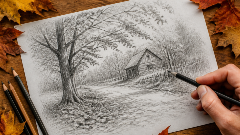
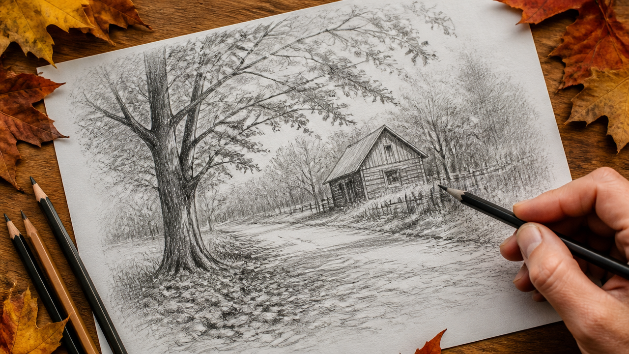
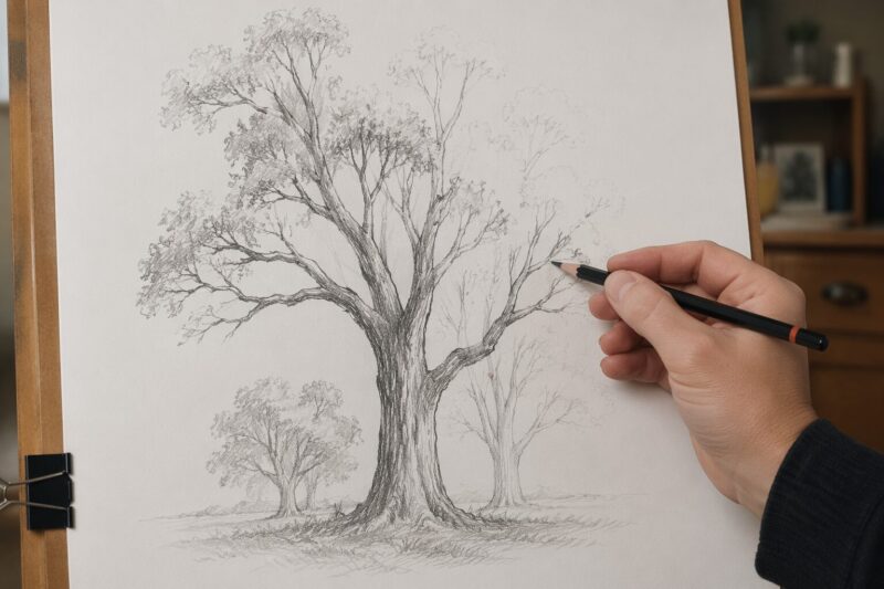
Trees are the backbone of most fall drawings. Start with the trunk, drawing it narrower at the top and slightly wider at the base—trees taper, they don’t stay uniform. Add primary branches extending outward and upward, tapering as they stretch away from the trunk. Secondary and tertiary branches create the intricate network that supports leaves.
Within the branch structure, block in foliage masses using upside-down U shapes and bumpy, organic outlines. These shapes should feel natural and irregular, never perfectly round or symmetrical. Leave small gaps between foliage clumps so branches peek through—this creates depth and visual interest. As you build the tree structure, darken your pencil work gradually, but keep it loose enough that you can still adjust.
Step 4: Layer Warm Colors to Create Depth
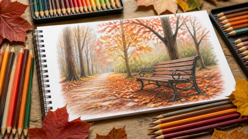
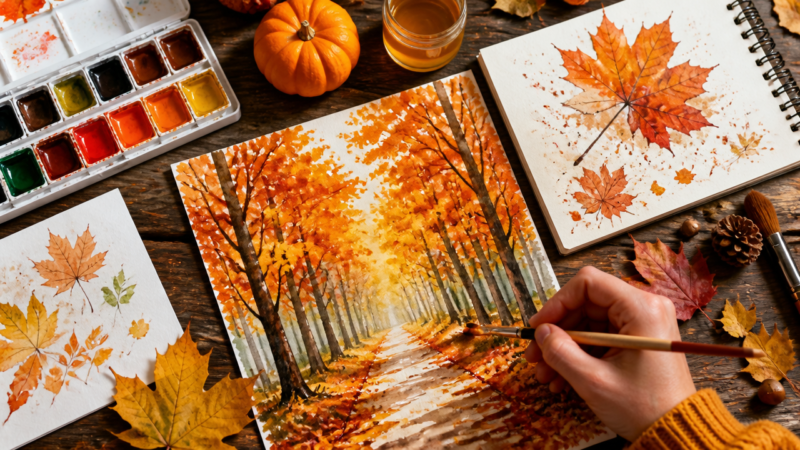
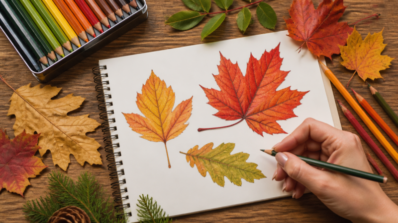
This is where fall art truly comes alive. Begin layering warm yellows, oranges, and reds to capture autumn’s signature palette. If you’re using colored pencils, start with the lightest warm yellow as your base layer. Light pressure and multiple passes build rich color without flattening the paper.
Work from light to medium to dark, layering one color over another. Yellow over orange creates a vibrant orange-gold. Orange over red produces deep rust tones. This layering approach, called color glazing, creates depth and richness that single-stroke color application cannot achieve. According to art education research, layering colored pencils creates up to 40% more color complexity than applying single colors.
Leave some areas lighter to suggest highlights where sunlight hits foliage directly. These lighter spots pull the viewer’s eye and create the illusion of dimension. Shadows appear as darker values of the same warm hue—deep burgundy in the shadows of red leaves, for instance, rather than pure black.
Step 5: Define Individual Leaves and Add Texture Details
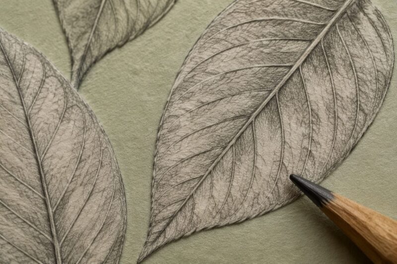
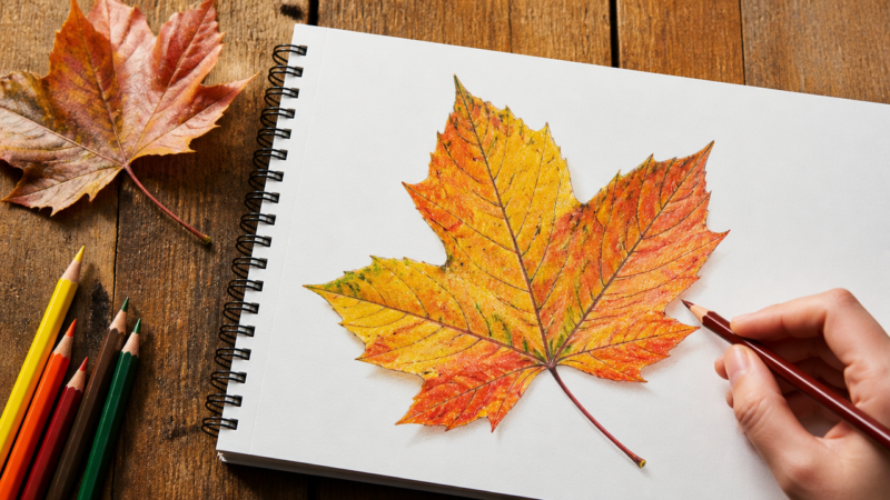
Once your broad color layers are established, zoom in on individual leaves to add personality and texture. Use a fine-tip marker or sharpened colored pencil to draw veining patterns. Leaf veins typically radiate from a central stem or follow curved paths that echo the leaf’s shape. Real leaves are asymmetrical and irregular—embrace imperfection.
Add small bumps, irregular edges, and texture marks to represent individual leaf surfaces. Layering tiny marks creates visual richness that reads as detail from a distance. This doesn’t mean drawing every single leaf—instead, add detailed texture to a few focal leaves and suggest the rest with softer, less defined marks. The eye fills in the gaps.
For leaves that overlap or sit in the foreground, darken the undersides and shadows. The underside of a leaf often appears darker and slightly less vibrant than the illuminated top. This simple contrast trick creates convincing layering and depth.
Step 6: Create Dramatic Sky and Atmospheric Effects
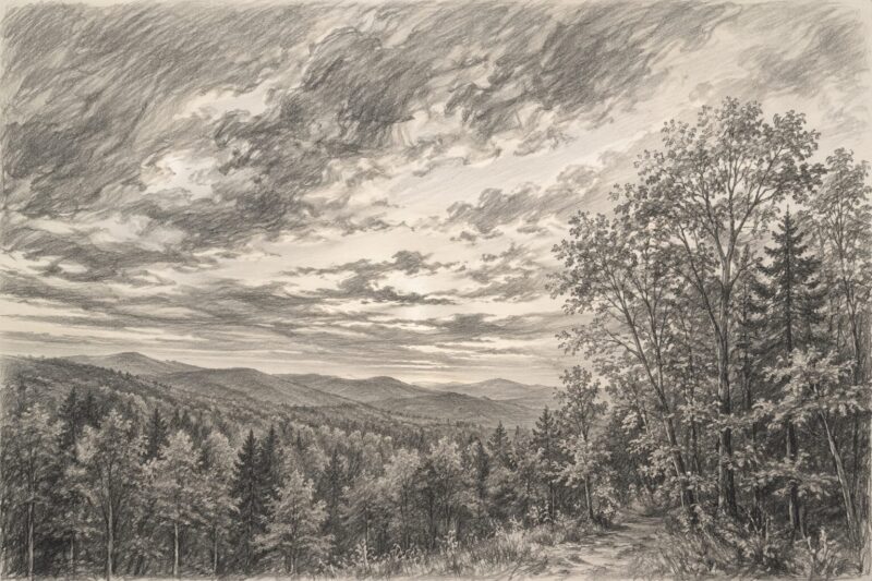
The sky in fall drawings deserves as much attention as the foliage. Autumn skies often display warm peachy tones near the horizon, shifting to deeper blues overhead. If you’re using watercolor or acrylic, apply sky color wet-on-wet for soft, blended transitions. Drop in warm yellows and oranges near the horizon first, then cool blues higher up, allowing colors to mingle naturally.
For colored pencil, layer warm tones in the sky area, blending with light pressure and warm grays. The transition from warm to cool creates atmospheric perspective—distant elements appear cooler and hazier than nearby foreground elements. This principle alone elevates a fall drawing from flat to dimensional.
Consider adding clouds using soft erasing techniques. If you’ve laid down light pencil marks for clouds, a kneaded eraser gently pressed over the area lifts color and creates soft cloud shapes. Wispy clouds feel more natural than solid cloud outlines.
Step 7: Emphasize Focal Points and Final Details
Every composition needs a clear focal point where the viewer’s eye lands first. In fall landscapes, this might be a particularly vibrant tree, an interesting foreground element, or a striking sky. Draw your eye to that spot by making it the darkest dark, the brightest bright, or the most detailed area.
Surrounding areas should be slightly less intense to preserve focus. This doesn’t mean making the rest blurry or vague—it means being more selective with detail elsewhere. Add final dark accents using markers or dark colored pencil to define edges and create pop. A few strategic dark lines or shadows often transform a good drawing into a compelling one.
Step back frequently and squint at your work. Squinting collapses details and lets you see overall value distribution and balance. If one half feels heavier or brighter than the other, rebalance through subtle adjustments.
Tips for Drawing Stunning Fall Art
Start with autumn subjects that excite you genuinely. Enthusiasm shows in your work. A drawing of a pumpkin you actually care about beats a technically perfect but emotionally flat landscape every time.
Collect real fallen leaves and press them into your sketchbook. Glued real leaves create authentic texture and add surprising dimension to your artwork. Your drawing then becomes a hybrid piece combining observation with found natural materials.
Practice quick gesture sketches of trees and leaves regularly. Five-minute sketches build confidence and train your hand to capture shapes intuitively. Speed prevents overthinking and often produces more natural results than labored, careful work.
Watch how light moves across your subject at different times of day. The same tree looks completely different in morning light versus afternoon golden hour versus twilight. This shifting quality is what makes fall landscapes so compelling—light transforms them hourly.
Don’t feel pressured to work large. Some of the most satisfying fall drawings happen in sketchbook-sized formats, roughly 5 by 7 inches or 6 by 9 inches. Smaller scale can feel less intimidating and often produces more intimate, focused results.
Blend colored pencils using light pressure and layering rather than harsh blending tools. Your hand, with natural warmth and sensitivity, often produces more nuanced blends than mechanical tools can achieve.
FAQ
Q: How do you draw a fall landscape step by step?
Start by drawing a diagonal line for the foreground, leaving space on paper edges to avoid drawing on the table. Add trees with branches, then use orange markers to draw shapes around big foreground trees. Inside these shapes, add smaller upside-down U shapes and little bumps to represent individual leaves. This layered approach builds complexity without requiring intensive detail work.
Q: Are there art challenges for fall drawing?
Yes, artists can make one ink drawing daily throughout October or participate in “Peachtober” with daily prompts. Another challenge invites creating artwork daily for one week in November based on a daily prompt list. These challenges are open to all mediums and styles, encouraging consistent fall-themed practice and community engagement.
Q: What materials work best for fall art projects?
Colored pencils, watercolors, and pastels work best for fall art as they capture autumn’s warm colors beautifully. These materials allow artists to layer warm yellows, oranges, and reds effectively. Marker pens are also commonly used to define shapes and add details like individual leaf textures and edge definition.
Q: When is the best time to sketch outdoor fall scenes?
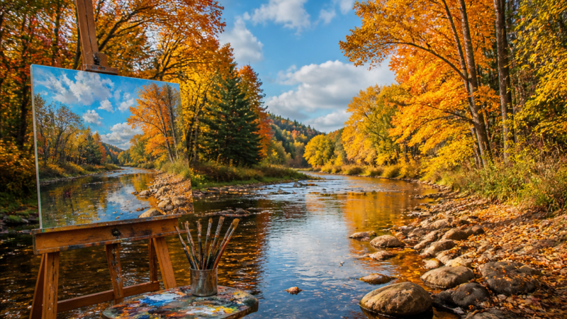
Golden hour provides the most dramatic lighting for autumn landscape drawings, making it the best time for outdoor sketching. The low-angle sunlight enhances the warm colors of fall foliage and creates rich shadows. This lighting helps capture the depth and texture of trees and fallen leaves more vividly than midday light ever could.
Q: Does combining fall elements make better drawings?
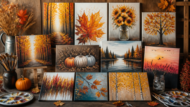
Yes, mixing various autumn elements like leaves, pumpkins, and trees creates rich, storytelling compositions that viewers love. Combining different fall elements allows artists to create more dynamic and engaging artwork. This approach helps convey the full atmosphere and spirit of the autumn season in ways that single-subject drawings sometimes cannot.
Q: What are cozy fall fashion drawing ideas?
Cozy fall fashion drawings include sweaters, scarves, and boots in warm, autumnal colors. A fun idea is drawing a cozy fall scarf with playful tassels and incorporating different patterns and colors. These subjects capture the comfort and style associated with dressing for the cooler autumn weather and make relatable subjects for seasonal portfolios.
Q: Which fall subjects are best for sketchbooks?
Popular sketchbook subjects include mushrooms, pumpkins, collected real leaves glued as bouquets, and favorite autumn foods like apple pie. Artists can also draw fall doodles for bullet journals, fall wreaths, lanterns with glowing effects, or rusty bicycles adorned with fallen leaves. Collecting and gluing real leaves into sketchbooks adds authentic texture to autumn art.
My Experience With Fall Art Drawing
I started drawing fall landscapes on a whim one October morning, honestly expecting them to look flat and uninspired. What I discovered was that autumn subjects are almost forgiving in their visual richness—it’s genuinely hard to make fall colors boring. My first decent drawing happened when I stopped trying to render photorealistic detail and instead focused on capturing the feeling of warm light hitting a pile of leaves.
The real breakthrough came when I realized that layering pale yellows and oranges created way more convincing color depth than trying to apply the “perfect” shade in one go. That’s the trick nobody warns you about—patience with layering beats technical perfection every single time. I’ve since filled multiple sketchbooks with fall drawings, from tiny botanical studies of individual leaves to full landscapes. The consistency has improved my color theory knowledge and hand control more than any formal lesson could.
One detail that stuck with me: fallen leaves almost never lie flat. They crumple, curl, and fold. Drawing that crumpled quality—those shadows within a single leaf—transforms the whole piece from flat to tactile. Have you found that small textural details make the biggest impact in your own artwork?
Latest Updates
As of 2026, fall art communities on social platforms continue to thrive, particularly around October. The growth of aesthetic bullet journal communities has renewed interest in seasonal doodles and quick sketches. Digital tools now offer excellent color simulation, but traditional media remains preferred for its tactile, satisfying quality—the physical act of layering colored pencil or blending pastels still beats digital for most hobbyist artists.
Many artists report increasing interest in mixed-media fall art, combining traditional drawing with real pressed leaves, botanical elements, and collected natural materials. This hybrid approach aligns with broader trends toward sustainable, nature-connected creative practices.
Conclusion
Fall art drawing rewards observation more than natural talent. Start simple with individual leaves or pumpkins. Build your foundation using light pencil sketches and broad color layers. Add texture and definition gradually, resisting the urge to overwork areas. Let golden hour light inform your color choices, and remember that warm yellows and oranges layered strategically read as richer and more convincing than any single perfect shade applied flat.
The real satisfaction comes when someone sees your drawing and feels the same quiet joy you felt outdoors watching autumn light hit a maple tree. That emotional resonance is worth every sketch, every failed attempt, and every hour spent practicing. Pick up a pencil and a reference image this season, and start drawing fall.
References
Art Education Partnership. (n.d.). Color layering techniques in visual arts. The National Endowment for the Arts. https://www.arts.gov/
MyRuler. (2024). 12 Aesthetic fall doodles to level up your bullet journal. MyRuler. https://myruler.co.uk/12-aesthetic-fall-doodles-to-level-up-your-bullet-journal/
MyRuler. (2024). 8 Cute fall doodles to transform your seasonal journaling. MyRuler. https://myruler.co.uk/8-cute-fall-doodles-to-transform-your-seasonal-journaling/
A Teacher with 5 years of experience. Our Expertise, is reliable to meet your full Academic development needs . Worked on many crafts and construction projects offering services from design to development to deployment over the years. You will find many of my works in my business portfolio on request.