
Making a yearbook poster can feel like a big job when you have a blank page and no clue where to start. The good news is that great posters usually come from a few simple choices done well: a strong theme, a bold layout, and photos that actually mean something to your class. This list walks through thirteen poster ideas you can use for a yearbook committee project, a class contest entry, or a page spread that needs a poster-style centerpiece. Each one is easy to adapt no matter what tools you have on hand, from scissors and glue to Canva. Some of these ideas take an afternoon, others need a few weeks of collecting photos, so skim through and pick the one that matches how much time your committee actually has left.
Quick Answer
The best yearbook poster ideas are photo collages, theme-based designs like retro or decades, class superlatives, timeline posters, and quote walls. Pick one strong idea, keep the layout simple, and let real photos of your classmates do most of the work.
| Poster Type | Effort Level | Best For |
| Photo Collage | Easy | Any class |
| Decades/Retro Theme | Medium | Spirit weeks |
| Timeline Poster | Harder | Whole-year recap |
| Superlatives Board | Medium | Senior class |
| Quote Wall | Easy | Any class |
1. Candid Photo Collage
Grab twenty or thirty candid shots from the year and arrange them edge to edge with no gaps. Skip posed pictures. The messy, real moments like someone laughing at lunch or mid-jump at a pep rally are what people remember. Group photos by color so the whole poster feels balanced instead of random. This works for any class size and needs nothing more than printed photos and glue or a free Canva grid template.
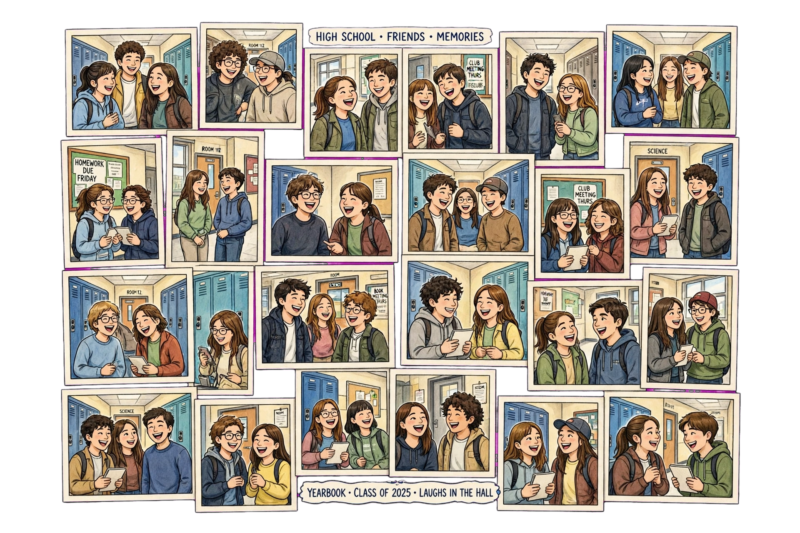
Leave a small border around the whole collage so it does not bleed off the poster board awkwardly. A thin white gap between photos also helps the eye rest instead of feeling overloaded. If you want the collage to feel less random, sort photos loosely by event instead of scattering them completely, so people can still trace the year from start to finish.
2. Decades Theme Poster
Pick a decade, the 70s, 90s, or Y2K era, and build the whole poster around its colors and fonts. Bubble letters and neon work for the 90s. Bell bottoms and warm orange tones fit the 70s. Add a few current-year photos edited to look like old film shots for a fun contrast. Decades posters are a hit during spirit week because they turn a plain announcement into something people stop and look at.
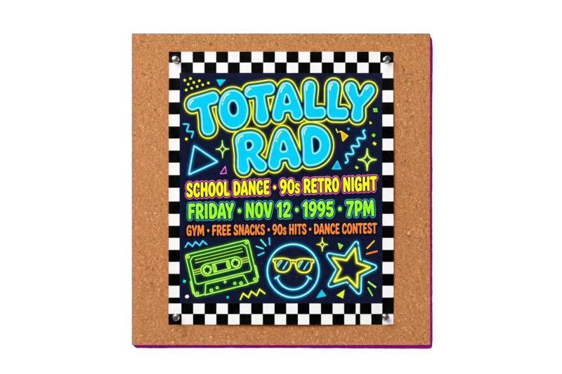
Pull font inspiration from real ads or album covers from that era rather than guessing. A quick image search for the decade’s magazine covers gives an accurate feel for the colors and shapes to copy. Small period details, like an old radio icon or a checkerboard pattern, sell the theme better than fonts alone.
3. Class Superlatives Board
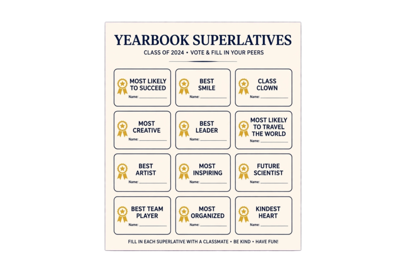
List out categories like Most Likely to Be Late, Best Laugh, or Most School Spirit, then pair each one with a small photo of the winner. Keep the layout in a grid so it reads like a mini awards show. Superlatives posters get people talking because everyone wants to see who won what. Leave a couple of blank slots for late nominations if you are making it before voting closes.
Ask a teacher or advisor to confirm the winners list before printing so nobody gets left off by mistake. If a category feels mean-spirited, swap it for a kinder version, Best Smile instead of a joke category. Superlatives boards age well too, since alumni tend to remember these pages more than plain group photos.
4. Year-in-Review Timeline
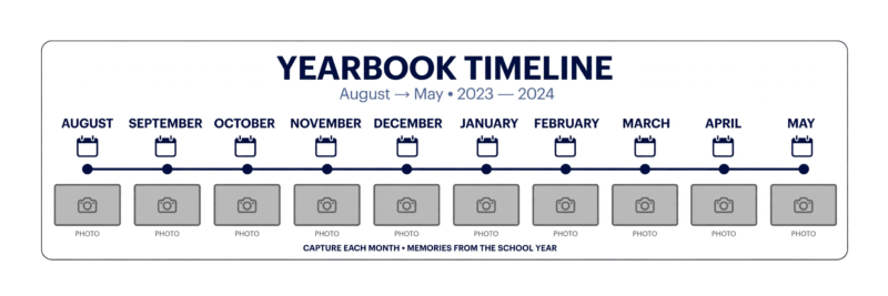
Draw a horizontal or vertical line down the poster and mark it by month, August through May. Under each month, drop in one photo and a short caption of what happened, like the first football game or winter formal. This poster takes more planning since you need photos spread across the whole year, but it works well as a recap piece near the front or back of the yearbook.
Start collecting photos for this one early in the year, since it is hard to fill in October if nobody saved anything from October. A shared folder where students can drop photos by month makes the whole project much easier by the time spring rolls around and the poster needs to come together.
5. Quote Wall
Ask classmates for one favorite line each, a song lyric, a teacher’s saying, an inside joke. Print each quote in a different font size scattered across the poster like a word cloud. Add small doodles or icons between quotes so it does not look like a plain list. Quote walls are cheap to make and give quieter students a chance to be part of the poster without needing a photo.

Give people a deadline and a simple way to submit, a sticky note box in the classroom works fine. Read through submissions before printing to catch anything that should not go on a school poster. A quote wall with forty or fifty short lines feels much fuller than one with only a dozen.
6. Sports Highlight Poster
Focus one poster on a single team or on the whole athletics program. Pull action shots, not just team lineup photos, and add the season record or a standout stat in bold numbers. A scoreboard-style border around the edge makes it feel official. This is a strong pick if your school has a big sports culture and wants a poster that goes up near the gym as well as in the yearbook spread.
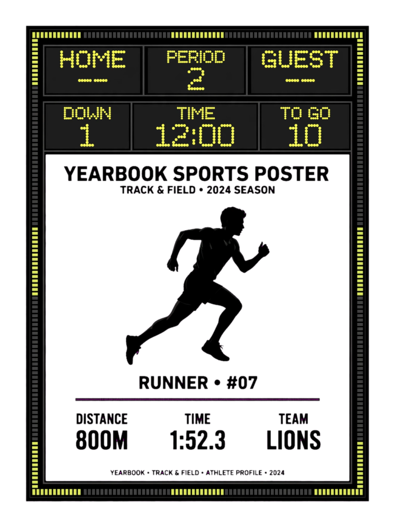
Ask a coach for the season’s best stat lines so the numbers on the poster are accurate. If your school has several strong teams, consider a separate poster for each one instead of cramming them together, since one focused poster per team usually looks sharper than a crowded shared design.
7. Club and Activity Grid
Break the poster into small boxes, one per club or activity, drama, robotics, student council, choir. Put one photo and a one-line description in each box. This poster solves the problem of trying to fit every group into one design without it turning into clutter, since the grid keeps everything organized and easy to scan.
Reach out to every club sponsor ahead of time so nobody gets left off the grid. Keep box sizes equal across the poster so no single club looks more important than another. This layout is also the easiest one to hand off to a small team, since each person can finish one box at a time.
8. Silly Selfie Wall
Set up a poster made entirely of goofy face selfies from as many students as you can get. Keep every photo the same small square size so the wall feels uniform even though the faces are chaotic. This one needs almost no design skill and gets a lot of engagement because everyone wants to find their own photo in the crowd.
Set up a phone or tablet at lunch for a week and let students snap their own square selfie right there, which saves you from chasing down submissions later. A simple colored backdrop taped to a wall keeps every photo looking consistent even though the faces and expressions are all different.
9. Movie Poster Parody
Turn your senior class or a specific club into the “cast” of a made-up movie. Use a popular movie poster layout, big title text at the top, faces lined up across the middle, tagline at the bottom. Swap the movie title for something like “Class of [Year]: The Final Chapter.” This idea gets a lot of laughs and works great for a senior section opener.
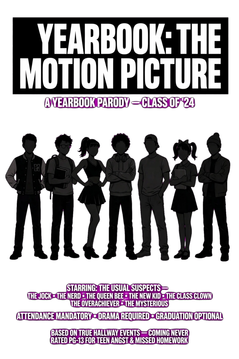
Pick a movie style everyone will recognize, an action blockbuster or a superhero team-up, so the joke lands right away. Keep the tagline short and punchy, one sentence is plenty. This idea also works well as a video announcement thumbnail if your school posts video content alongside the printed yearbook.
10. Then and Now Poster
Pair a baby photo or freshman year photo next to a current photo for a handful of students, side by side. Add a short line about how much they have changed or one thing that stayed the same. This poster hits hardest with seniors looking back at four years, and it tends to become one of the most flipped-to pages once the yearbook comes out.
Ask for baby or freshman photos a few weeks ahead since these usually take longer to track down than recent photos. Keep the two photos the same size and shape for each student so the comparison feels fair and clean rather than mismatched or lopsided.
11. Handwritten Notes Poster
Instead of typed text, scan or photograph actual handwritten notes, a teacher’s encouragement, a friend’s goodbye message, a locker note. Layer them across the poster like a scrapbook page. The imperfect handwriting adds warmth that a typed font cannot copy, and it is a good option if your class does not have a lot of extra event photos to work with.
Photograph notes on a plain, well-lit background so the handwriting stays easy to read once it is shrunk down to fit the poster. Mixing in a few notes from teachers alongside student notes adds a nice range of voices and keeps the poster from feeling one-note.
12. Color-Block Grade Poster
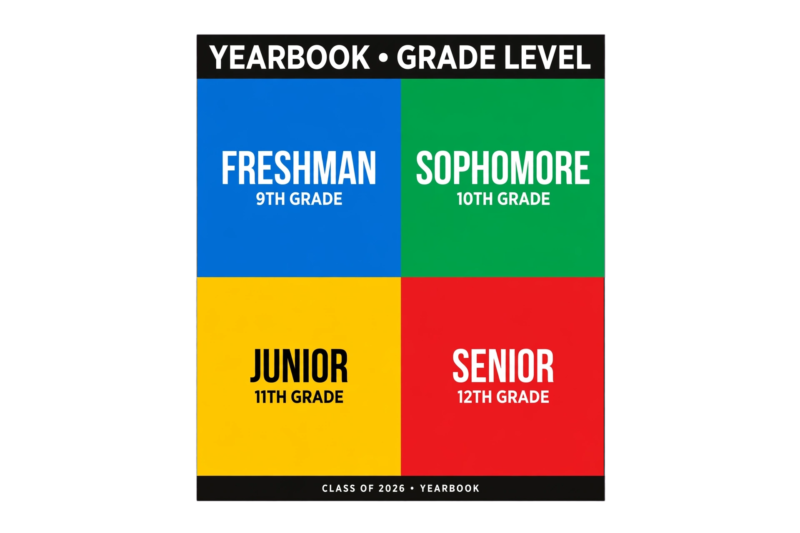
Assign each grade level its own color, freshmen in blue, sophomores in green, and so on, then split the poster into blocks of that color with photos from each grade inside. It is a simple way to represent the whole school on one poster without any single grade taking over the space, and the color blocking makes it easy to read from across a hallway.
Pick colors that are easy to tell apart at a glance, avoid two shades of blue for two different grades. Add the grade name in bold white text over each color block so the poster still makes sense to someone who has never seen the color key before.
13. Countdown Poster
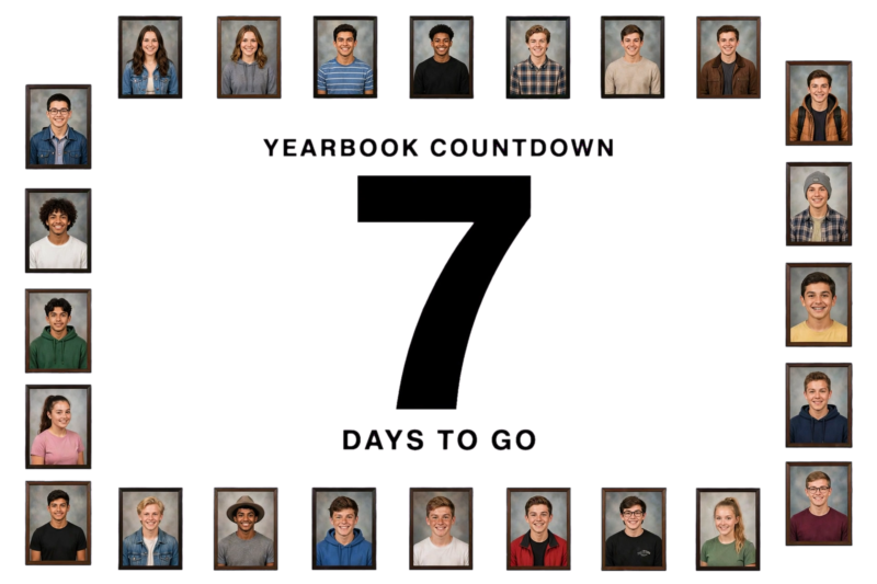
Build the poster around a big number, days left in the school year, or days until graduation, with photos filling the space around the number like a frame. Update it a few times through the year if it is going up in a hallway, or use the final countdown number as a fun keepsake shot for the yearbook. Bold, oversized numbers make this poster readable even from far away.
If the poster is going up as a running countdown, plan for someone to update the number regularly so it does not sit wrong for weeks. For the yearbook version, a photo of the poster on the very last day, showing zero, makes a strong closing image for the final pages.
FAQ
What size should a yearbook poster be?
Most school posters print at 11×17 or 18×24 inches. Check your school’s printer or print shop for the exact size they support before finalizing your layout.
What tools work best for making a yearbook poster?
Canva is the easiest free option with drag-and-drop templates. Physical posters can also be made with printed photos, poster board, and markers for a scrapbook feel.
How many photos should go on one poster?
Between fifteen and thirty photos usually fills a poster without feeling cramped. Fewer than ten can look empty unless the design leans on big text or graphics instead.
Can one poster idea work for a whole yearbook spread instead of just a poster?
Yes. Any of these ideas can be resized to fit a two-page spread. Collage, superlatives, and club grid layouts adapt especially well to full yearbook pages.
Do posters need to match the rest of the yearbook’s design?
It helps but is not required. A poster with its own bold look can work fine as a standalone spread, though sticking to the yearbook’s overall color palette keeps the whole book feeling connected page to page.
References
- Picaboo Yearbooks, “Yearbook Posters: Eye-Catching Promotion for Increased Sales” (2024)
- Canva, “Free Printable Yearbook Templates You Can Customize” (2024)
- PosterMyWall, “Free Templates for Yearbook” (2024)

A Teacher with 5 years of experience. Our Expertise, is reliable to meet your full Academic development needs . Worked on many crafts and construction projects offering services from design to development to deployment over the years. You will find many of my works in my business portfolio on request.