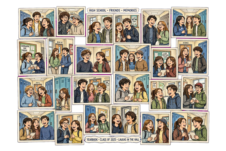

Filling an entire yearbook with pages that actually feel different from each other is harder than it sounds. It is easy to end up with page after page of the same grid-of-photos layout until the whole book blurs together. This list pulls fourteen page ideas from real yearbook staffs and coverage guides, mixed with a few reliable layout basics, so every section of the book has its own personality while still feeling like one connected story. Two of the ideas below come straight from named real-school examples, so you can see exactly how another yearbook staff pulled it off before adapting it for your own book.
Quick Answer
Strong yearbook page ideas include a crowdsourced pet spread, a school spirit quiz, a then-and-now anniversary page, an art showcase, a fashion spotlight, and sidebar features like top ten lists, Q&A bio boxes, and opinion polls. Mix photo-heavy pages with data or quiz pages so the book stays visually varied from start to finish.
| Page Idea | Content Needed | Best Section |
| Pet Spread | Crowdsourced photos | Any section |
| Spirit Quiz | Photos + scoring | Portrait/junior section |
| Then-and-Now Page | Archive research | Theme/anniversary years |
| Fashion Spotlight | Photos + interviews | Student life |
| Sidebar Feature (poll/quiz/Q&A) | Short data | Filler pages |
1. Crowdsourced Pet Spread
Ask students and staff to submit photos of their pets and build a page around them. One yearbook publisher found that when they asked their own team to submit photos of kids and pets for sample spreads, the pet photos came in at nearly double the rate. People are simply more willing to share a photo of a dog or cat than almost anything else, which makes this one of the easiest pages to fill with real crowdsourced content.
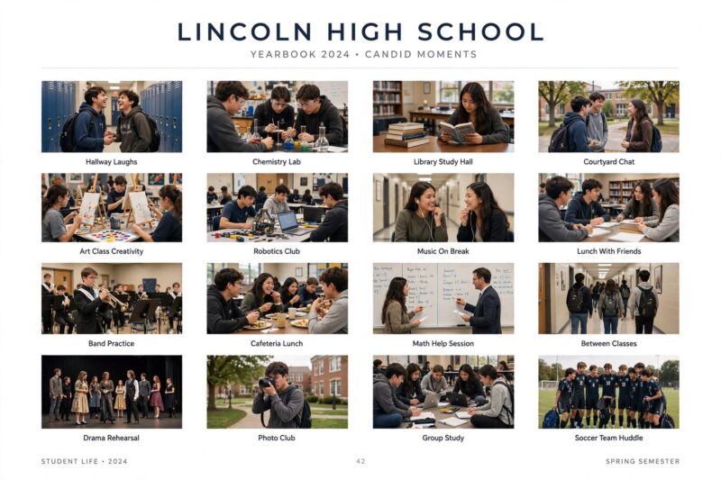
This page also reaches students who avoid the camera everywhere else in the book. A shy student who skips every club photo will often happily send in a photo of their cat, which means the pet spread quietly captures kids who would otherwise be missing from the yearbook entirely.
2. School Spirit Quiz
When Sequoia High School needed to fill more than half a page in their junior section, their staff built a teen-magazine-style spirit quiz featuring eight extra students plus the school mascot. The quiz worked as both a fun read and an easy way to squeeze in more portrait coverage without needing a whole new photo shoot.
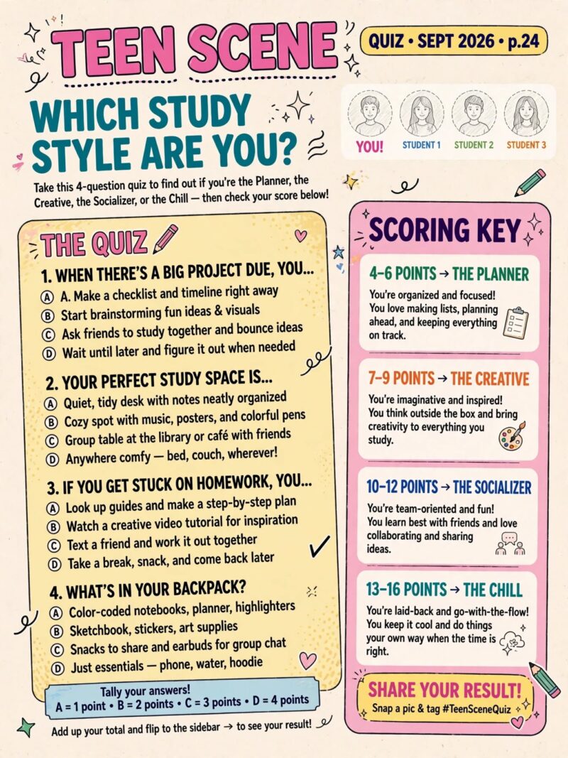
To build your own version, list out behaviors that define school spirit at your school, owning spirit wear, going to games, knowing the words to the fight song, and assign each one a point value. Readers add up their score at the end, which turns a simple filler page into something people actually want to take and complete.
3. Then-and-Now Anniversary Page
An anniversary year is a natural excuse to reflect on how far the school has come. When Magnolia Middle School marked its 50th anniversary, its yearbook staff paired old campus photographs with photos of the current graduating class in the table of contents. It is a small design move that turns a routine page into a real historical record.
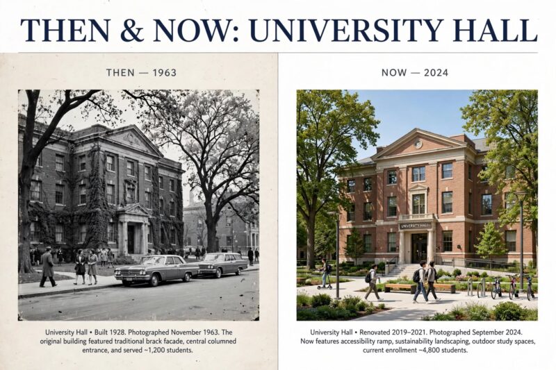
You do not need a major milestone to use this idea. Building projects, campus splits, and expansion projects all give a natural reason to add reflective photos and copy. Pull material from teachers and coaches who are alumni themselves, past yearbooks, old blueprints, or a local historical society if your school archive is thin.
4. Art Showcase Page
Student creativity does not only happen on the field or on stage. A page dedicated to art made in the studio or during classroom art time gives visual artists their own spotlight, the same way a pet spread does for camera-shy students. Frame each piece with the student’s name so it reads like a small gallery wall rather than a scattered collage.
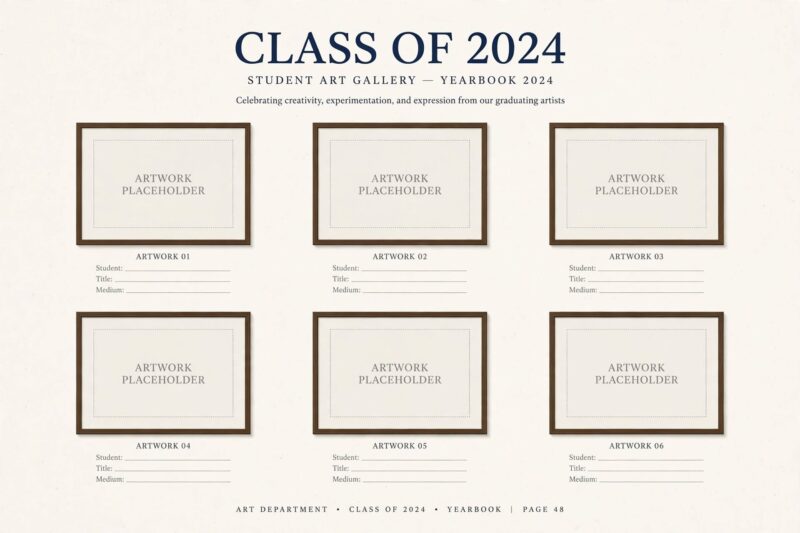
Reach out to the art teacher directly for submissions instead of relying only on students to volunteer, since teachers usually know exactly which pieces from the year are strongest and most worth featuring.
5. Fashion Spotlight Spread
One yearbook staff added a fashion spread specifically to spotlight classmates from different grades whose personal style stood out, pairing photos with short interviews about their style inspiration. Another school asked featured students to show up for the shoot in a plain white shirt and jeans, which kept the focus on each student’s added styling rather than a busy background.
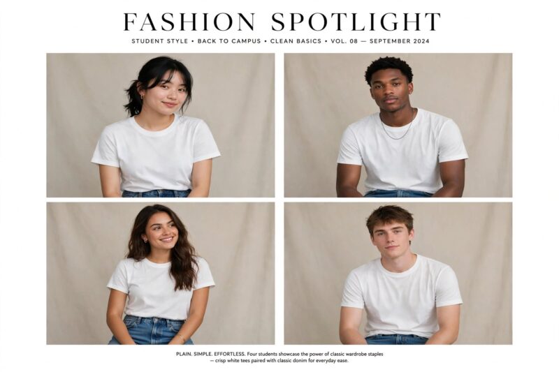
Adding a short school-wide poll about style, favorite trend, go-to accessory, alongside the interviews turns the page into more of a real snapshot of the year rather than just a photo gallery of a few standout outfits.
6. Top Ten or Top Five List Page
Yearbook coverage guides used by scholastic press advisers consistently point to simple ranked lists as one of the easiest ways to add reader appeal to a page: top ten movies, top five songs, most popular hangout spots that year. Lists are fast to build and fast to read, which makes them a reliable choice for a page that needs to come together quickly.
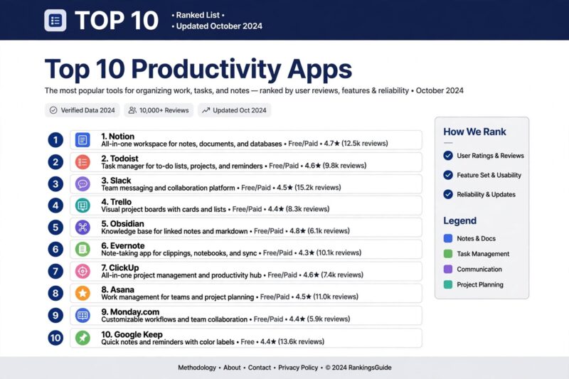
Rotate which category gets the list treatment section by section, songs in the student life section, movies in a filler page, hangouts in the community section, so the same format does not repeat too often across the book.
Base the list on an actual poll of students rather than guessing what was popular, since a list built from real survey answers holds up much better years later than one staff members assumed on their own.
7. Q&A Bio Box Page
Bio boxes built around a short Q&A or mini-interview are a standard tool for covering students who are not pictured elsewhere in the book. A few sharp questions and short answers, paired with a small photo, fill space quickly while giving readers a real sense of who that student is beyond a portrait shot.
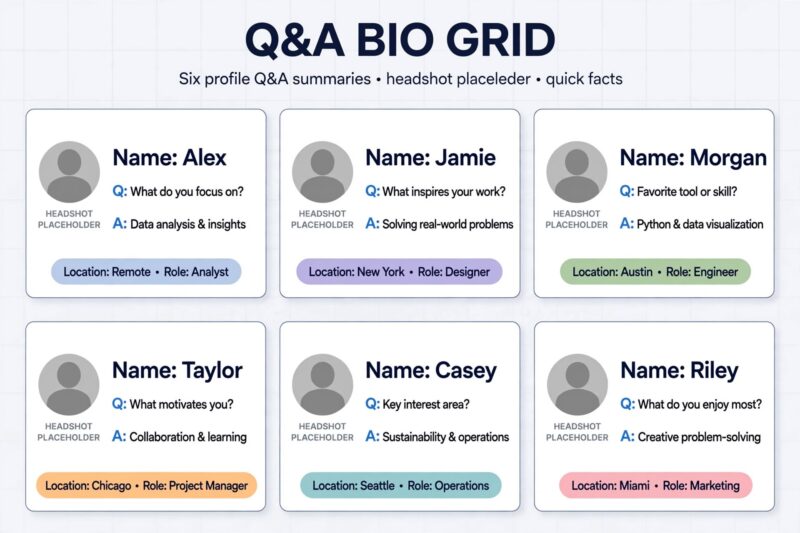
Keep the same three or four questions consistent across every bio box on the page, since a uniform question set makes it easy to compare answers and keeps the layout clean even with many boxes on one spread.
8. Timeline Sidebar
A timeline sidebar gives readers a historical record of events and people across a given stretch of the year, which makes it a useful tool for both theme pages and section openers. Coverage guides recommend timelines specifically as a way to add structure to a page that otherwise has no natural order to follow.
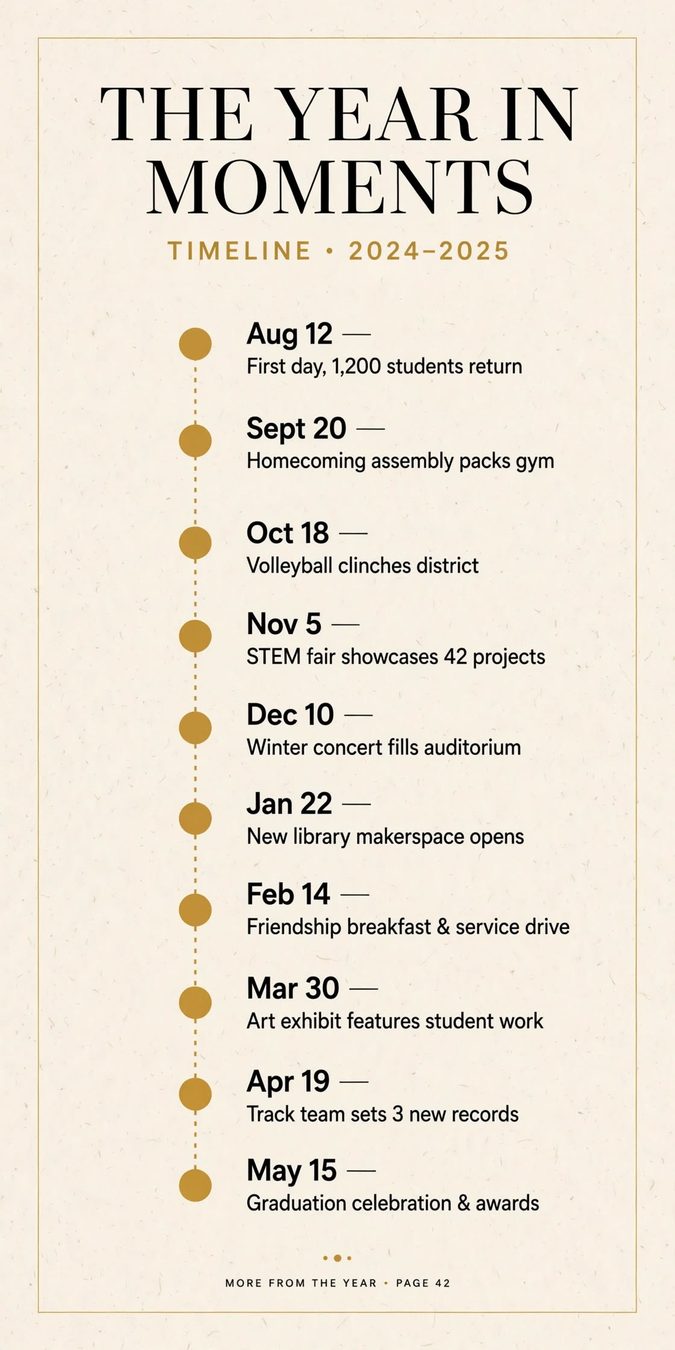
A timeline works especially well paired with a theme spread, since it gives the reader concrete dated events to anchor the more abstract theme copy that usually runs alongside it.
Keep entries short, a date and one line, rather than full paragraphs, so the timeline reads quickly as a sidebar instead of competing with the main content on the page for the reader’s attention.
9. Quote Collection Page
A quote collection gathers a series of student or staff quotes around one shared topic, favorite school memory, best advice from a teacher, and lays them out together on a single page. It is one of the simplest sidebar ideas to execute since it needs no photoshoot, only a handful of short written submissions.
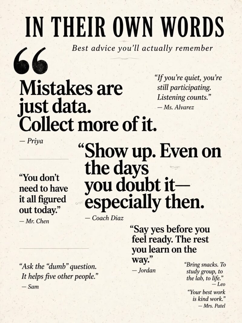
Vary the font size or weight slightly between quotes so the page does not read as one flat block of identical text, and credit each quote with a first name so readers can recognize their classmates.
10. Interactive Quiz Page
Beyond the spirit quiz format, coverage guides call out quizzes generally as one of the most effective ways to make a yearbook more interactive for the whole student body, not just those pictured on the page. A trivia quiz about the school year, guessing games about staff, or a “which club fits you” style quiz all work under this same idea.
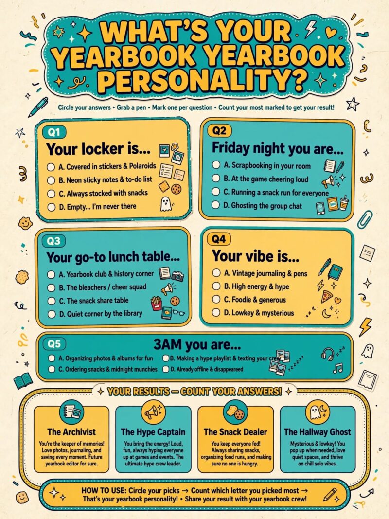
Print the answer key in small type nearby rather than leaving it out entirely, since readers who cannot check their answers tend to lose interest in a quiz page faster than one that lets them confirm how they did.
11. Public Opinion Poll Page
A straightforward poll or survey of the student body, then a visual breakdown of the results, is another sidebar staple recommended in yearbook coverage guides for building reader appeal quickly. Simple bar-style graphics or pie charts turn a handful of survey answers into a page that feels data-driven rather than opinion-based.
Aim for at least fifty responses before building the graphics, since a poll based on only a handful of answers can feel thin once it is blown up into a full-page visual.
Run the poll through a quick digital form so results tally automatically, and pick questions specific to that year, this year’s biggest trend or event, rather than generic questions that could apply to any year’s book.
12. Fill-in-the-Blank Interactive Page
A fill-in-the-blank page leaves open space, prompts like “My favorite memory this year was ___” or “In ten years I hope to be ___”, for the student’s own copy to personalize each printed book. Coverage guides flag this as a strong way for students to customize a yearbook that is otherwise identical copy to copy.
This idea works especially well as one of the very last pages in the book, right before or alongside the autograph pages, since it gives students one more spot to make their personal copy feel like their own.
13. Six-Photo Grid Spread
A reliable grid layout, six equal-sized photos arranged in two rows of three with a headline and short copy anchored in one corner, is a foundational template yearbook design guides point to for club photos, candid event coverage, and academic department overviews. It gives every photo equal visual weight, which keeps the page fair when no single image is a clear standout.
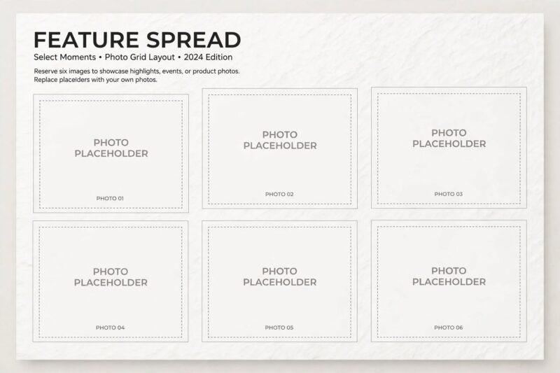
Swap the corner used for the headline from spread to spread, sometimes top left, sometimes bottom right, so pages using the same grid template still feel a little different from each other.
Keep this exact template on hand as a reusable starting point for staff members, since having two or three go-to grid variations ready to drop in speeds up production a lot when a section still needs one more page close to deadline.
14. Story Caption Spread
Rather than a single caption line under a photo, a story caption spread uses longer, narrative-style captions to actually tell the story of the event pictured on the page, who was there, what happened, why it mattered. Coverage guides recommend this approach specifically for spot news and non-academic events like prom, homecoming, or graduation, where the story behind the photo carries as much weight as the image itself.
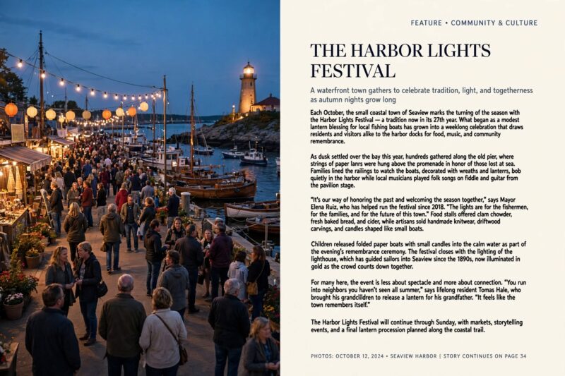
Assign one student writer to interview a few people who were actually at the event rather than writing the caption from memory alone, since firsthand quotes make the story caption feel like real reporting instead of a guess at what happened.
FAQ
What is the fastest page idea to build close to a deadline?
A quote collection or fill-in-the-blank page needs almost no photography, just short written submissions, which makes either one a fast option when a section needs one more page and time is short.
How do sidebar features help fill a yearbook page?
Sidebars like polls, quizzes, and timelines add reader appeal without needing a full photo shoot. They pull attention to a page and give readers something to interact with beyond looking at photos.
What is a good way to include students who avoid the camera?
Pet spreads and art showcase pages both work well for camera-shy students, since they let a student contribute through a photo of something they made or own rather than a photo of themselves.
Should every page include photos?
No. Sidebar pages built around lists, polls, or quizzes give the book visual variety. A yearbook made entirely of photo grids can start to feel repetitive by the middle of the book.
References
- Treering, “Six Ideas to Fill Pages” (2025)
- Digital Yearbook, “35+ Yearbook Spread Ideas: Creative Layouts That Make Pages Pop” (2025)
- Yearbook Staff Coverage Curriculum, “Hands For Coverage: Ideas for Creative Coverage” (accessed 2026)

A Teacher with 5 years of experience. Our Expertise, is reliable to meet your full Academic development needs . Worked on many crafts and construction projects offering services from design to development to deployment over the years. You will find many of my works in my business portfolio on request.