


Want to capture that iconic mortarboard in a drawing, whether you’re celebrating a milestone or just exploring your artistic side? Drawing a graduation cap might seem tricky at first, but the process breaks down into simple geometric shapes that anyone can master. Whether you’re prepping for a graduation party invitation, creating a keepsake card, or just practicing your line work, this tutorial walks you through each stage—from the initial light sketch to the final shaded details. By the end, you’ll have a polished graduation cap ready to color or display.
Quick Questions and Answers
Question: Why do graduation caps have a flat square top? The flat square top, called a mortarboard, is a traditional academic symbol representing knowledge. It provides a stable surface for the tassel and button, and its geometric shape contrasts with the rounded skullcap underneath for visual balance.
Question: Can kids draw a graduation cap easily? Yes, kids can draw a graduation cap easily using simple shapes like diamonds and ovals. Most tutorials break the process into 5–7 clear steps, making it accessible for beginners and children as young as 5 or 6.
Question: Do I need a ruler to draw a perfect graduation cap? You don’t strictly need a ruler, but using one helps create precise straight lines for the mortarboard edges. Many artists sketch lightly first and refine lines later, though a ruler ensures symmetry and clean geometry.
Key Takeaways
Drawing a graduation cap relies on mastering a few core shapes: the horizontal rhombus for the mortarboard and curved or straight lines for the skullcap. Light pencil work during the planning stage makes corrections simple. Adding shading and color transforms a basic outline into a three-dimensional, realistic cap. Practice at different angles builds confidence and perspective skills. Free resources and coloring pages are widely available for extra practice.
What You Need
| Item | Purpose | Notes |
|---|---|---|
| Drawing paper | Foundation for your cap sketch | Standard 8.5×11 inch works fine; heavier weight reduces wrinkles |
| Graphite pencils (HB or 2B) | Light initial sketching | Softer lead erases cleanly without damaging paper surface |
| Eraser (kneaded or standard) | Remove guidelines and mistakes | Kneaded erasers lift graphite without harsh rubbing |
| Ruler or straightedge | Ensure parallel, symmetrical lines | Optional but recommended for precision mortarboard edges |
| Colored pencils | Add depth and realism through shading | Professional-grade brands offer better color blending |
| Markers (optional) | Bold, vibrant final colors | Use after pencil work is complete and fully erased |
| Blending stump or tissue | Smooth shading transitions | Creates soft gradients and realistic shadows |
Step 1: Prepare Your Workspace

Place your drawing paper flat on a clean, stable surface with good lighting. This prevents smudges and keeps your hand steady as you work. Position your pencil, eraser, and any coloring materials within arm’s reach—you don’t want to interrupt your flow hunting for supplies. A slightly tilted surface (like a sketchbook easel) can reduce neck strain during longer drawing sessions, though a flat table works perfectly fine. Clear away clutter so you have room to rest your hand without accidentally erasing completed work. Proper setup takes one minute but saves hours of frustration.
Step 2: Sketch the Mortarboard (the Flat Top)
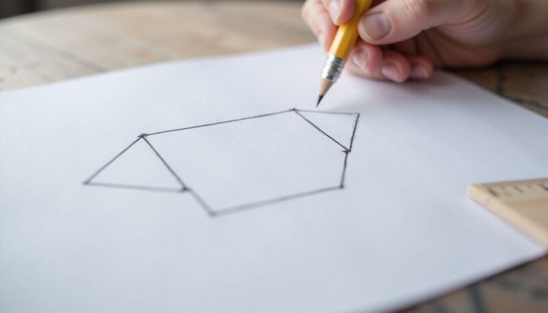
Start with the most important shape: a horizontal rhombus, also called a diamond. This represents the mortarboard—the flat, square top of the graduation cap. Lightly draw four lines to form the rhombus, ensuring the top and bottom edges are roughly parallel. The rhombus should lean slightly, giving it that classic angled perspective. Don’t press hard; light pencil strokes let you adjust the proportions before committing to the shape.
The rhombus is wider than it is tall, mirroring how a real mortarboard appears when viewed from a slight angle. If you’re using a ruler, align it along each edge for perfectly straight lines. Begin at the top-left corner, draw to the top-right, then down to the bottom-right, and finally back up to the bottom-left point. Close the shape with a final line. This foundation determines everything else, so take your time getting the proportions balanced.
Step 3: Add the Vertical Lines for the Skullcap
From the two bottom corners of your rhombus, draw two short, slanted vertical lines heading downward. These lines form the sides of the skullcap—the part that rests on the head. Angle them so they lean slightly inward, creating a natural taper. Each line should be roughly the same length (about one-third the height of the mortarboard). Avoid making them perfectly vertical; the slight inward slant looks more realistic and three-dimensional.
The angle matters here. If the lines are too vertical, the cap looks flat and lifeless. If they lean too far, the cap appears unstable. Aim for a subtle angle—around 5 to 10 degrees from true vertical works well. Use your ruler if precision feels important, or freehand sketch lightly and refine the angle as you go. The beauty of light pencil work is that you can adjust without penalty.
Step 4: Connect the Lines to Form the Skullcap Base
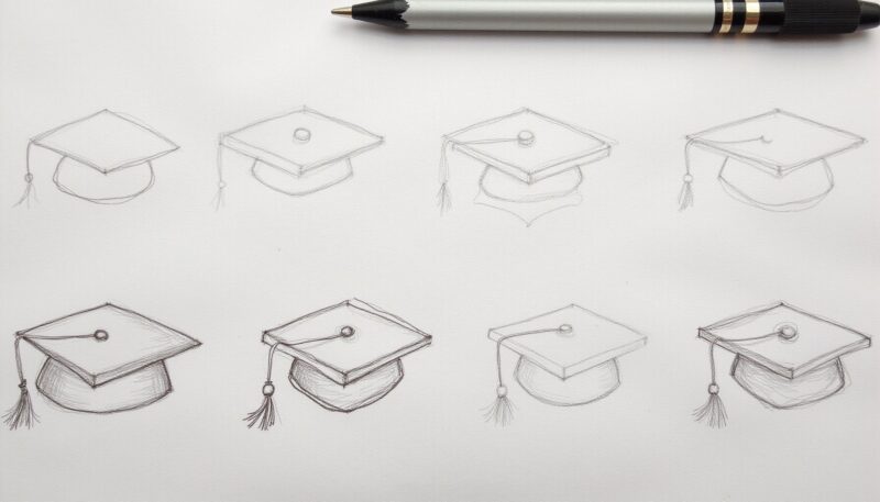
Connect the bottoms of those two slanted lines with a curved or straight line. This creates the lower edge of the skullcap—essentially the band that circles the head. A gentle curve looks more natural than a sharp angle, but either works depending on your artistic preference. This closed shape now shows the three-dimensional form: flat mortarboard on top, rounded or angled skullcap below. Stand back and check proportions. The cap should look balanced, not lopsided or stretched.
Step 5: Add the Center Button Detail
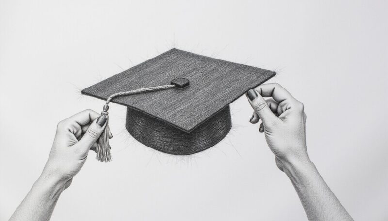
At the very center of the mortarboard rhombus, sketch a small circle or oval. This button is where the tassel attaches. Make it subtle—just large enough to be noticeable but not so big it dominates the mortarboard. A circle about one-quarter inch in diameter works for most drawings. This detail anchors the tassel and adds realism, signaling to viewers that they’re looking at an actual graduation cap, not just geometric shapes.
Step 6: Draw the Tassel
The tassel is the cord and fringe hanging from the cap’s button. Start with two thin lines extending downward from the center button, representing the string. These lines can hang straight down or curve slightly for a more dynamic look. Below the string, sketch a small circle or oval shape—this is the tassel bulb where the cord splits into fringe. From this bulb, draw several thin, downward-flowing lines to represent the individual strands of the tassel.
The tassel adds movement and elegance to your drawing. Traditionally, it hangs on the right side before graduation and moves to the left after. For artistic purposes, place it wherever feels balanced in your composition. If your drawing feels too heavy on one side, offsetting the tassel can restore visual equilibrium. Make sure the tassel doesn’t overpower the cap itself—it’s an accent, not the focal point.
Step 7: Refine Lines and Erase Guidelines
Once all major shapes are in place, carefully erase any visible light pencil lines that don’t contribute to the final outline. Use a kneaded eraser for gentle removal, or a standard eraser with a light touch. This reveals a clean line drawing of your graduation cap without any construction marks. If certain lines are too faint to erase completely, that’s fine—they’ll disappear once you add color or shading.
Go over the main outlines with a slightly darker pencil line (or a fine-tip pen if you want permanence) to define the cap clearly. This makes the shape pop and prepares it for shading. Don’t overwork this step; simple, confident lines look better than a maze of repeated sketches. If you make a mistake, use your eraser gently and redraw.
Step 8: Add Shading for Depth and Realism
Shading transforms a flat outline into a three-dimensional object. Think about where light hits the cap: typically from above and slightly to one side. The top of the mortarboard should be lighter, while the underside (where it meets the skullcap) should be darker. Shade the sides of the skullcap with gentle pencil strokes, using a softer graphite (2B or 4B) for darker tones.
Use a blending stump or tissue to smooth out harsh pencil marks and create soft transitions. This mimics how light naturally falls on curved surfaces. The tassel benefits from subtle shading too—darken one side slightly to suggest dimension. Avoid heavy, uniform shading; instead, build up tone gradually with multiple light layers. This approach gives you control and prevents the cap from looking muddy or overworked.
Step 9: Add Color (Optional)
Colored pencils or markers bring your graduation cap to life. School colors, metallics, or even a classic black mortarboard all work. Start with light color layers and build intensity gradually. Blend colors where they meet (like where the mortarboard touches the skullcap) for a polished look. Markers offer bold, vibrant results but can bleed through thin paper, so test on scrap paper first.
If you’re creating this for a specific graduation, matching the school’s official colors adds a personal touch. Gold tassels with a navy mortarboard feel formal and celebratory. Red and white caps look bold and striking. Experiment until the colors feel right for your vision. Remember that colored pencils allow more precision and blending, while markers deliver faster coverage and higher saturation.
Tips for Drawing a Perfect Graduation Cap
Light pencil work during planning saves time during finishing. Pressing hard early means difficult erasing later. A ruler keeps lines parallel and symmetrical; even professional artists use them for technical drawing. Pay attention to perspective—the angle of the rhombus determines whether the cap looks realistic or tilted. Practice at multiple angles (straight-on, three-quarter view, from below) to build confidence with the form. Reference photos of real graduation caps for color inspiration and shading direction.
Common Mistakes to Avoid
Pressing too hard with your pencil during the initial sketch is the number-one error. It damages paper texture and leaves ghost marks even after erasing. Ignore this advice and your final drawing suffers. The rhombus angle is critical; even slightly off creates an unbalanced, lopsided cap. Many beginners skip the preparation step and dive straight into darkening lines, then panic when mistakes can’t be fixed cleanly.
Failing to prep the workspace leads to smudges, interruptions, and accidentally erasing completed work. A messy setup derails focus. Neglecting the tassel or button detail makes the cap feel incomplete—these small elements signal “graduation cap” to viewers instantly. Without them, you’ve drawn a flat shape that could be anything. Finally, overworking shading can muddy the drawing and destroy crisp lines. Less is often more; a few well-placed shadows beat heavy coverage.
Troubleshooting Your Drawing
If the cap looks tilted, check whether the top and bottom edges of your rhombus are truly parallel. A ruler helps here. Redraw the rhombus if needed—it’s worth the extra minute for accuracy. If lines appear too dark or heavy, use a kneaded eraser to lift some graphite before you add final color. This prevents a grimy appearance.
If the tassel seems disproportionate (too thick or too long), erase and redraw it proportionally. The tassel should be roughly one-third the height of the entire cap. If shading looks streaky or uneven, blend it more thoroughly with a tissue or blending stump. Smooth, gradual shading looks more professional than obvious pencil lines. If the cap doesn’t look three-dimensional, add darker shading to the underside of the mortarboard and sides of the skullcap. These shadow areas create depth instantly.
My Experience With How to Draw a Perfect Graduation Cap: Simple Step-by-Step Tutorial
I’ve drawn dozens of graduation caps for invitations, cards, and personal projects, and I can tell you the difference between a flat, lifeless cap and one that jumps off the page comes down to two things: nailing the rhombus angle and not skipping the shading step. The angle was my biggest stumbling block early on—I’d get the proportions right but tilt the whole thing sideways without realizing it, making the cap look drunk and unstable. Now I always check that the top and bottom edges run parallel, and it fixes everything instantly.
The other breakthrough was embracing light pencil work. I used to press hard from the start, thinking darker lines meant better precision. Wrong. Light lines let you adjust freely, erase cleanly, and build up to final darkness gradually. It’s counterintuitive but transforms your workflow.
Here’s the sharp insight: the button detail matters way more than most tutorials admit. Without it, you’ve drawn a generic shape. With it, suddenly everyone recognizes “graduation cap” instantly. That one small circle anchors the entire drawing’s meaning. I skip it sometimes in quick sketches and always regret it.
Color is where people get timid. Black and gold feels safest, but red mortarboards with silver tassels? Navy with white accents? They pop and feel fresh. Push beyond the defaults.
Which graduation color combination have you seen that actually made you stop and look?
FAQ
Q: Are there different ways to draw a graduation cap?
Yes, you can draw a graduation cap from above showing the diamond mortarboard, or from below seeing the oval skullcap. Each perspective changes which parts are visible, like the button or tassel attachment point.
Q: How long does it take to draw a graduation cap?
Drawing a basic graduation cap typically takes about 15 to 30 minutes for beginners. Adding details like shading, tassel strings, or color can extend the time to 45 minutes or more.
Q: Will adding shading make my graduation cap look more realistic?
Adding shading to the sides and under the mortarboard creates depth and realism. Darker tones under the board and along the skullcap curves mimic how light naturally falls on the cap’s three-dimensional shape.
Q: When should I draw the tassel on my graduation cap?
Draw the tassel after completing the main cap shape, usually attaching it to the top button or side of the mortarboard. Start with two small lines for the string, then add the circular base and flowing strands below.
Q: What is the easiest shape to start with for a graduation cap?
The easiest starting shape is a diamond or rhombus for the mortarboard, paired with an oval or curved lines for the skullcap. These simple geometric forms make it easy to build a balanced, recognizable cap.
Q: Is a graduation cap the same as a mortarboard?
A graduation cap includes both the skullcap (the part fitting the head) and the mortarboard (the flat square top). The term “mortarboard” specifically refers to the flat board, not the entire cap assembly.
Q: Which side should the tassel hang on a graduation cap?
Traditionally, the tassel hangs on the right side before graduation and moves to the left after receiving the degree. When drawing, you can place it on either side for artistic preference, though right is standard pre-graduation.
Latest Updates
For 2026, digital drawing tools remain popular for graduation cap sketches. Platforms like Art Projects for Kids continue offering free printable tutorials and coloring pages, which work great for practice alongside traditional pencil-and-paper methods. Many artists now combine traditional sketching with digital coloring apps for a hybrid workflow—sketch by hand, then scan and colorize digitally. This approach gives you the tactile satisfaction of pencil work plus the flexibility of digital tools.
If you want to explore beyond basic drawing, looking at how anime sketching techniques apply perspective and shading can elevate your cap drawings with anime-style dimensional effects. Graduation caps drawn in manga or anime style (with bold outlines and exaggerated perspective) are trending for celebration art. Similarly, exploring fall art and drawing ideas can inspire ways to frame your cap within seasonal contexts—drawing a graduation cap surrounded by autumn leaves or spring flowers, for example.
Conclusion
Drawing a perfect graduation cap comes down to mastering a few simple shapes and understanding basic shading principles. Start with a light rhombus for the mortarboard, add slanted lines for the skullcap, sketch the button and tassel, then refine with shading and color. The process takes 20 to 45 minutes depending on detail level, and practice makes each subsequent cap faster and more confident.
Whether you’re creating a card for a graduate, designing an invitation, or just practicing fundamental drawing skills, this tutorial provides a clear path from blank paper to finished artwork. Keep your pencil light during planning, use a ruler for precision, and don’t skip the shading—it’s what transforms a flat shape into a believable three-dimensional cap. With these steps and a bit of practice, you’ll draw graduation caps that feel polished and celebratory.
References
- DIY.org. (n.d.). How to draw a graduation cap. DIY.org. https://www.diy.org/challenges/how-to-draw-a-graduation-cap
- WikiHow. (n.d.). How to draw a graduation cap (with pictures). WikiHow. https://www.wikihow.com/Draw-a-Graduation-Cap
- Art Projects for Kids. (n.d.). Easy how to draw a graduation cap tutorial and coloring page. Art Projects for Kids. https://artprojectsforkids.org/how-to-draw-a-graduation-cap

A Teacher with 5 years of experience. Our Expertise, is reliable to meet your full Academic development needs . Worked on many crafts and construction projects offering services from design to development to deployment over the years. You will find many of my works in my business portfolio on request.