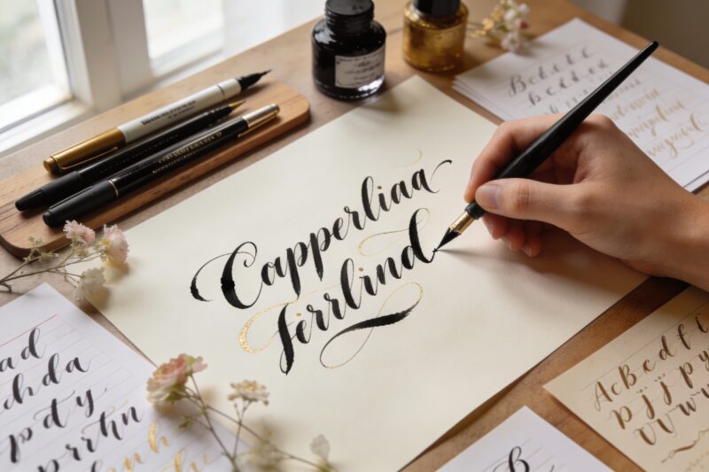
Ready to ditch your boring handwriting and create something absolutely stunning? These calligraphy alphabet styles are way easier than you think, and you’ll be creating gorgeous lettering before you know it. Whether you’re making wedding invitations, journaling, or just want your grocery lists to look fancy, these alphabets have got you covered.
1. The Classic Copperplate – Your Gateway Drug to Fancy Writing
Let’s start with the OG of calligraphy styles. Copperplate is that elegant, slanted script you see on fancy wedding invitations and historical documents. It looks intimidating, but the basic alphabet is actually pretty straightforward once you get the hang of the pressure patterns.
The secret? It’s all about thick downstrokes and thin upstrokes. You press down when your pen moves downward and lighten up when it goes up. Sounds simple, right? That’s because it actually is.
What You’ll Need:
Pointed nib pen or flexible brush pen
Smooth paper (at least 32 lb weight)
Practice guidelines with 55-degree slant lines
Start with lowercase letters before tackling those dramatic uppercase swirls. Trust me, mastering the basic strokes first will save you so much frustration later. This alphabet works perfectly for formal occasions, addressing envelopes, or anytime you want to look ridiculously sophisticated.
2. Modern Brush Lettering – The Instagram Darling
If Copperplate is the grandmother of calligraphy, modern brush lettering is the cool younger cousin who wears sneakers to weddings. This style takes traditional calligraphy rules and loosens them up for a more casual, bouncy feel.
You’ll create the same thick and thin strokes, but letters can bounce above and below the baseline. Want your ‘t’ to be taller than your ‘h’? Go for it! This alphabet is all about breaking the rules while still looking intentional.
Quick Tips:
Use a small brush pen to start (Tombow Fudenosuke is perfect)
Let letters dance on different levels
Connect letters loosely – they don’t all need to touch
Embrace imperfection as part of the charm
This style absolutely kills it for social media posts, greeting cards, and bullet journals. Seriously, once you nail this alphabet, your Instagram stories will never be the same.
3. Gothic Blackletter – Medieval Vibes for Days
Want to look like you just stepped out of a monastery in 1200 AD? Gothic blackletter is your jam. These dense, angular letters have serious presence on the page and aren’t nearly as hard as they look.
The trick is thinking in vertical strokes and sharp angles rather than curves. Each letter is basically a series of straight lines with tiny connecting bits. You’re essentially building letters like tiny architectural structures.
Key Characteristics:
Tall, narrow letters with sharp angles
Minimal curves and rounded shapes
Dense, dramatic appearance
Heavy, consistent stroke weight
Use a broad-edge pen or marker held at a consistent 45-degree angle. The pen does most of the work – you just guide it. This alphabet is perfect for certificates, brewery branding, tattoo designs, or making your D&D character sheets look epic.
4. Italic Cursive – The Everyday Fancy Script
Think of italic cursive as calligraphy’s most practical alphabet. It’s elegant enough to impress but simple enough to actually use for taking notes. Plus, it’ll make your regular handwriting so much prettier.
The letters lean forward at about 5-15 degrees and flow smoothly into each other. Unlike Copperplate’s dramatic thick-thin contrast, italic maintains more consistent stroke weight, making it way less fussy to write.
You can use literally any pen – even a ballpoint works great. The letter forms themselves create the beauty, not fancy tools or pressure variations. This makes it the most accessible alphabet on this list, IMO.
Perfect For:
Daily journaling
Personal letters and cards
Class notes that don’t look boring
Quick signs and labels
Once you get comfortable with italic, it can actually become your everyday handwriting. How cool is that?
5. Faux Calligraphy – The Cheat Code Everyone Needs
Here’s the secret weapon: faux calligraphy lets you create gorgeous lettering with just a regular pen. No special tools required. You literally fake it till you make it, and nobody can tell the difference.
Write your words in cursive (any style works), then go back and thicken the downstrokes by drawing a parallel line next to them. Fill in the space between, and boom – instant calligraphy that looks like you used fancy pens.
The Process:
Write your word in connected cursive
Find all the downward strokes
Draw a line parallel to each downstroke
Color in the space between
This technique is a total game-changer for beginners. You get beautiful results immediately, which keeps you motivated to learn more advanced techniques. Use it for chalkboard signs, posters, or anywhere you need calligraphy but don’t have your fancy pens handy.
6. Uncial Script – The Friendly Medieval Alphabet
If Gothic blackletter is the serious older sibling, uncial script is the fun, approachable one. These rounded, chunky letters originated in early medieval manuscripts but feel surprisingly modern and friendly.
The letters sit between uppercase and lowercase – they’re all roughly the same height with gentle, rounded shapes. There are no sharp angles or dramatic flourishes, just smooth, satisfying curves.
Use a broad-edge pen at a flat angle (almost horizontal). The pen naturally creates the thick and thin variations as you follow the letter shapes. The result looks ancient and contemporary at the same time, which is kind of magical.
Best Uses:
Children’s book titles
Inspirational quotes
Celtic-themed projects
Friendly signage and headers
This alphabet brings a warm, welcoming vibe that works great when you want something special but not overly formal.
7. Spencerian Script – The Vintage Beauty
Remember those gorgeous signatures on old documents from the 1800s? That’s Spencerian script, and it’s absolutely dreamy. This alphabet is all about delicate, flowing curves and ornamental flourishes.
Spencerian is lighter and more delicate than Copperplate, with thinner overall strokes and more extreme thick-thin contrast. The letters flow together like silk, creating this incredibly elegant connected script.
Fair warning: this one takes patience. The letterforms require precise control and light pressure, which means lots of practice. But seriously, the results are so worth it when you nail those graceful curves.
What Makes It Special:
Extremely light, delicate strokes
Lots of ornamental loops and curls
Very consistent slant (usually 52 degrees)
Maximum elegance factor
Use Spencerian for vintage-themed projects, formal invitations, or creating artwork where the lettering itself is the star of the show.
8. Bounce Lettering – Playful and Perfectly Imperfect
Take everything you know about keeping letters on a baseline and throw it out the window. Bounce lettering creates rhythm and energy by intentionally varying letter heights and positions.
Some letters sit below the baseline, others float above it, creating this fun, dancing effect across the page. The thick-thin strokes follow basic brush lettering rules, but the playful arrangement gives it serious personality.
The key is making the bouncing look intentional, not random. Generally, you’ll alternate high and low letters in a pattern, or group them by word for visual interest. It sounds chaotic, but it creates amazing dynamic compositions.
Tips for Great Bounce:
Start with a light pencil baseline for reference
Vary letter heights but keep consistent spacing
Don’t bounce every single letter (too busy!)
Let descenders and ascenders overlap occasionally
This alphabet absolutely shines in motivational quotes, party invitations, and anything where you want energetic, happy vibes. FYI, kids especially love this style because it feels fun and approachable.
9. Simplified Sans Serif – Modern Minimalist Magic
Who says calligraphy has to be curvy and connected? Sans serif calligraphy brings clean, modern vibes with simple, disconnected letters that still pack visual punch.
You’ll use the same thick-thin principle, but apply it to blocky, geometric letterforms. Think of it as calligraphy meeting contemporary graphic design. The result is fresh, clean, and totally Instagram-worthy.
The beauty here is in the simplicity and precision. Each letter stands alone with clean lines and thoughtful spacing. You can add subtle variations in stroke weight or keep it uniform – both approaches look amazing.
Perfect Applications:
Modern wedding stationery
Minimalist home decor
Business branding
Clean, contemporary designs
This style proves that calligraphy doesn’t always mean fancy flourishes. Sometimes simple and bold makes the biggest statement.
Let’s wrap up with the most versatile alphabet on this list. Casual print calligraphy takes regular printed letters and elevates them with slight variations in stroke weight and thoughtful composition.
The letters don’t connect, the forms stay simple and readable, but you add calligraphic flair through strategic thickening of downstrokes and careful spacing. It’s like giving your print handwriting a sophisticated upgrade without making it unrecognizable.
This approach works with any basic print alphabet you already know. Just write naturally, then enhance the downward strokes to create visual interest. You maintain maximum readability while adding artistic touch.
Why It’s Awesome:
Super readable for all ages
Works with any pen or marker
Friendly, approachable vibe
Great for beginners and kids
Use this for planners, recipe cards, labels, and anything where you want it pretty but still totally functional. It’s calligraphy for real life, basically.
There you have it – ten calligraphy alphabets that’ll take your lettering from basic to absolutely beautiful. Pick one that speaks to you, grab some practice paper, and just start. The only way to get good at calligraphy is to actually do it, so stop overthinking and start writing. Your future fancy handwriting self will thank you!
A Teacher with 5 years of experience. Our Expertise, is reliable to meet your full Academic development needs . Worked on many crafts and construction projects offering services from design to development to deployment over the years. You will find many of my works in my business portfolio on request.