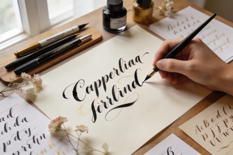
Whether you’re addressing wedding invitations, designing logos, or simply exploring a creative hobby, these 10 calligraphy alphabet ideas to spark your next project will give you fresh inspiration and practical starting points. From classic scripts to modern styles, each alphabet brings its own personality and technical challenges to help you grow as a lettering artist.
Key Takeaways
Gothic (Blackletter) works best for formal certificates, medieval-themed projects, and dramatic headlines
Copperplate and Spencerian are ideal for wedding invitations and elegant personal stationery
Italic script offers versatility for both formal documents and everyday creative projects
Brush lettering creates modern, expressive designs perfect for social media and contemporary branding
Uncial alphabet brings historical authenticity to Celtic-inspired or religious projects
Practice with guidelines and consistent slant angles improves letter uniformity across all styles
Start with basic lowercase letters before tackling ornate capitals and flourishes
The 10 calligraphy alphabet ideas covered here range from traditional scripts like Gothic and Copperplate to modern styles like brush lettering and bounce calligraphy. Each style serves different project needs: choose formal scripts for weddings and certificates, playful styles for social media content, or historical alphabets for themed designs. Beginners should start with Italic or foundational hand scripts, while experienced calligraphers can explore ornate Spencerian flourishes or experimental modern variations.
What Are the Best Traditional Calligraphy Alphabets to Start With?
Traditional calligraphy alphabets like Foundational Hand, Italic, and Uncial provide the technical foundation every calligrapher needs. These scripts teach proper pen angle, consistent letter height, and rhythm—skills that transfer to more complex styles later.
Foundational Hand (also called Round Hand) uses a broad-edge pen held at a 30-degree angle. The letters are simple, rounded, and highly readable, making this the best starting point for absolute beginners. You’ll learn consistent stroke order and spacing without wrestling with complicated flourishes.
Italic script evolved from Foundational Hand but adds a forward slant (typically 5-10 degrees) and slightly compressed letter forms. This alphabet works beautifully for:
Personal correspondence and greeting cards
Poetry and quotations
Menu designs and place cards
Any project requiring elegance without excessive formality
Uncial alphabet dates back to the 4th century and features rounded, majuscule (capital-like) letters without true ascenders or descenders. The pen angle shifts between 0 and 20 degrees depending on the stroke. Choose Uncial when you want a Celtic or early Christian manuscript aesthetic for book titles, certificates, or historical reproductions.
Common mistake: Beginners often rush into pointed-pen scripts like Copperplate before mastering broad-edge basics. Build your foundation first—the discipline of maintaining consistent pen angle and letter proportions will make pointed-pen work much easier later.
How Do Gothic and Blackletter Alphabets Enhance Formal Projects?
Gothic calligraphy (Blackletter) creates dramatic, high-contrast letters with angular forms and compressed spacing. This alphabet style dominated European manuscripts from the 12th to 17th centuries and still conveys formality, tradition, and gravitas.
The main Blackletter variations include:
Textura (Textualis): The most formal, with vertical strokes that resemble a woven texture
Rotunda: Slightly rounder and more readable, popular in Italian manuscripts
Fraktur: German style with decorative capitals and distinctive lowercase forms
Schwabacher: Earlier German style, less angular than Fraktur
When to use Gothic alphabets:
Choose Blackletter for diplomas, certificates, beer labels, metal band logos, medieval-themed invitations, and anywhere you need commanding visual presence. The dense, vertical letterforms demand attention and communicate seriousness.
Technical considerations: Gothic scripts require a broad-edge pen held at 40-45 degrees. The letters are typically 4-5 nib-widths tall (compared to 5-6 for Foundational Hand), creating that characteristic compressed, dark appearance. Maintain consistent vertical strokes—any wobble becomes immediately obvious in this style.
Edge case: While Gothic looks impressive, it sacrifices readability. Use it for short headlines or names, not body text. If your project requires more than a few lines of text, consider pairing Gothic capitals with a more readable lowercase alphabet like Italic.
Which Pointed-Pen Alphabets Work Best for Wedding Invitations?
Pointed-pen calligraphy creates the elegant, flowing scripts most people associate with wedding invitations and formal announcements. Unlike broad-edge calligraphy, pointed-pen styles rely on pressure variation to create thick downstrokes and hairline upstrokes.
Copperplate (English Roundhand) features precise, consistent letterforms with a 52-55 degree slant. The letters connect smoothly, and the capitals often include restrained loops and curves. This alphabet communicates refined elegance without excessive decoration—perfect for traditional wedding stationery, formal invitations, and professional certificates.
Spencerian script offers more personality than Copperplate, with lighter overall weight and more pronounced flourishes. Developed in the mid-1800s as a business writing system, Spencerian balances legibility with decorative appeal. The capitals can be quite ornate, featuring loops, bird-like curves, and extended strokes.
Comparison:
Feature
Copperplate
Spencerian
Slant angle
52-55 degrees
52-55 degrees
Overall weight
Medium to bold
Light to medium
Capital style
Moderately ornate
Highly decorative
Learning curve
Moderate
Challenging
Best for
Traditional weddings, formal events
Vintage-themed weddings, personal projects
Practical tip: Start with basic Copperplate drills—ovals, compound curves, and ascending/descending loops—before attempting full words. Consistent pressure control takes months to develop. Use guidelines with slant lines until your muscle memory locks in the correct angle.
Choose Copperplate if your client wants timeless elegance. Choose Spencerian if they’re drawn to vintage aesthetics, romantic flourishes, or want their invitations to feel more personal and artistic.
What Modern Calligraphy Alphabets Are Trending in 2026?
Modern calligraphy breaks traditional rules to create expressive, personality-driven lettering. These alphabets prioritize individual style over historical accuracy, making them perfect for branding, social media content, and contemporary design projects.
Brush lettering uses flexible brush pens or actual paintbrushes to create thick downstrokes and thin upstrokes through pressure variation (similar to pointed-pen technique). The letters often feature exaggerated contrast, bouncy baselines, and playful connections. This style dominates Instagram, product packaging, and modern wedding stationery.
Bounce calligraphy takes traditional scripts like Copperplate and deliberately varies the baseline—some letters sit higher, others dip lower—creating a casual, hand-drawn feel. The rhythm becomes more important than perfect uniformity.
Monoline script uses consistent stroke width throughout (no thick/thin variation), creating clean, geometric letterforms. This alphabet works beautifully for:
Logo design and branding
Digital illustrations and vector artwork
Minimalist wedding invitations
Projects requiring easy scalability
Faux calligraphy lets you create calligraphic effects with any pen by writing in monoline first, then manually thickening the downstrokes. Perfect for beginners who want the calligraphy look without investing in specialized tools.
Current trends: In 2026, we’re seeing a shift toward cleaner, more restrained modern calligraphy. The ultra-bouncy, heavily flourished styles popular in 2018-2020 are giving way to sophisticated letterforms with selective embellishment. Think intentional white space, balanced compositions, and strategic flourishes rather than decoration on every letter.
Common mistake: New calligraphers sometimes create illegible modern scripts by breaking too many rules at once. Vary either the baseline OR the slant OR the letter proportions—not all three simultaneously. Your letters should still be recognizable as the alphabet.
How Can You Use Decorative and Display Alphabets Effectively?
Decorative calligraphy alphabets serve as visual focal points rather than text workhorses. These highly embellished styles work best for single words, monograms, or short phrases where readability isn’t the primary concern.
Ornamental capitals (versals) feature intricate internal patterns, flourishes, and sometimes color or gilding. Medieval manuscripts often paired simple lowercase text with elaborate decorated initials. Use ornamental capitals for:
Drop caps in chapter openings
Monogram designs
Single-word logos or titles
Certificate recipient names
Flourished alphabets extend basic letterforms with decorative strokes that fill space and create visual interest. The flourishes should enhance the design’s balance—not just add decoration randomly.
Decision rule: Choose decorative alphabets when the text itself is minimal and the visual impact matters more than quick readability. If someone needs to read a full sentence quickly, use a simpler alphabet.
Combining alphabets strategically:
Pair decorative capitals with simple lowercase letters to create hierarchy without overwhelming the reader. For example, combine a flourished Copperplate capital with standard Copperplate lowercase, or use an ornamental versal with Italic text.
Technical consideration: Decorative alphabets require more planning. Sketch your layout first to ensure flourishes don’t collide with other text elements or create awkward white space. The most successful decorative work looks effortless but requires careful spatial planning.
Edge case: If you’re creating a logo or monogram that will be reproduced at various sizes, test your decorative alphabet at small scales. Intricate details that look stunning at 6 inches tall may become muddy blobs when reduced to 1 inch.
What Historical Alphabets Add Unique Character to Projects?
Historical calligraphy alphabets connect your work to specific time periods and cultural contexts. These scripts work beautifully for themed projects, historical reproductions, or designs that need authentic period flavor.
Carolingian minuscule (8th-9th century) features clear, rounded lowercase letters that improved readability compared to earlier scripts. The letters are well-spaced with distinct word separation—revolutionary for its time. Choose Carolingian for projects evoking early medieval scholarship, monastery aesthetics, or educational themes.
Roman capitals (Capitalis Monumentalis) are the formal, geometric letters carved into ancient Roman monuments. These perfectly proportioned letters follow mathematical ratios and look best when executed with precision. Use Roman capitals for:
Classical or academic themes
Architecture-related projects
Formal certificates and awards
Any design requiring timeless authority
Rustic capitals offer a less formal alternative to Roman capitals, with slightly condensed letterforms and more variation in stroke width. These work well for historical fiction book covers, museum exhibit labels, or projects evoking ancient Rome without excessive formality.
Batarde (15th-16th century) combines Gothic angularity with cursive flow, creating a script that’s both formal and practical. This alphabet was used for legal documents, books, and correspondence across Northern Europe. Choose Batarde when you want Gothic’s visual impact with better readability.
Practical application: Historical alphabets require research. Study manuscript examples to understand authentic letter proportions, spacing, and typical uses. Modern interpretations often simplify or regularize historical forms—decide whether you want historical accuracy or a style inspired by the period.
Common mistake: Mixing historical alphabets from different centuries or regions without intentional design purpose. A Roman capital paired with Gothic lowercase creates visual confusion unless you’re deliberately creating a contrast for specific effect.
How Do You Choose the Right Calligraphy Alphabet for Your Project?
Selecting the appropriate calligraphy alphabet depends on your project’s purpose, audience, readability requirements, and production constraints. Use this decision framework to narrow your options.
Step 1: Define your project’s formality level
Highly formal (diplomas, legal certificates): Gothic Textura, Roman capitals, traditional Copperplate
If readers need to quickly scan multiple lines of text, choose Italic, Foundational Hand, or Carolingian. If you’re lettering a single name or short phrase where visual impact matters more, decorative or Gothic alphabets work well.
Beginners should start with Foundational Hand or Italic before attempting pressure-sensitive scripts. If you have a tight deadline, choose an alphabet you’ve already practiced extensively rather than learning a new style under time pressure.
Step 5: Consider production method
Digital reproduction: Clean, high-contrast alphabets like Copperplate or monoline script scan and vectorize easily.
Hand-lettered originals: Any alphabet works, but consider whether recipients will frame the piece (choose archival materials) or simply appreciate it temporarily.
Reproduction at various sizes: Avoid extremely fine hairlines or intricate details that disappear when reduced.
What Are Common Mistakes When Learning New Calligraphy Alphabets?
Learning calligraphy alphabets efficiently requires avoiding these common pitfalls that slow progress and create frustrating habits.
Inconsistent practice spacing: Practicing letters in isolation without considering spacing creates awkward-looking words. Practice letter combinations (nn, oo, on, no) to develop consistent rhythm and spacing intuition.
Ignoring guidelines: Beginners often abandon guidelines too quickly, leading to wobbly baselines and inconsistent letter heights. Use guidelines until your muscle memory is completely reliable—usually several months of regular practice.
Copying styles without understanding structure: Mimicking letterforms without understanding the underlying pen angle, stroke order, and proportions creates fragile skills that don’t transfer to new alphabets. Study the mechanics, not just the appearance.
Rushing to capitals: Ornate capital letters look impressive but require solid foundational skills. Master lowercase letters first—they appear more frequently and teach the alphabet’s rhythm and spacing.
Using poor-quality tools: Scratchy nibs, inconsistent ink flow, and bleeding paper make practice frustrating and hide whether your technique is actually improving. Invest in decent student-grade materials.
Practicing without feedback: Recording yourself or photographing your work reveals issues you can’t see while writing. Compare your letters to exemplars regularly and identify specific differences.
Switching alphabets too frequently: Dabbling in five different scripts simultaneously prevents mastery of any single style. Choose one alphabet, practice it for 2-3 months until it feels natural, then add another style.
Neglecting warm-up exercises: Jumping straight into letterforms without warming up leads to tension and inconsistent strokes. Spend 5-10 minutes on basic strokes, curves, and pressure drills before each session.
Edge case: If you’re learning calligraphy specifically for a one-time project (like your own wedding invitations), this advice changes. Focus exclusively on the exact alphabet and specific words you need, drilling those letters until they’re perfect rather than building comprehensive skills.
How Can You Develop Your Own Unique Calligraphy Alphabet Style?
Creating a signature calligraphy alphabet means understanding traditional forms well enough to break rules intentionally. Your unique style should reflect your aesthetic preferences while maintaining readability and visual harmony.
Foundation first: Master at least two traditional alphabets completely before attempting to develop personal variations. You need to understand why traditional forms work before you can successfully modify them.
Identify your aesthetic preferences: Analyze calligraphy you’re drawn to. Do you prefer angular or rounded forms? High or low contrast? Compressed or extended letterforms? Formal or casual rhythm? Your preferences will guide your style development.
Experiment systematically: Change one variable at a time. Try your base alphabet with:
Different slant angles (more upright or more extreme)
Varied letter proportions (taller ascenders, shorter x-height)
Modified entrance and exit strokes
Different flourish styles
Adjusted spacing (tighter or more open)
Test readability: Show your experimental alphabets to people unfamiliar with your work. If they struggle to read simple words, you’ve modified too much. Pull back toward traditional forms.
Develop consistency: Once you’ve identified modifications you like, practice them until they become automatic. An alphabet style only works if you can execute it consistently across different words and contexts.
Document your standards: Create an exemplar sheet showing your alphabet’s specific characteristics—slant angle, x-height ratio, typical flourishes, spacing guidelines. This reference keeps your style consistent across projects.
Practical timeline: Developing a distinctive personal style typically takes 2-3 years of regular practice. You’ll create recognizable work much sooner, but a truly refined signature style requires extensive experimentation and refinement.
FAQ
What’s the easiest calligraphy alphabet for complete beginners?
Foundational Hand (Round Hand) is the easiest starting point because it uses simple, rounded letterforms with consistent pen angle and clear stroke order. You’ll build fundamental skills without complicated flourishes or pressure variation.
Can I learn calligraphy alphabets without expensive tools?
Yes. Start with a Pilot Parallel pen (around $10-15) or even a broad-edge marker. You need smooth paper, guidelines (print free ones online), and patience—not expensive equipment. Invest in better tools once you’ve confirmed you enjoy the practice.
How long does it take to master a calligraphy alphabet?
Basic competence takes 2-3 months of regular practice (15-30 minutes daily). True mastery—where the alphabet feels natural and you can write at reasonable speed while maintaining quality—typically requires 6-12 months of consistent work.
What’s the difference between calligraphy and hand lettering?
Calligraphy is writing with specific tools (broad-edge or pointed pens) following established alphabets and techniques. Hand lettering is drawing letters in any style, often combining multiple techniques and focusing on illustration rather than writing flow.
Should I learn broad-edge or pointed-pen calligraphy first?
Broad-edge calligraphy (Foundational Hand, Italic, Gothic) teaches fundamental skills like consistent pen angle and rhythm more clearly than pointed-pen work. Start with broad-edge, then transition to pointed-pen scripts after 3-6 months.
Can I mix different calligraphy alphabets in one project?
Yes, but pair contrasting styles intentionally. Combine a decorative alphabet for emphasis with a simple alphabet for body text, or pair formal capitals with casual lowercase. Avoid mixing alphabets with similar formality levels—the contrast won’t be clear.
What paper works best for practicing calligraphy alphabets?
Smooth paper that doesn’t bleed or feather works best. Rhodia, HP Premium 32lb, or Canson marker paper are excellent choices. Avoid heavily textured paper until you’ve mastered smooth surfaces—texture hides technique problems.
How do I create guidelines for different calligraphy alphabets?
Each alphabet has specific proportions (x-height, ascender/descender length, slant angle). Use online guideline generators or create custom guidelines in design software. Most alphabets use 4-6 nib-widths for x-height, with ascenders/descenders 2-3 nib-widths beyond that.
What’s the best way to practice new calligraphy alphabets efficiently?
Practice in this order: basic strokes, individual letters (focusing on the most common ones first), letter combinations, words, then sentences. Spend 70% of practice time on lowercase letters and 30% on capitals. Quality repetition beats mindless quantity.
Can left-handed people learn calligraphy alphabets?
Absolutely. Left-handed calligraphers often use different pen angles or paper positions to achieve the same results. Some prefer oblique nibs designed for left-handed writers. The learning curve may be slightly steeper, but many accomplished calligraphers are left-handed.
How do I know which calligraphy alphabet suits my handwriting style?
Analyze your natural handwriting’s slant, roundness, and rhythm. If you naturally write with an upright slant and rounded forms, Foundational Hand or Uncial may feel more intuitive. If your writing slants forward with connected letters, Italic or Copperplate might suit you better.
What’s the difference between Copperplate and Spencerian alphabets?
Both use pointed pen with similar slant angles, but Copperplate features heavier overall weight and more restrained capitals, while Spencerian is lighter with more ornate, flowing capitals. Copperplate looks more formal; Spencerian appears more decorative and personal.
Conclusion
These 10 calligraphy alphabet ideas to spark your next project give you a solid foundation for choosing, learning, and applying different lettering styles. Whether you’re drawn to the medieval drama of Gothic scripts, the elegant formality of Copperplate, or the contemporary energy of brush lettering, each alphabet offers unique possibilities for creative expression.
Your next steps:
Choose one alphabet that matches your immediate project needs or personal aesthetic preferences
Gather appropriate tools—broad-edge pen for traditional scripts or brush pens for modern styles
Download or create guidelines specific to your chosen alphabet’s proportions
Practice basic strokes for 5-10 minutes daily before attempting full letters
Focus on lowercase letters for the first 2-3 weeks, building consistency and rhythm
Document your progress with photos to track improvement and identify areas needing work
Remember that calligraphy skill develops through consistent, focused practice rather than marathon sessions. Fifteen minutes of daily, mindful practice beats occasional three-hour sessions. Be patient with yourself, study exemplars carefully, and enjoy the meditative process of forming beautiful letters.
The alphabet you choose today might become your signature style, open professional opportunities, or simply provide a satisfying creative outlet. Start with one style, master its fundamentals, and let your calligraphy journey unfold naturally from there.
A Teacher with 5 years of experience. Our Expertise, is reliable to meet your full Academic development needs . Worked on many crafts and construction projects offering services from design to development to deployment over the years. You will find many of my works in my business portfolio on request.