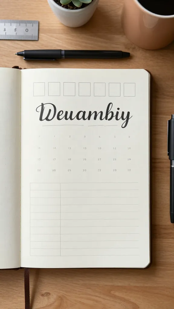
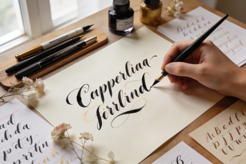
Your bullet journal deserves better than chicken-scratch headers, right? These beginner-friendly lettering ideas make your pages pop without needing art school. We’ll keep it simple, fun, and seriously doable with tools you probably already own. Ready to level up your spreads and low-key impress yourself?
1. Faux Calligraphy That Fools Everyone
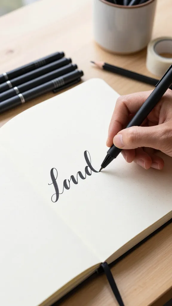
Calligraphy looks fancy, but you don’t need a brush pen to get the vibe. Faux calligraphy uses a regular pen and a clever trick: draw your letters, then thicken the downstrokes. The result? Satisfying, bold headers that look legit.
How To Do It:
Write your word in cursive with any pen.
Identify the downstrokes (the lines you draw downward).
Draw a second line next to each downstroke and fill it in.
It’s perfect for monthly titles and quotes when you want impact without fuss. Bonus: it trains your eye for real brush lettering later.
2. Monoline Magic With One Simple Pen
Monoline lettering keeps the stroke width the same throughout the word. It’s clean, minimal, and zero-pressure. If your hand shakes? It somehow still looks cool and intentional.
Tips:
Use a fineliner (0.5–0.8 mm) for headers and 0.3–0.5 mm for subheads.
Add gentle curves and keep consistent spacing between letters.
Play with tall caps or wide spacing for drama.
Use monoline when your spread already has a lot going on and you need sleek, chill headers that don’t shout.
3. Bounce Lettering For Playful Vibes
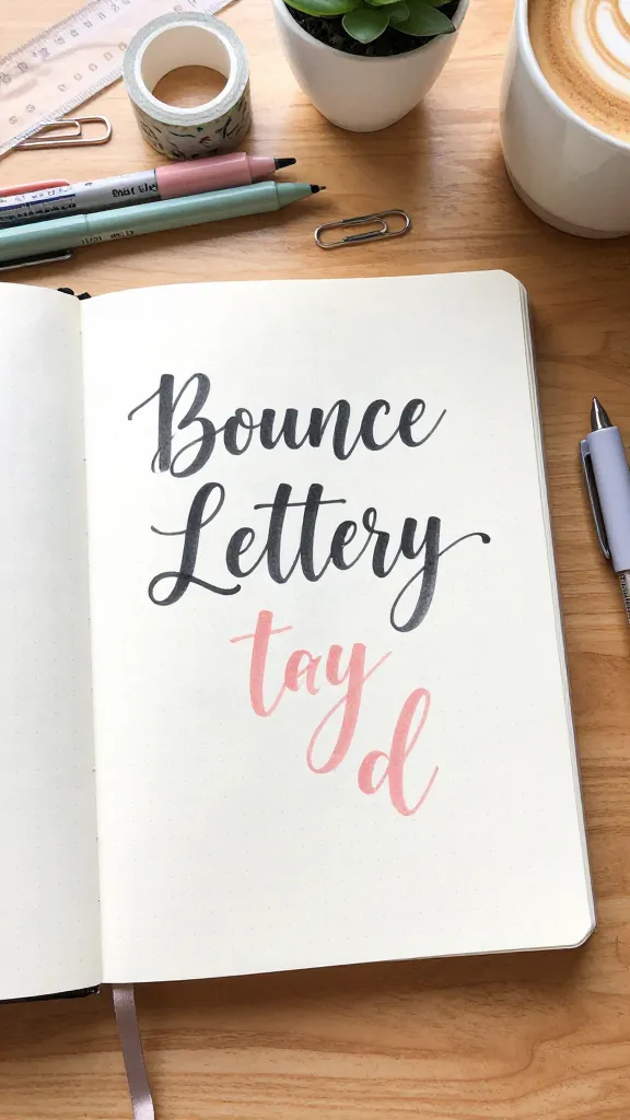
Want your words to look like they’re dancing? Bounce lettering lowers some letters slightly below the baseline and lifts others a touch. It creates energy without overcomplicating things.
Quick Guide:
Write in cursive, but let letters like y, g, and j dip extra low.
Raise letters like t, h, and l a little higher than usual.
Keep the slant consistent so it looks intentional.
Great for mood trackers, weekend headers, and anywhere you want a little whimsy. FYI, imperfection makes it cuter.
4. Shadow And Drop Highlights For Instant Depth
Shadows turn basic lettering into “whoa, did you print that?” magic. You can fake 3D with one gray marker and a white gel pen. It takes 30 seconds and looks ridiculously polished.
How To:
Write your word in any style.
Pick a light source (top left is easiest).
Add a gray line on the opposite side of each stroke (bottom right).
Add tiny white highlights on the top-left edges.
Use this on monthly titles or habit tracker headers when you want bold but balanced impact. Trust me, it photographs well too.
5. Block Letters You Can Sketch In Your Sleep
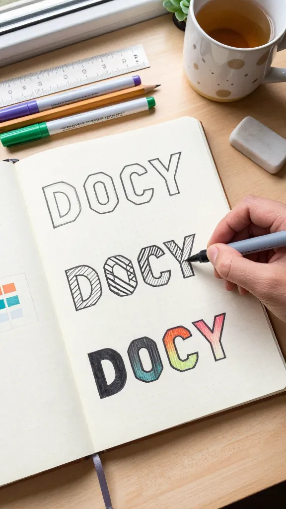
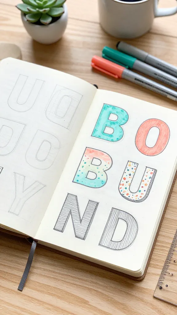
Block letters are the peanut butter and jelly of bullet journaling: basic, dependable, and always welcome. Outline chunky caps, then fill them with color or patterns. You can’t mess this up.
Variations:
Hollow: Leave letters unfilled for a clean look.
Striped: Add diagonal lines inside for texture.
Gradient: Blend two markers from dark to light.
Use block letters for weekly spreads or project pages where you want high readability and low drama.
6. Ribbon Lettering That Looks Extra (But Isn’t)
Ribbon lettering turns each stroke into a folded ribbon with simple shading. It looks fancy, yet you only need outlines and a light gray to suggest folds. People will ask how long it took. You’ll smile.
Step-By-Step:
Write a chunky cursive word with clear thick-and-thin strokes (or faux calligraphy).
On curves and overlaps, add a slim shadow to indicate the “under” part of the ribbon.
Use a lighter color inside one edge for shine.
Perfect for cover pages or quotes that deserve a little drama. IMO, it pairs beautifully with simple spreads to balance the flair.
7. Serif Vs. Sans-Serif: The Minimalist Power Duo
Typography nerd moment: serifs have little feet; sans-serifs don’t. Mixing both gives your headers editorial polish with zero art skills required. It’s all about contrast and hierarchy.
Try This Combo:
Top line: Sans-serif caps (thin, spaced-out).
Bottom line: Serif lowercase (slightly thicker).
Add a micro line under the serif word for balance.
Use this for calendars and future logs where clarity matters. It keeps everything readable while still looking curated.
8. Brush Pen Basics Without The Stress
Brush lettering gets all the love for a reason: those thick downstrokes and whisper-thin upstrokes look stunning. Start slow and let the pen do the work. Light up, heavy down—repeat until it clicks.
Materials:
Small brush pen (Tombow Fudenosuke soft or hard tip)
Smooth paper to protect your nibs
Scrap sheet for warm-ups
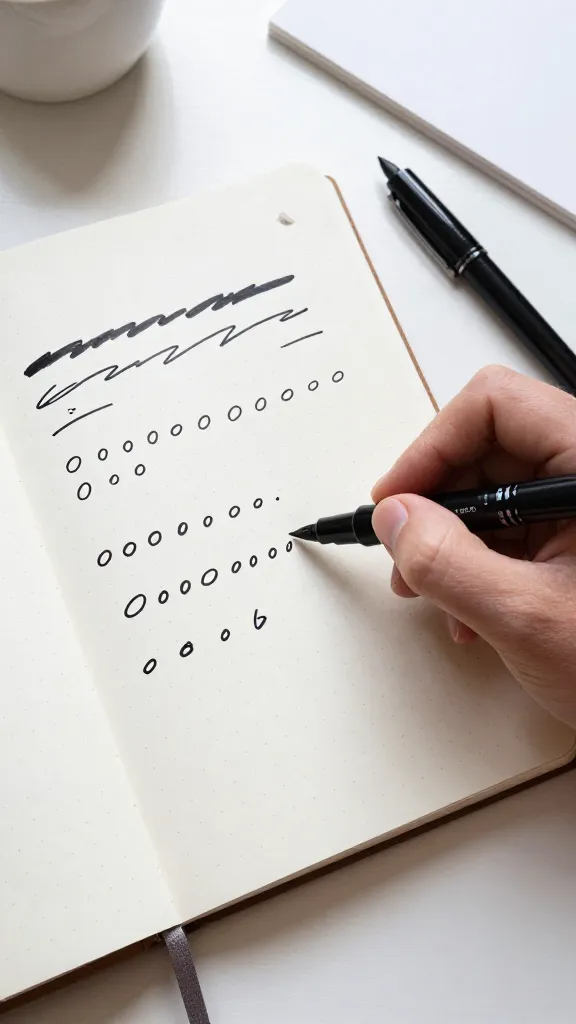
Warm-Up Drills:
Thin upstrokes, thick downstrokes
Entrance/exit strokes (little swooshes)
Ovals and connected loops
Use brush pen headers for special spreads or when you want a hero moment. Keep it slow—you’re not racing anyone.
9. Outline, Fill, Repeat: The Two-Step Glow-Up
Outline-first lettering gives you control and forgiveness. Draw your letters, tweak spacing, then fill them with color, gradient, or patterns. It’s the chill route to crisp results.
Ideas To Fill:
Ombre: Blend two colors with a colorless blender or light marker.
Confetti: Tiny dots or stars inside the letters.
Hatching: Parallel lines for a sketchbook look.
Perfect when you crave consistency across a whole month theme. Also great for beginners who want control over proportions.
10. Doodle-Infused Lettering For Themed Spreads
Combine simple illustrations with basic letters for instant cohesion. Think leaves wrapping around serifs, stars tucked into negative space, or tiny icons perched on letter stems. It turns headers into mini artworks without eating your entire evening.
Themes To Try:
Botanical: Vines around capitals, leaf shadows, green gradients.
Celestial: Star bursts, crescent accents, pale yellow highlights.
Cozy: Stitch lines, washi “tape” doodles, warm browns and creams.
Use doodle-infused lettering for monthly covers or habit trackers. It ties your theme together and sparks joy every time you flip the page—seriously.
Ready to give your headers a glow-up? Start with one style this week and rotate through the rest—your future self will love the variety. Keep it playful, embrace the imperfections, and watch your bullet journal go from meh to mesmerizing.
A Teacher with 5 years of experience. Our Expertise, is reliable to meet your full Academic development needs . Worked on many crafts and construction projects offering services from design to development to deployment over the years. You will find many of my works in my business portfolio on request.