Henna hand designs turn plain skin into a glowing mini artwork—and they’re easier than you think.
When you learn a few reliable motifs and how to place them, you can create new looks anytime, for any mood.
Henna is perfect for birthdays, celebrations, festivals, or just a fun self-care moment. I also love that hand designs can be simple (like a wrist band) or bold (like a full back-of-hand panel) without needing to be “perfect.”
If you want clean lines, balanced spacing, and ideas you can actually copy into your own style, keep reading—I’ll walk you through 12 hand layout concepts plus a simple workflow you can reuse.
Key Takeaways
Most great henna hand designs are built from repeatable motif “building blocks” (flowers, paisley, tendrils, stars, vines, spirals, leaves, water drops, criss-crosses, waves).
Clean lines come from steady pressure and starting simple (lines + dots) before you add heavy details.
A strong design flow usually goes: outline big motifs → add connectors → fill with dots/lines/pattern texture.
You can freestyle and still look “planned” by keeping spacing rules and motif sizes consistent.
Coordinated designs (both hands) look best when they mirror the main focal motif but vary the smaller fills.
Quick Answer
If you want 12 henna hand design ideas, pick your placement (wrist band, palm center, back of hand, finger accents), choose 2–4 motifs, and follow this build order for each idea: outline → connectors → fills → refine edges. Use motifs like flowers, paisley, tendrils, stars, vines, spirals, leaves, water drops, criss-crosses, and waves to create easy variations that still look balanced.
What You Need
Item
Purpose
Notes
Henna paste (natural or ready-to-use)
Makes the design
Natural henna is often mixed from organic henna powder; ready-to-use works too.
Applicator cone/bottle with fine tip
Control for lines
A smaller opening gives cleaner detail.
Clean tissue or cotton swab
Fix small mistakes fast
Wipe before staining spreads.
Sketch paper (optional)
Plan layout
Practice on paper first; it’s a confidence booster.
Transfer pencil/chalk (optional)
Light guide points
Helps if you struggle with placement on skin.
Gloves or hand protection (optional)
Keeps hands cleaner
Especially helpful while practicing.
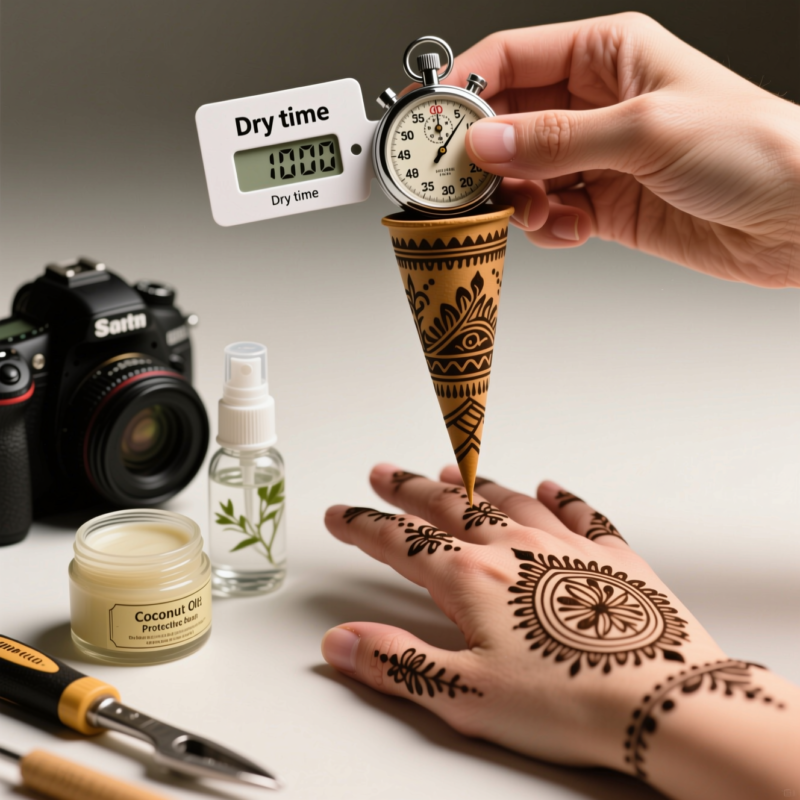
Timer
Helps with timing routine
Useful for consistent practice sessions.
Moisturizer or skin-safe barrier (as appropriate)
Comfort and protection
Use only methods you’re confident are safe and compatible with henna.
Reference images (optional)
Inspiration for placement
Use them as guides, not exact copy-paste.
Step 1: Prep & Safety Before You Start
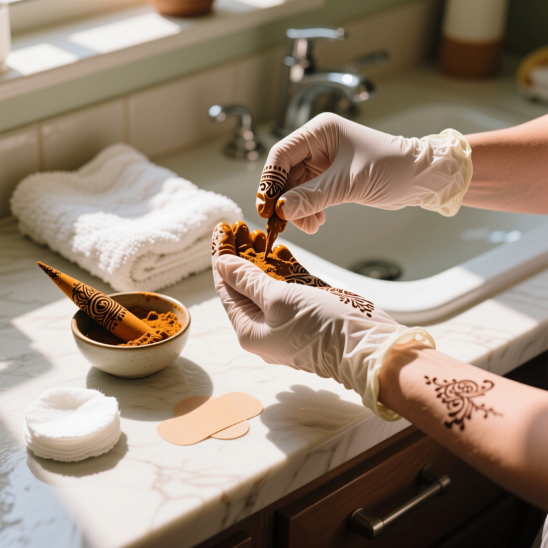
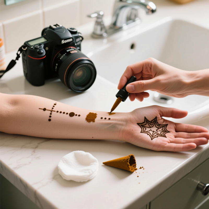
Before I squeeze the cone and draw my first line, I take a minute to prep—because safety and comfort make the whole experience better.
First, I make sure I’m using a henna paste that I trust. If I’m mixing from powder, I follow the instructions I have and keep the paste consistent. If I’m using ready-to-use paste, I check freshness and how it pipes.
Next, I check the skin area. I avoid applying henna over broken skin or irritation. If it’s my first time using a specific paste, I do a patch test (especially if I’m using natural henna powders or new brands). Safety guides commonly remind beginners to protect skin and plan ahead, which I totally agree with.
Finally, I plan placement. On hands, placement matters more than people realize. For example:
Wrist bands look best when they match the width of your wrist.
Palm centers need enough “breathing room” so the design doesn’t crowd.
Back-of-hand designs can go bolder because there’s more space on the surface.
Quick mindset switch: I’m not trying to “draw perfectly.” I’m trying to create a balanced pattern that looks intentional.
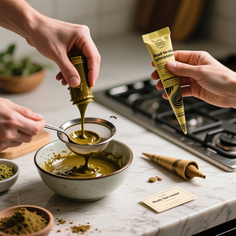
Step 2: Decide Your Paste Approach (Natural vs. Ready-to-Use)
This part changes how your design feels—not just how it looks.
If you mix natural henna paste
I enjoy it because it feels custom, and I can adjust thickness. I aim for a smooth, paste-like texture that flows from the cone without clumping.
If you use ready-to-use paste
I like how convenient it is. My goal is to pipe at the right flow so lines are smooth and not chunky.
No matter which option I use, I test a tiny line first. If the paste is too thick, the line may wobble. If it’s too runny, it can blur.
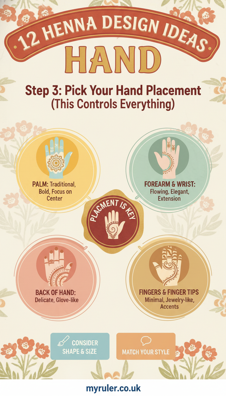
Step 3: Pick Your Hand Placement (This Controls Everything)
When I plan a hand design, I choose one “main home” for the focal element, then I build around it.
Here are the common placement zones I use:
Wrist: Great for bands, chevrons, and repeating rhythm patterns.
Back of hand (top area): Perfect for a flower cluster, vine frame, lattice panel, or panel-style motifs.
Palm center: Works well for single paisley centerpieces or small star-and-leaf layouts.
Finger accents: Ideal for water-drop trails, star scatter, or mini leaf connectors.
A simple trick: if I want the design to look easy and clean, I keep it to one main zone plus a few connecting touches.
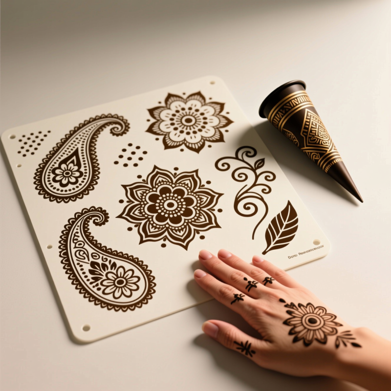
Step 4: Use Core Motifs as Your Building Blocks
The magic is that henna designs often reuse the same motifs—so once you know the motifs, you basically know 100 designs.
Here are common henna hand motifs (and how I think of them):
Flowers: focal points (big outlines) with buds as supporting bits
Paisley: a strong teardrop-with-swirls centerpiece shape
Tendrils/Vines: curved connectors that make patterns feel connected
Stars: easy accents that look festive with minimal effort
Spirals: bold “hero” elements that add movement
Leaves: supportive texture that fills small spaces neatly
Water drops: small teardrop dots that create a light, stringy vibe
Criss-crosses: geometric texture that makes designs look fuller
Waves: rhythm patterns that help bands look uniform
When I combine motifs, I usually follow this structure:
Outline big motif → add connectors (tendrils/vines/waves) → fill spaces with dots/lines/leaves/criss-cross texture.
Step 5: Beginner Technique Checklist (Clean Lines Without Stress)
This is where most beginners level up fast.
Keep your hand steady: I slow down. Speed usually makes lines wobble.
Match pressure: I try to keep the cone pressure consistent so my line thickness stays similar.
Start with lines and dots: Before I jump into paisley or criss-cross lattices, I practice tiny dots and short lines to get rhythm.
Practice on paper first: This step is a lifesaver. I sketch the placement and rehearse the motifs so my first attempt on skin is smoother.
Think in steps: even if I freestyle, I still build in the order: big outline first, then connectors, then fills.
If you’re ever stuck, fall back to a simple workflow: tap dots where you need texture, add leaves in small gaps, and use tendrils to connect separated elements.
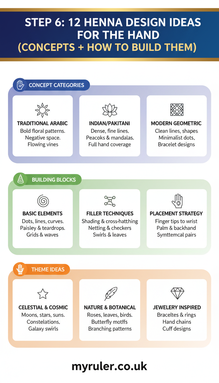
Step 6: 12 Henna Design Ideas for the Hand (Concepts + How to Build Them)
Below are 12 design ideas you can mix and match. For each one, I’ll tell you placement, motifs, and a simple build order: outline first → connectors → fills.
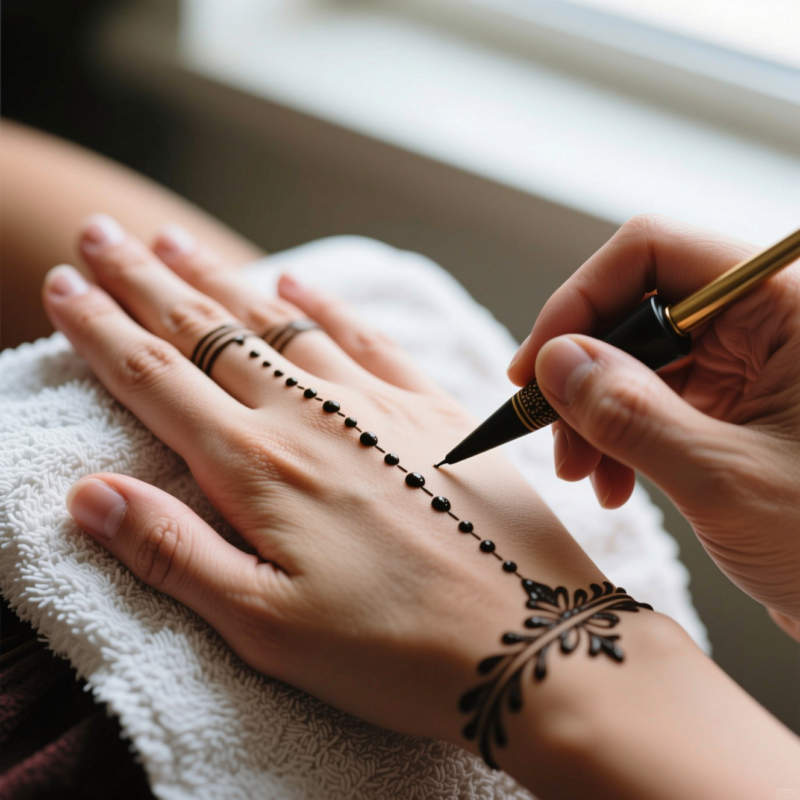
1) Outline a straight or slightly curved band line
2) Add small dots at intervals (like little beats)
3) Optional: add a simple wave edge or mini criss-cross line detail
2. Single Paisley Centerpiece
Placement: Palm center or back-of-hand top center
Motifs: Paisley, leaf, water drop
Build order:
1) Outline one paisley in the center
2) Add two small leaf/water-drop companions near the sides
3) Fill the paisley accents with tiny dots/short lines (keep it light)
3. Flower Cluster on the Back of the Hand
Placement: Back of hand (top surface)
Motifs: Flower, small buds, tendrils as connectors
Build order:
1) Outline the main flower (a larger petals shape)
2) Add 3–5 smaller buds around it
3) Connect edges with a light tendril curve and finish with dotted texture inside petals
4. Vine/Tendril Frame Around a Blank Center
Placement: Back of hand with an open middle space
Motifs: Vines/Tendrils, leaves, tiny dots
Build order:
1) Outline a partial frame using curling tendrils from wrist toward mid-hand
2) Add leaf pairs as “checkpoints”
3) Keep the center mostly blank, and add small dots only at corners
5. Criss-Cross Lattice Panel (Palm/Back)
Placement: Palm panel or a rectangular-ish area on the back of hand
Motifs: Criss-cross, small stars breaks, dots
Build order:
1) Draw a base grid guideline (diagonals work great)
2) Fill with criss-cross strokes between diagonals
3) Add a few small stars in corners or at intervals so it doesn’t feel flat
6. Spiral Accent with Leaf Fill
Placement: Side of palm or back-of-hand center-right
Motifs: Spiral, leaves, water drops (optional)
Build order:
1) Outline the spiral as the hero
2) Add leaf shapes next to spiral turns
3) Fill tiny gaps with dot clusters or mini water drops for a “sparkly” finish
7. Wave & Dot Chevron Band (Easy Rhythm Pattern)
Placement: Wrist or across the back of the hand near the knuckles
Motifs: Waves, dots, optional chevron edge
Build order:
1) Draw alternating wave lines
2) Place dots between waves (consistent spacing)
3) Optional: outline chevron shapes on the band edges to make it look clean
8. Water-Drop String Trail from Wrist to Fingers
Placement: Start at wrist, trail toward finger tips on the back of hand
Motifs: Water drops, tiny leaves between
Build order:
1) Draw a tapered trail line (wider at wrist, smaller toward fingers)
2) Add water drops along the trail so they “hang” from the line
3) Add a small leaf or dot accent near a few drops to keep it interesting
9. Star Scatter with Tiny Leaf Connectors
Placement: Back of hand or top area around the middle
Motifs: Stars, leaves, light tendrils (optional)
Build order:
1) Place 8–12 stars in a loose cluster or diagonal pattern
2) Add tiny leaf connectors between some stars
3) Use dots to fill only small gaps—avoid overstuffing
10. Flower + Paisley Mix (Layered Focal Design)
Placement: Back of hand center
Motifs: Flower, paisley, leaves
Build order:
1) Outline the paisley first as the background layer shape
2) Add a flower outline over the top as the main focal point
3) Finish with leaf fill around the edges and a few dots inside petals
11. “Freehand Freestyle” Motif Remix
Placement: Anywhere you want, but I recommend back-of-hand top or wrist-to-mid placement
1) Sketch your placement points (where each big motif will go)
2) Outline each big motif (don’t start with tiny fills yet)
3) Connect them using tendrils/vines/waves
4) Finish with small dot/leaf texture where gaps appear
12. Both-Hands Matching Variation (coordinated, not identical)
Placement: Same main zone on both hands (like wrist band on each, or back-of-hand center on each)
Motifs: Mirror one focal motif (like paisley or flower), vary smaller fills
Build order:
1) Choose one hero motif and make its outline similar on both hands
2) Add connectors that match (tendrils or waves)
3) Change smaller fills on each hand (like switching star counts, leaf sizes, or dot placement)
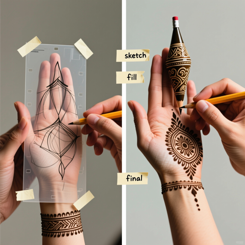
Step 7: Step-by-Step Execution Workflow (From Sketch to Final)
Here’s the exact workflow I use whenever I want my hand designs to look polished.
Map placement points:
I mark where the wrist band starts and ends, where the palm center is, and how far the finger accents will reach.
Draw a light guide (on paper or mentally):
Symmetry helps even in freestyle. I make sure my design has a “center line” in mind.
Outline big motifs first:
I start with paisley, flowers, spirals—anything that will take the most space.
Add connectors:
This is where tendrils/vines/waves come in. They help the design feel connected, not random.
Fill with dots/lines/criss-cross where needed:
I don’t fill everything. I add texture to balance density—more near the focal point.
Refine edges and balance density:
I check if the corners feel too empty or if the center feels too heavy. Then I adjust.
Step 8: Inspiration Sources & How to Use References Without Copying
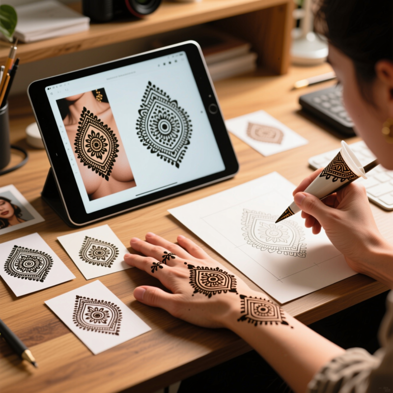
I love using reference images because they help me “see” how motifs flow on real hands. But I avoid copying exactly.
Here’s how I use references the smart way:
I look for placement patterns first (wrist band vs. back-of-hand cluster vs. finger trail).
Then I swap in my own motif combos:
– If the reference has flowers + vines, I might use paisley + stars instead.
– If it uses a lattice, I might switch to waves + dots.
Finally, I keep the reference’s balance idea (like “focal center + lighter edges”) while changing the actual shapes.
That’s how your design becomes yours—even if you’re inspired by someone else’s layout.
Step 9: Troubleshooting Common Beginner Problems
Sometimes things don’t go as planned. I’ve been there—here’s how I fix it.
Problem: Uneven line thickness
Fix: Slow down and keep pressure consistent. If you have to, refill the cone and take your time.
Problem: Patterns feel crowded
Fix: Reduce fill. Leave more blank space, especially in the center or around major motifs.
Problem: Designs look disconnected
Fix: Add connectors like tendrils/vines. Even a few curved lines can “link” separate elements.
Problem: The design feels messy at the end
Fix: Return to the outline edges. Clean up major contour lines first, then add only small dots to finish.
Tips
Keep a “motif inventory” in your notes (flowers, paisley, tendrils, stars, vines, spirals, leaves, water drops, criss-crosses, waves). Then rotate them through your designs.
Use consistent sizes for similar motifs (example: all water drops should be roughly the same scale).
If you’re nervous, start with one “easy win” design: minimal wrist band, water-drop trail, or wave + dot chevron band.
For a more elegant look, put your heaviest detail near the focal point, and lighten up as you move outward.
Want symmetry without stress? Make one side first, then mirror it on the other side (even in freehand, a mirror helps).
FAQ
How long does it take to finish a hand henna design?
It depends on detail level. A simple wrist band can take about 10–20 minutes. A back-of-hand floral or lattice-style design often takes 30–60 minutes.
Can I combine different styles in one design?
Yes! That’s one of my favorite ways to create. Just keep one hero element (like a flower or paisley) and use the other motifs as supporting accents.
What if I’m a complete beginner?
Start with designs built from simple lines and dots, then move to one main motif (like a paisley or spiral). Practice on paper first, then do one small section on skin.
Do I need to plan with a sketch?
Not always, but it helps. Even a quick paper layout or a few mental placement points will reduce mistakes—especially for coordinated patterns.
Are these designs the same on everyone’s hands?
No—hands have different shapes and sizes. I recommend adjusting spacing based on your hand width and finger length so the motifs look proportional.
Conclusion: Your Next Practice Plan
Now that you have 12 henna hand design ideas, the best next step is to practice in a way that builds confidence fast. I’d pick 2–3 favorite motifs (like flowers, tendrils, and water drops) and complete one design per day or per week. Each time, I keep my build order the same—outline big motifs → add connectors → fill with dots/lines—so your results get cleaner with every attempt. Soon, you won’t just repeat designs—you’ll remix them confidently and make layouts that feel uniquely “you.”
A Teacher with 5 years of experience. Our Expertise, is reliable to meet your full Academic development needs . Worked on many crafts and construction projects offering services from design to development to deployment over the years. You will find many of my works in my business portfolio on request.