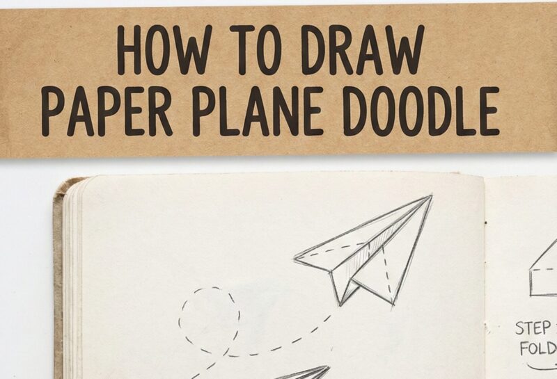
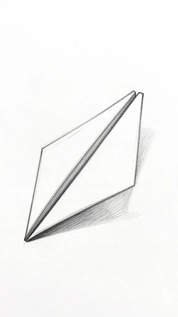
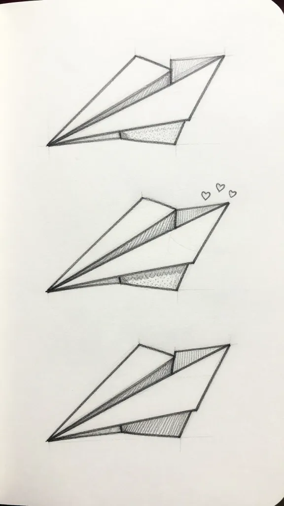
You know those cute paper plane doodles that make any notebook look 10x cooler? Let’s draw them—fast, easy, and with style. No fancy art degree needed, just a pen and a tiny bit of confidence. Follow along and you’ll be sketching snappy planes that look crisp, playful, and ready to “whoosh” across the page.
We’ll keep it simple with five fun techniques, from the classic outline to dynamic action lines and shadows. Each section builds your skills with zero fluff. Ready to give your margins some personality?
1. Nail The Classic Outline (Your No-Fail Starter Plane)
This is the blueprint of all paper plane doodles. Once you master the outline, everything else feels easy. You’ll get clean angles, a solid silhouette, and that instantly recognizable “paper plane” shape.
Materials
Fine-tip pen or pencil (0.3–0.5 mm works great)
Plain paper or a notebook
Eraser if you’re sketching first
Start with a long, slightly tilted triangle pointing up-right. That’s your main body. Add a second, smaller triangle overlapping the first to hint at the folded wing—think “triangle snuggled inside triangle.”
Draw a short line from the top point downward to suggest the vertical fold. Keep your lines crisp and confident. Wobbly? No big deal—short, deliberate strokes beat long, shaky ones every time.
Key Points
Keep angles sharp. Paper planes are all about clean geometry.
Vary line weight slightly—thicker outline, thinner inner folds—for instant depth.
Leave a tiny gap between wing edges for breathing room. It adds a “designed on purpose” vibe.
Use this anytime you want a simple, iconic doodle: margin notes, headers, or mini checklists. It’s the classic for a reason.
2. Add Fold Magic (Make It Look Actually Folded)
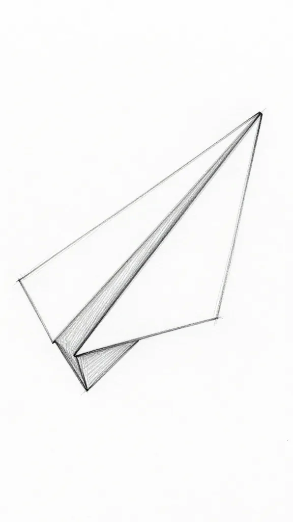
Want your doodle to read as “paper,” not just “triangle with dreams”? Add fold lines and subtle overlaps. These cues trick the eye into seeing depth and structure—no shading required.
How To Build Folds
Mark the center fold from the tip back with a light, dashed or thin line.
Sketch the wing fold by drawing a diagonal line across one side, slightly offset from the edge.
Show a tiny overlap of the far wing—just a sliver peeking behind the near wing.
Keep your fold lines lighter than the outer edges. If you press too hard, the plane looks heavy and cartoony—but not in a cute way. A quick fix: use a finer pen for inner details, or lighten your hand pressure.
Pro Tips
Use line hierarchy: bold for outer edges, thin for inner folds, dashed for “hidden” creases.
Angle variety sells realism—avoid perfect symmetry unless you want a super-technical vibe.
Try a tiny notch at the tail end to imply the back fold—subtle but effective.
These fold cues make your plane feel crafted, not scribbled. Perfect for journal headers, planners, or notes where you want a little “I tried, but not too hard” energy.
3. Add Motion Lines And Personality (Because Planes Should Zoom)
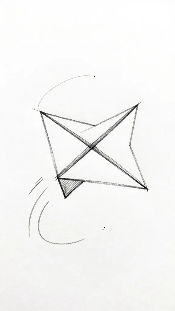
Static planes look fine. But planes with motion lines? Way more playful. A few swoops and dashes can make your doodle feel like it’s cruising across the page, passing deadlines and to-dos like a champ.
Motion Basics
Draw two short, parallel lines behind the tail to show speed. Keep them shorter near the tip and longer behind the plane.
For a curvy flight, sketch a single swoosh path that loops gently. Keep it thinner than the plane’s outline.
Add tiny dot clusters or short dashes trailing behind for extra energy.
Vary the direction. Tilt your plane slightly up for optimism, down for drama, sideways for chaos (in a cute way). Motion lines should echo that tilt. If the plane leans right, your swoosh should curve right too—consistency sells the illusion.
Fun Variations
Double swoosh: Two lightly curving lines, one shorter, one longer—clean and stylish.
Loop-de-loop: A figure-eight vibe behind the plane—great for playful notes.
Tiny sparkles: Add small star asterisks near the path for a whimsical touch.
Use motion lines when your page needs life: project trackers, study notes, or that one boring meeting agenda. A little movement goes a long way, seriously.
4. Shade And Highlight For Pop (Simple Depth That Looks Fancy)
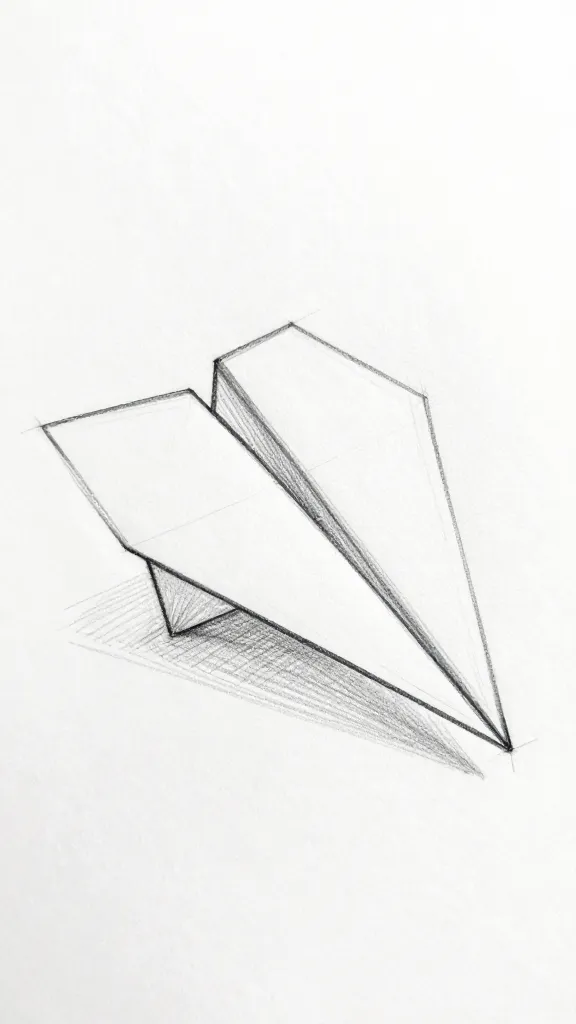
Shadows turn a flat doodle into a mini illustration. You don’t need blending skills—just smart placement. Think “suggest, don’t smother.” We’re aiming for crisp, graphic shading.
Quick Shading Tricks
Drop shadow: Draw a soft, offset shape beneath the plane—slightly down-left or down-right. Keep it faint and not touching the plane.
Hatch the underside: Add short, angled lines under the near wing or along the bottom edge. Keep spacing consistent.
Fill the far wing: Lightly fill the far wing or tail flap with a pale gray or super light hatching to push it back.
Highlights? Easy. Leave paper-white edges along the top of the near wing and the tip. If you use a gray pen/marker, a single swipe under the plane sells that floaty look. FYI, over-shading turns paper into metal—cool, but not the vibe here.
Line Weight = Instant Depth
Thicken the near edges, thin the far ones.
Use a tapered stroke from the tip backwards—thicker at the base, thinner at the tip.
Add a tiny cast shadow right under the tip for a “hovering” effect.
Shadows and highlights make your plane feel intentional and polished. Great for cover pages, invites, or any place you want that “minimal but elevated” look.
5. Style Remix: Cute, Minimal, Or Graphic (Pick Your Vibe)
Here’s where your plane doodle gets personality. Swap line styles, add patterns, or go ultra-minimal. Your notebook, your rules.
Minimalist Mode
Just the outer triangle plus one fold line. Nothing else.
No shading, no motion lines—clean and elegant.
Use a single, consistent line weight for a zen look.
Great for headers, calendars, or mood boards. It whispers “I have my life together,” even if you definitely don’t.
Cute And Playful
Round off the plane’s tip slightly for a softer feel.
Add tiny hearts or sparkles on the motion path.
Use dotted motion lines and little “whoosh” curves near the tail.
Perfect for journals, pen-pal notes, and anything that needs a smile. IMO, this style wins for planners and sticky notes.
Graphic And Bold
Thick outer lines, filled far wing with solid black or dark gray.
Sharp angle emphasis with doubled edges near the nose.
High-contrast drop shadow—tight and angular.
This one pops on posters, titles, or thumbnails. It screams “look here,” in the best way.
Patterned Wings
Fill one wing with diagonal stripes, the other with dots.
Try grids, crosshatch, or tiny stars for texture.
Keep patterns light so the outline still leads.
Pattern play adds character without clutter. Use it when you want your doodle to stand out on busy pages or moodboards.
Bonus Mini-Tutorial: One-Line Paper Plane
Start at the tip, trace the top edge back, dip to suggest the fold, and swing around the tail.
Finish by sliding up the bottom edge and flicking a short motion line—no pen lifts.
Embrace imperfections. The charm lives in the wobble.
One-liners are fast, stylish, and oddly satisfying. Ideal for quick notes or when your meeting runs two minutes too long.
Common Mistakes (And Fast Fixes)
Too symmetrical? Nudge one wing longer by a few millimeters. Instant realism.
Tip looks blobby? Redraw the front with two short strokes that meet in a crisp point.
Shadow too heavy? Break it into hatch lines or lighten with an eraser if you sketched first.
Small tweaks rescue most doodles. Don’t restart—refine. Your future self will thank you.
Ready to send your notebook skyward? Start with the classic outline, sprinkle in folds, throw on motion lines, then experiment with shadows and styles. You’ll have a fleet of tiny planes in no time—organized chaos, but make it cute. Now go doodle, captain.
A Teacher with 5 years of experience. Our Expertise, is reliable to meet your full Academic development needs . Worked on many crafts and construction projects offering services from design to development to deployment over the years. You will find many of my works in my business portfolio on request.