Oil pastels are one of the friendliest art supplies out there. There is no water, no mixing palette, and no waiting for anything to dry. You just pick up a stick and start blending colors with your finger. If you want project ideas that actually use what makes oil pastels special, keep reading.
Quick answer: The easiest oil pastel ideas for beginners are sunsets, simple landscapes, and blended color backgrounds, since they only need a light sketch, a few base colors, and finger blending to look finished. More advanced options like layering with a palette knife or scratching designs into the wax build on those same basic skills.
Below are 14 oil pastel ideas, sorted from true beginner projects to ones that stretch your skills a little further. Pick textured watercolor paper or another paper with real tooth, since smooth paper makes blending harder. A basic 24-color artist-grade set covers every idea on this list, so there is no need to buy specialty colors before you start. Work through the first five or six ideas in order if you are brand new, since each one builds on a skill from the last, and skip straight to whichever project excites you most if you already have some pastel experience.
Project Type
Skill Needed
Time
Skies, sunsets & color fields
Standard
20-45 min
Landscapes & still life
Varies
1-2 hrs
Mixed media & advanced texture
Caution
2+ hrs
Setup time
Blending ease
Mess level
1. Blended Sunset Sky
Capture the colors of a sunset by blending vibrant oranges, reds, and purples smoothly across the sky. Lay down horizontal bands of color, lightest near the horizon, then rub them together with your finger or a blending stump where they meet. This is the single best starter project because oil pastels blend so easily into gradients, and a messy blend still reads as a sunset. Add a simple dark silhouette, like a row of hills or a lone tree, along the bottom to give the sky something to sit behind. If your colors start looking muddy, wipe your finger clean between blends so you are not dragging leftover pigment from the last color into the next one.
2. Soft Summer Meadow
Use soft greens and yellows to depict a simple, serene meadow scene. Block in a green field and a pale blue sky, then dab in small strokes of yellow, white, and pink for wildflowers scattered across the grass. Keep the flowers as loose dots and dashes rather than detailed shapes, since that looseness is what makes a meadow scene feel breezy instead of stiff. Vary your greens by mixing in a little yellow near the top of the grass, where sunlight would hit, and a little blue near the bottom for shadow, so the field does not read as one flat color.
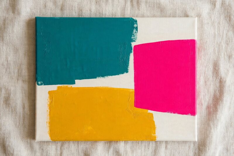
3. Abstract Color Block Design
Experiment with blocks of bold color to create a simple, elegant abstract piece. Divide your paper into uneven sections with a pencil, then fill each one with a different oil pastel color, pressing hard for a solid, even fill. This project needs no drawing skill at all and is the fastest way to learn how much pressure it takes to get a fully opaque patch of color.
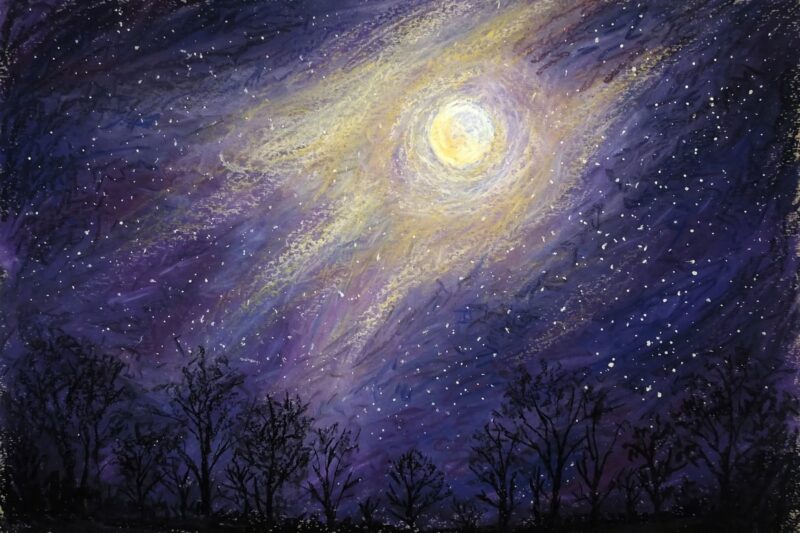
4. Glowing Moonlit Night Scene
Paint a dark navy or purple night sky, then add a soft white and yellow moon with light rays blended outward using your finger. Scatter tiny star dots with the tip of a white pastel. A few black tree silhouettes along the bottom edge finish the scene and give it a sense of depth without needing much detail work. Blend the area right around the moon a bit more than the rest of the sky, since that soft glow is what sells the light source and keeps the moon from looking like a flat white circle stuck on top.
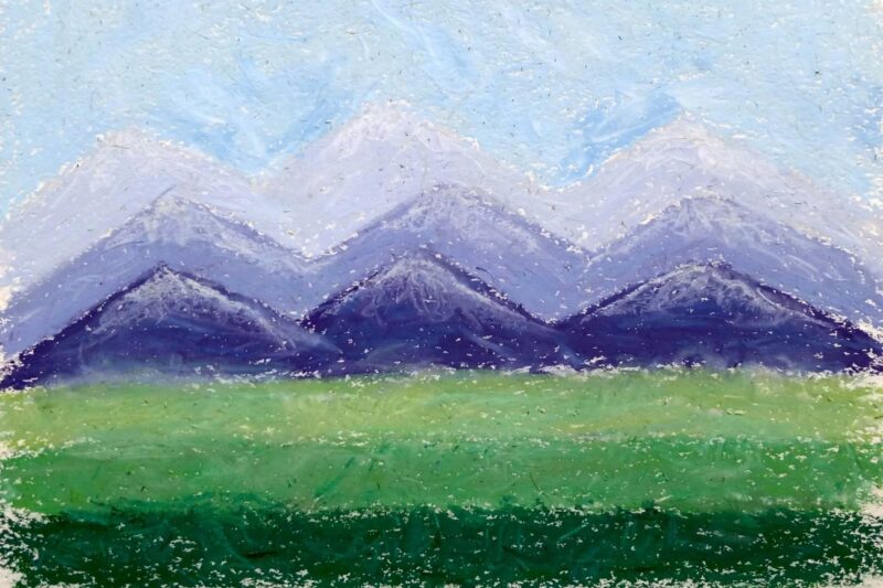
5. Simple Mountain Landscape
Layer a pale blue sky, purple-blue mountain shapes, and a green foreground in three flat bands, then soften just the edges where each band meets the next. Leave the mountain peaks a shade lighter to suggest snow or mist. Landscapes like this teach you to think in simple shapes first and details second, which is the core skill behind most oil pastel scenery. Overlap the mountain shapes slightly, with the closest range darkest and the farthest range palest, since that value shift alone is enough to suggest distance without any extra detail work.
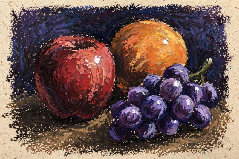
6. Textured Fruit Still Life
Draw a simple apple, orange, or bunch of grapes, then build up color in layers, dark base coat first, lighter highlights on top. Pressing the pastel firmly against the paper to blend colors directly on the surface gives a smooth but interesting texture that works well for the rounded surface of fruit. Add one small white highlight dot last to make the fruit look glossy and real.
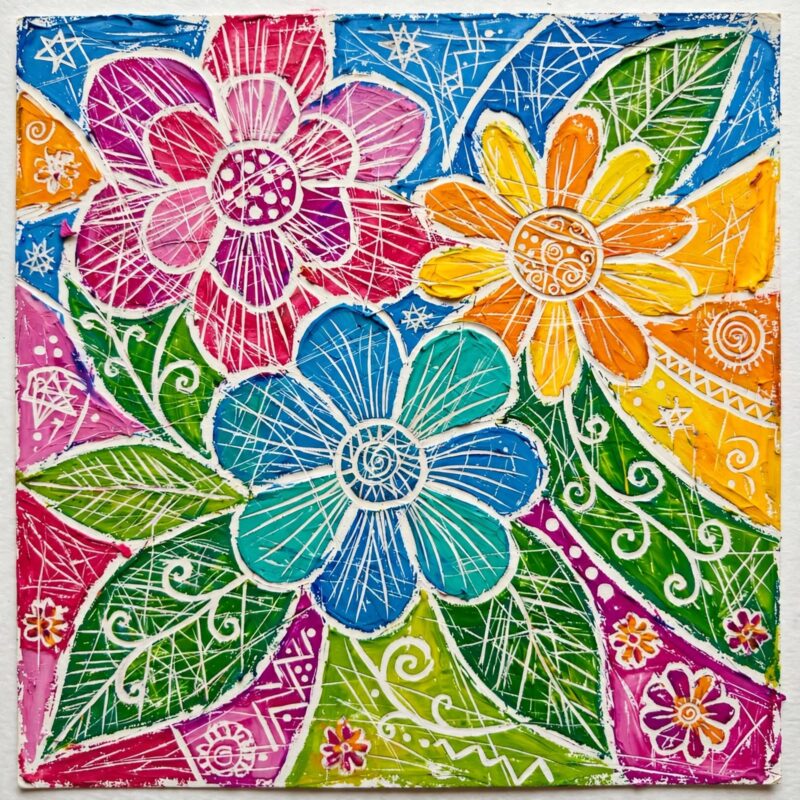
7. Scratched Sgraffito Design
Oil pastels work great for scumbling, sgraffito, and impasto techniques. Cover your paper edge to edge in a thick, solid layer of bright color, then scratch a design into it, like flowers, patterns, or lines, using a toothpick, a paperclip, or the wrong end of a paintbrush. The scratched lines reveal the white paper or a contrasting color underneath, giving a stained-glass look with almost no drawing skill needed.
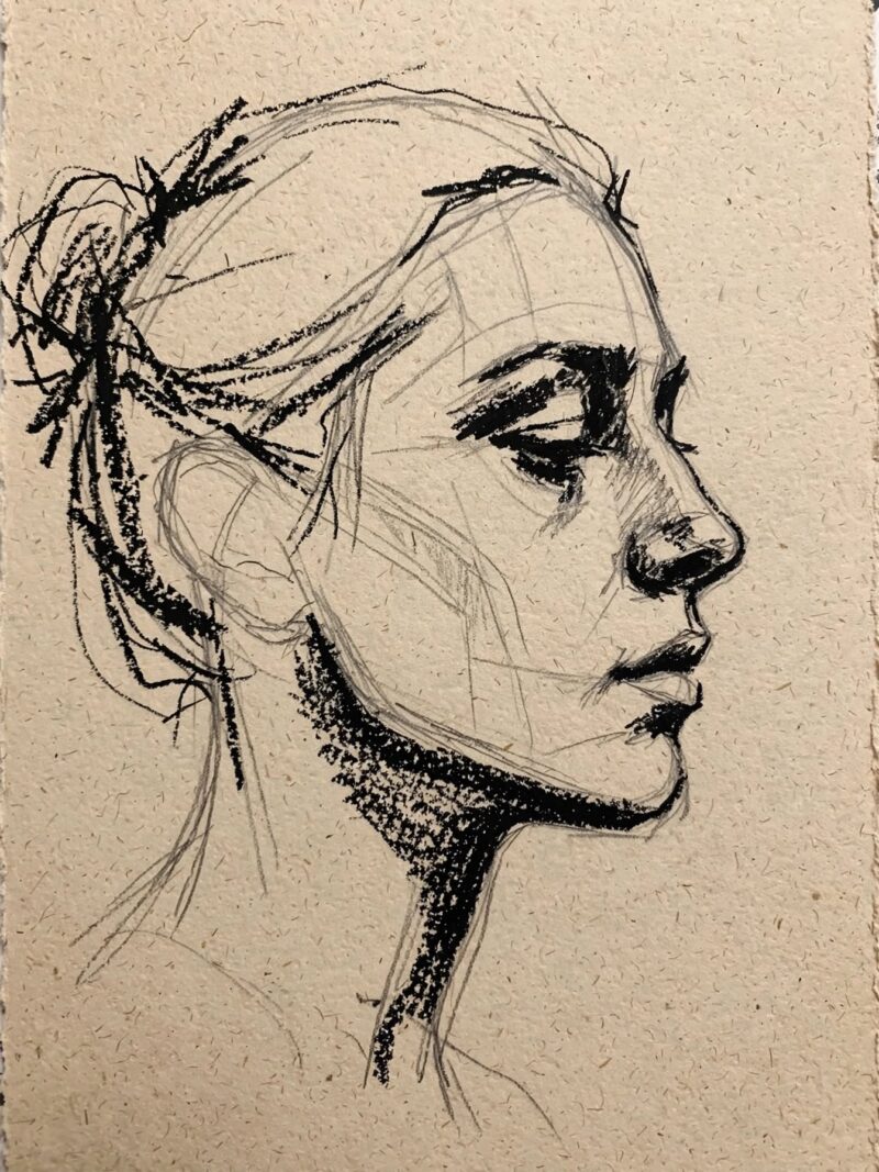
8. Black Oil Pastel Line Portrait
Use a black oil pastel for sharp shadows and details to elevate your artwork. Sketch a simple face or profile in pencil first, then go over the key shadow lines, under the chin, around the nose, inside the eye socket, with a sharpened black pastel. This project is a good way to practice line confidence before you add any color.
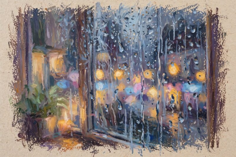
9. Rainy Window Reflection
Draw a foggy blue-gray cityscape or tree line as if seen through a rainy window, then use the edge of a white pastel to add streaky raindrop lines running down the page. Smudge the background scene slightly with your finger so it looks blurred behind the glass. This idea plays with soft focus, which oil pastels handle better than almost any other drawing medium. Vary the pressure on your raindrop lines, pressing harder near the top and lighter toward the bottom, so each streak looks like it is fading as it runs down the glass instead of sitting as one uniform line.
10. Stippled Dot Pattern Piece
Learn stippling as one of the core oil pastel techniques worth practicing before finished projects. Instead of blending, dab the pastel tip repeatedly to build color from small dots, the way a pointillist painting works. Try it on a simple bowl of fruit or a flower and leave the dots visible instead of smoothing them, since the texture itself is the point of this technique.
11. Palette Knife Mixed Media Piece
Mix soft pastels with oil pastels, or use a palette knife to combine oil pastel with acrylic paint for a textured result. Start with a thin acrylic paint background, let it dry, then scrape oil pastel over the top with a palette knife so ridges of color sit on top of the flat paint. This combo gives you both a smooth base and a raised, textured layer in the same piece.
12. Underwater Scene With Wet Blending
Wet blending is one of the six core oil pastel techniques worth learning in order. Lay down blues, teals, and purples for an underwater background, then dip a small brush in a little baby oil or mineral spirits and gently brush over the pastel to melt the colors into a smooth, painterly blend. Add a simple fish or jellyfish shape once the background blend is dry to the touch.
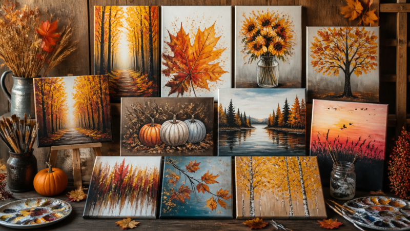
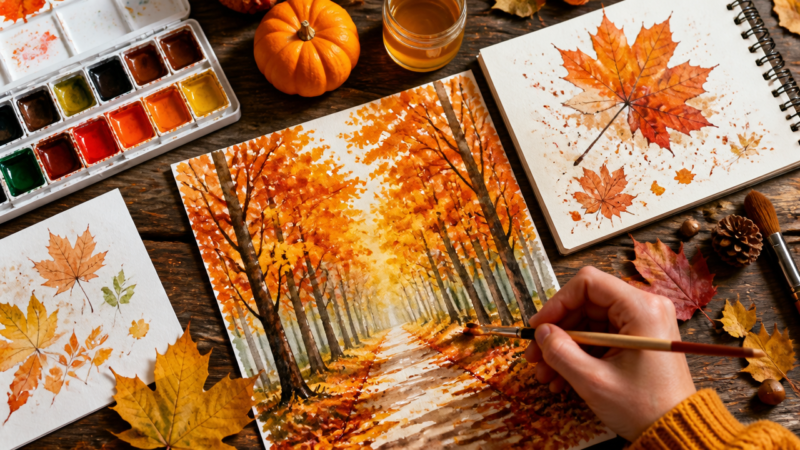
13. Layered Autumn Tree
Draw a bare tree trunk and branches in brown and black, then dab clusters of red, orange, and yellow around the top for fall leaves, letting some of the paper show through as gaps in the canopy. Scatter a few loose dots of the same colors falling toward the ground. Layering three or four leaf colors instead of one single orange gives the tree far more depth and realism. Cluster the leaves thicker toward the center of the canopy and thinner near the outer branches, so the tree shape still reads clearly even with all the color scattered around it.
14. Galaxy And Nebula Sky
Layer black, deep purple, and blue across the paper, then blend in soft clouds of pink and teal for a nebula using small circular finger motions. Flick or dot white pastel across the top for stars, pressing harder in a few spots for brighter points of light. This project uses almost every blending skill from the earlier ideas in one piece, which makes it a great one to save for last. Layer your nebula colors in patches rather than one even wash, since real nebula photos show uneven pockets of color, and that unevenness is exactly what makes a galaxy piece feel believable instead of flat.
How Do You Blend Oil Pastels Like A Pro?
You blend oil pastels smoothly by layering light to dark, then softening the edges where colors meet with a finger, blending stump, or a touch of baby oil. Follow these steps for any project above.
Sketch your design lightly in pencil so mistakes are easy to fix.
Lay down your base colors first, working from light to dark.
Blend the base colors together for a seamless look using your finger or a blending stump.
Add mid-tone details once the base blend is even.
Use a sharpened black or white pastel for final highlights and shadows.
For extra-smooth areas, gently brush a small amount of baby oil over the pastel.
Let the piece rest flat and cover it with wax paper before storing to protect the surface.
Frequently Asked Questions
What paper is best for oil pastel art?
A heavyweight paper with real tooth, like 300 gsm cotton paper or textured drawing paper, works best because it grips the waxy pigment and holds up to blending and layering.
Do oil pastels smudge after they dry?
Yes, oil pastels never fully dry the way paint does, so finished pieces can still smudge. A light fixative spray made for oil pastels, or framing behind glass, protects the artwork long term. Storing finished pieces flat with a sheet of wax paper or glassine between them also keeps colors from transferring onto nearby pages in a sketchbook.
What is the difference between oil pastels and soft pastels?
Oil pastels use an oil and wax binder that stays soft and blendable, while soft pastels use a dry, chalky binder that smudges more and needs a fixative spray to stay put. Oil pastels also feel more like crayons and layer more easily.
Can beginners use cheap oil pastels?
Cheap school-grade oil pastel sets use a different binder than artist-grade sets and tend to crack and flake within weeks, so a basic 24-color artist-grade set will give far better blending results and last much longer.
A Teacher with 5 years of experience. Our Expertise, is reliable to meet your full Academic development needs . Worked on many crafts and construction projects offering services from design to development to deployment over the years. You will find many of my works in my business portfolio on request.