12 Creative Painting Ideas for Beginners to Try Today
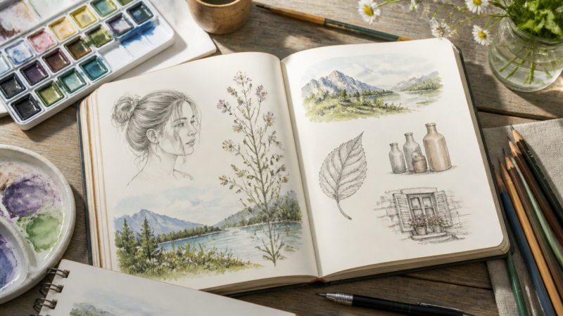
12 creative painting ideas for beginners to try in your sketchbook. Techniques like border miniatures, atmospheric studies, and grid layouts to build skill
Staring at a blank sketchbook page can feel paralyzing, especially when you’re unsure what to paint or how to fill the space without pressure. Whether you’re preparing for a relaxing weekend session, building toward a holiday gift, or just looking to practice without committing to a full canvas, the right painting idea makes all the difference. Sketchbook painting ideas range from simple still-life studies to experimental techniques that teach real skills in a low-stakes environment. These prompts work because they’re designed for small spaces, short timeframes, and materials you likely already have on hand. Here are 12 proven approaches to spark your next page and build your painting habit.
Quick Questions and Answers
Question: What are easy painting ideas for a sketchbook?
Easy sketchbook painting ideas include stippling, swatches, tea painting, insects, underwater scenes, mini canvases, and simple framed miniatures. Other options are compact scenes like stormy coasts, misty pines, single wildflowers, and citrus slices because they require only a few shapes and colors. These ideas work well when you want a page that looks finished without needing complex composition or advanced drawing skill.
Question: How do I start painting in a sketchbook?
A practical start is to choose a small area, tape off a border, or set a simple grid before painting. Using a taped rectangle or a 2×4 grid can make the page feel organized and reduce pressure while you work. Starting with a limited subject, such as a teacup or a single leaf, also keeps the first page manageable and builds confidence.
Question: Can I use acrylic paint in a sketchbook?
Yes, acrylic paint can be used in a sketchbook, and acrylic paint markers are especially useful for crisp shapes, borders, blobs, scales, and bold color accents. The main practical consideration is paper thickness, because thin pages may warp more easily under wet paint, so heavier sketchbook paper is preferable for longer-lasting results.
1. Masking Tape Border Miniatures
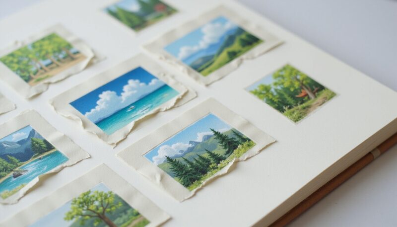
Press strips of masking tape onto your sketchbook page to section off small rectangles roughly 1.5 to 2 inches on each side. Firm pressure along the tape edges creates clean, sharp borders that feel intentional and gallery-ready. The tape acts as a frame for your work, transforming a single page into a collection of finished miniature studies rather than loose sketches.
This framing technique does something psychological—suddenly the space feels contained and purposeful. You’re not filling blank space; you’re creating individual artworks within a grid. Paint freely inside the taped border, knowing the frame will clean up any stray marks. Once your paint dries completely, peel away the tape to reveal crisp, professional-looking edges.
The beauty here is flexibility. One page can hold four to six different tiny compositions, each exploring a different subject, color palette, or technique. Use this layout when you want variety without commitment.
2. Atmospheric Stormy Coast
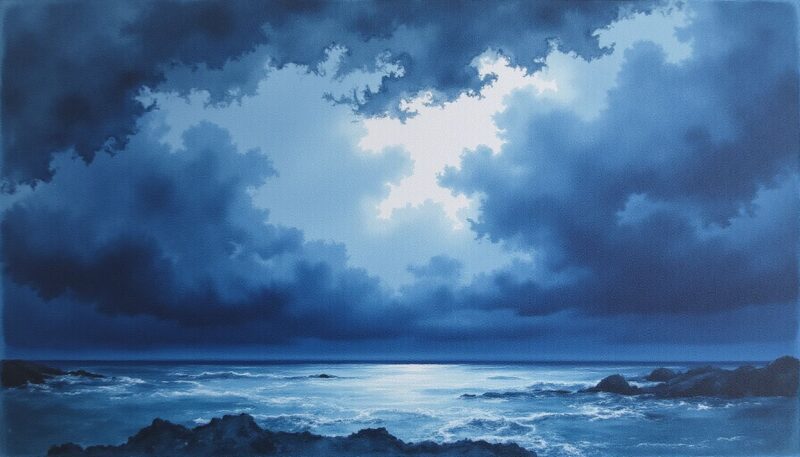
Capture the mood of a dramatic coastal scene using loose brushstrokes and a limited palette rather than tight, detailed rendering. Mix deep blues like Payne’s Grey and Indigo to build a moody, overcast sky. Focus on the feeling—turbulent water meeting dark shore—instead of drawing every wave.
Wet-on-wet technique is your friend here. Dampen the paper, drop in your dark colors, and let them flow and blend naturally. This approach teaches value control and color mixing without requiring accurate detail work. The loose application creates atmospheric depth; the viewer’s eye fills in the specifics.
Keep the horizon line low to emphasize the dramatic sky. A thin strip of rocky shoreline in deep shadow contrasts beautifully with the chaotic clouds above. The result looks sophisticated despite being technically simple—perfect for building confidence.
3. Household Object Collections
Gather 5 to 8 small, unrelated items from around your home—a coffee mug, a spoon, a book, a plant cutting, a jar—and arrange them as a single still-life composition. This exercise teaches you to observe shape, shadow, and proportion while building visual interest through variety.
The randomness is the point. Because the objects don’t naturally belong together, you’re forced to think about composition, negative space, and how different textures interact. One object might be ceramic and smooth; another might be fabric and textured. That contrast keeps the eye moving.
Paint the grouping at a manageable scale—roughly 4 to 6 inches across. You’re practicing fundamental skills: shadow placement, how light catches edges, and maintaining proportional accuracy. By the time you finish, you’ll have developed observation habits that transfer to any subject matter.
4. Loose Citrus Slice Studies
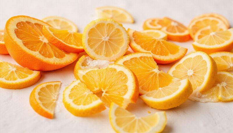
Use watercolor or gouache to paint citrus slices—lemons, oranges, or grapefruits—focusing entirely on transparency and layering. The translucent quality of citrus pulp is a natural teacher for watercolor technique. Build from light yellows and oranges to deeper reds and deeper values in the shadows.
Apply paint loosely; don’t overwork it. The beauty of a citrus slice is that irregular, organic shapes read instantly as recognizable. Slight imperfections feel natural. A few well-placed shadows suggest dimension without requiring photorealism.
Quick visual impact is the payoff. These paintings finish fast and look vibrant on a page. They’re ideal for building momentum or testing a new paint set. The subject is simple enough that you can focus entirely on color mixing and layering technique rather than struggling with complex drawing.
5. Multi-Panel Grid Layouts
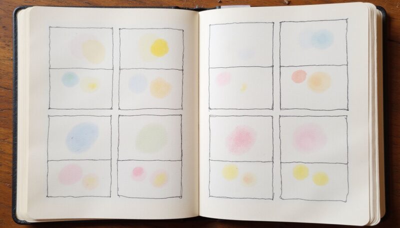
Divide a single sheet into a 2×4 grid—eight small panels, each about 2 to 3 inches square. Each panel becomes its own tiny painting experiment. This structure manages time and materials brilliantly; each square is small enough to complete in one sitting without fatigue.
Grids give you room to explore without committing to a single large composition. Try a different color palette in each panel, or repeat the same subject with different techniques. One panel might be a stippled texture study; the next, a wet-on-wet wash. The structured format prevents the page from feeling chaotic.
This layout is also psychologically forgiving. If one panel doesn’t work, you have seven others. The eye reads the page as a cohesive series rather than judging each square in isolation. Grid-based pages also photograph well and look great in a portfolio or online.
6. Stippled Texture Studies
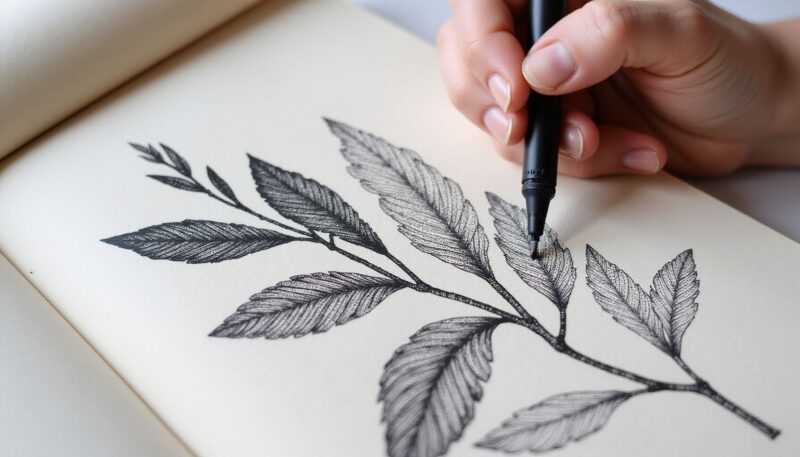
Use various sizes of markers or paint pen tips to build complex textures using thousands of small dots. Stippling creates depth and shadow through density rather than traditional brush shading. In areas where you want darkness, dots pack closely together; lighter areas have sparser dots.
Start with a light pencil sketch to map out your subject. Then stipple systematically, building value gradually. This method takes patience but teaches incredible discipline about value transitions and how the eye perceives form through pattern.
Stippling is beginner-friendly because it removes the pressure of “perfect” brushstrokes. Every dot is roughly equal; the magic happens through cumulative density. The resulting texture adds dimension to otherwise flat drawings. Practice on small subjects first—a fruit, a leaf, a simple object—to build rhythm before tackling larger compositions.
7. Historical Building Portraits
Select a building with personal significance—your childhood home, a local landmark, a historic structure in your neighborhood—and paint it in your sketchbook. This approach combines architectural observation with emotional storytelling. The building becomes a visual journal entry.
Focus on unique details: ornate windows, weathered doors, architectural flourishes that make the building distinct. Balance detail work with broader strokes for the overall form. You’re not creating a blueprint; you’re capturing character.
Build a dark-to-light blue underpainting first, then layer opaque acrylic paint markers over the dried surface. Start with broad, fluid washes of dark blue and indigo. Once dry, switch to acrylic markers—these deliver crisp, opaque coverage that contrasts beautifully against the soft background.
Use markers to add sharp highlights, fine details, and precise shapes. The hybrid approach combines the spontaneity of wet media with the control of pen-and-ink. The result feels sophisticated and deliberately composed.
This technique works particularly well for adding bold shapes—geometric patterns, clusters of small objects, or graphic elements—over a loose atmospheric base. The contrast between the organic underpainting and the precise marker work creates visual interest.
9. Panoramic Horizon Landscapes
Open your sketchbook to a full two-page spread and draw a single continuous horizon line across the center. This instantly transforms your sketchbook into something larger than a single page. Paint the sky above and the land or water below, treating it as one wide composition rather than two separate pieces.
This layout teaches you to think about proportional relationships and how elements interact across a wider field. The extended format forces you to consider composition at a larger scale than typical sketchbook studies.
Practice with something simple: a mountain range silhouetted against a sunset, a flat horizon with distant trees, a seascape with layered depth. The panoramic format is inherently dramatic, so even simple subjects feel compelling. You’re building habits around composition and value balance that transfer directly to canvas work.
10. Fictional Hybrid Creatures
Combine physical features from three or more different animal species into a single, imaginary creature. Start with a body type (say, a cat), add wings from another animal (a bird or dragon), and layer in a third element (scales, feathers, fur patterns from yet another species). The goal is cohesion despite the weirdness.
This prompt pushes creativity and requires you to solve problems about proportion, balance, and how different textures coexist. How do feathers transition to scales? How do multiple limb types attach convincingly? These are genuine technical questions, not just fantasy whimsy.
Color harmony ties the creature together. Use a unified palette so the hodgepodge of features feels intentional rather than chaotic. The result is imaginative, fun, and genuinely instructive about animal anatomy and texture.
11. Monochrome Tea Washes
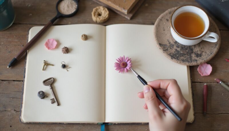
Brew strong black tea or herbal tea and use it as your painting medium to create warm, sepia-toned washes. It’s a cost-effective way to practice value control and atmospheric effect in a single-color palette. The neutral tones work beautifully on aged or vintage-style paper.
Tea painting teaches you to manage value—the range from very light to very dark—without the distraction of color. You’re forced to focus on light, shadow, and form. The warm, slightly imperfect tones create a naturally vintage aesthetic.
Experiment with concentration: strong tea for dark values, diluted tea for lighter washes. This exercise develops discipline about building value gradually rather than jumping straight to your darkest darks. By the time you return to full-color painting, you’ll have better control.
12. Surreal Misfit Object Insertion
Paint a realistic scene—a room, a landscape, a still life—and intentionally add one object that doesn’t belong. A lobster sitting on a kitchen table. A penguin in a suburban garden. A vintage telephone in a forest. The juxtaposition creates visual and conceptual tension.
This prompt teaches you to blend realistic painting technique with conceptual storytelling. You’re asking the viewer: Why is this object here? What does it mean? The technical skill is painting realism; the creative skill is disrupting expectation.
Start with a solid composition and execute it well. Then introduce your misfit element deliberately, paying attention to how light falls on it and how it interacts spatially with the scene. The surrealism works best when the painting itself is technically competent; the “wrongness” then becomes more unsettling and interesting.
Common Mistakes
Overworking small paintings kills them. Once a miniature composition has captured its essence, stop. Adding more detail doesn’t improve it; it flattens it. Know when a piece is finished and move on.
Skipping the prep work—taping, gridding, or sketching placement—leads to chaotic pages that feel unintended. Even five minutes of planning transforms the result. The structure makes the spontaneity better, not worse.
Using paper that’s too thin invites warping and frustration, especially with watercolor or tea. Invest in a sketchbook with heavier stock (at least 90 lb or 140 gsm). It handles wet media infinitely better and feels more substantial to work on.
Treating every sketchbook page like it needs to be gallery-ready creates paralysis. These are studies, experiments, practice. Permission to make “bad” paintings paradoxically improves your work faster than obsessing over perfection.
My Experience With 12 Creative Painting Ideas for Beginners to Try Today
I started these sketchbook ideas expecting them to be rigid prompts, but they’re actually springboards. The masking tape border thing alone changed how I think about a single page—suddenly one sheet of paper wasn’t this daunting blank expanse but a series of contained, manageable little frames. That shift in perspective is half the battle.
The household object collection taught me something genuinely useful: observing real light is exponentially better practice than copying photos. You notice things—how shadow doesn’t fall evenly, how reflections behave on different surfaces—that a flat image doesn’t teach. I stopped rushing through still lifes after doing this.
Tea painting was a humbling detour. No color to hide behind, nowhere to add “visual interest” through a flashy hue. It stripped everything down to value, and I realized my value control was weaker than I thought. That was valuable information.
The grid layouts saved me when I was burnt out. Instead of abandoning the sketchbook entirely, I could commit to eight tiny squares. The psychological permission to fail in some of them freed up something; I actually took more risks knowing the stakes were low.
What surprised me most was how quickly bad ideas stopped mattering. The more pages I filled, the less I worried about each one being precious. The real learning happened in volume, not perfection.
Which of these ideas are you most drawn to—the structured approaches like grids and borders, or the more experimental ones like hybrid creatures and surreal insertions?
FAQ
Q: What should I paint on a blank sketchbook page?
Good blank-page subjects include a travel photo, a tiny landscape, a citrus slice, a cozy teacup, or a cluster of small objects from home. These subjects work because they’re easy to find, easy to simplify, and can be completed in one sitting. If you want a more decorative approach, pattern-based options like swatches, wallpaper patterns, or straight-line designs also fill pages well.
Q: Why do artists paint tiny scenes in sketchbooks?
Tiny scenes reduce the pressure of committing to a large finished painting and let you experiment quickly with composition, color, and value. Mini paintings and framed squares teach you to see how much visual impact a small area can hold. That compressed scale is useful for practice because mistakes feel less costly and each page becomes its own standalone study.
Q: How many sketchbook painting ideas should I plan?
A useful working set is around 9 to 14 ideas—large enough for variety but still manageable to execute fully. For a beginner, 10 ideas is practical because it’s substantial enough to prevent repetition but small enough that you can actually complete them without losing momentum or interest.
Q: What are the best sketchbook ideas for beginners?
Beginners do best with simple objects and high-contrast scenes, such as swatches, a single wildflower, a teacup, a citrus slice, or a tiny lighthouse. These keep drawing complexity low while teaching color mixing, edge control, and composition. Pattern studies and bordered miniatures are also beginner-friendly because they let you practice without needing a complex background.
Q: How can I make my sketchbook painting look finished?
Use a defined composition: tape borders, add a grid, or place the subject inside a small frame. Borders, squares, and repeated motifs create the feeling of a deliberate finished piece rather than a casual note. A limited palette, a clear focal point, and stronger dark values near the subject also help the page read as complete and intentional.
Q: Which painting ideas work with watercolor in a sketchbook?
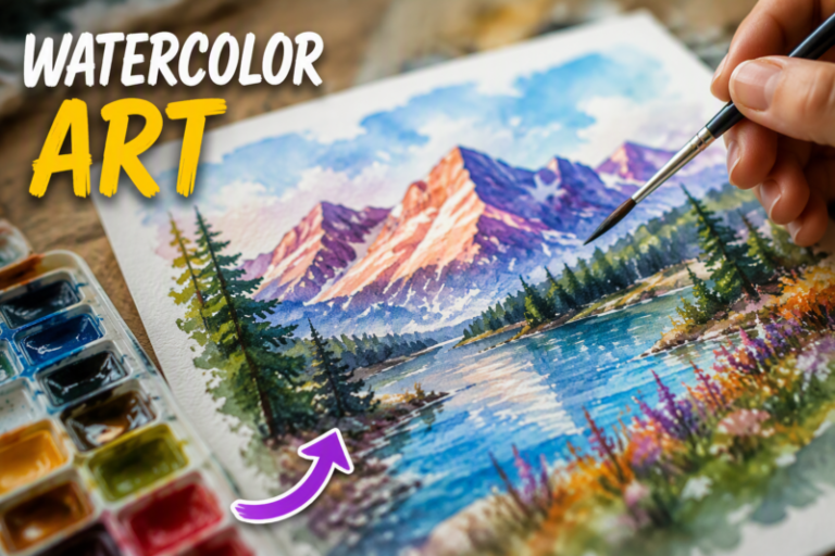
Watercolor-friendly ideas include morning mist in the pines, moon through bare branches, rainy streets, mountain layers, dramatic clouds, and loose citrus slices. Those subjects work well because they rely on wet-on-wet washes, negative painting, overlapping silhouettes, and transparency layering. Watercolor is especially effective when you want soft edges, atmospheric color, and quick value transitions.
Q: What sketchbook painting ideas use simple supplies?
Several ideas work with very minimal supplies, including tea painting, stippling with any marker, swatches, and abstract patterns. You can complete a full page with acrylic paint markers, a pencil grid, tape, and a few colors. These ideas are ideal when you want to paint without setting up a full studio or buying specialty materials.
Conclusion
Painting in a sketchbook is less about producing finished gallery pieces and more about building visual thinking. The 12 ideas here remove the guesswork—each one has a clear entry point and teaches something specific, whether it’s value control, composition, color mixing, or pure creative play. You don’t need expensive supplies or advanced skill to start.
A Teacher with 5 years of experience. Our Expertise, is reliable to meet your full Academic development needs . Worked on many crafts and construction projects offering services from design to development to deployment over the years. You will find many of my works in my business portfolio on request.