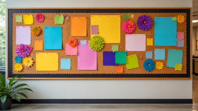
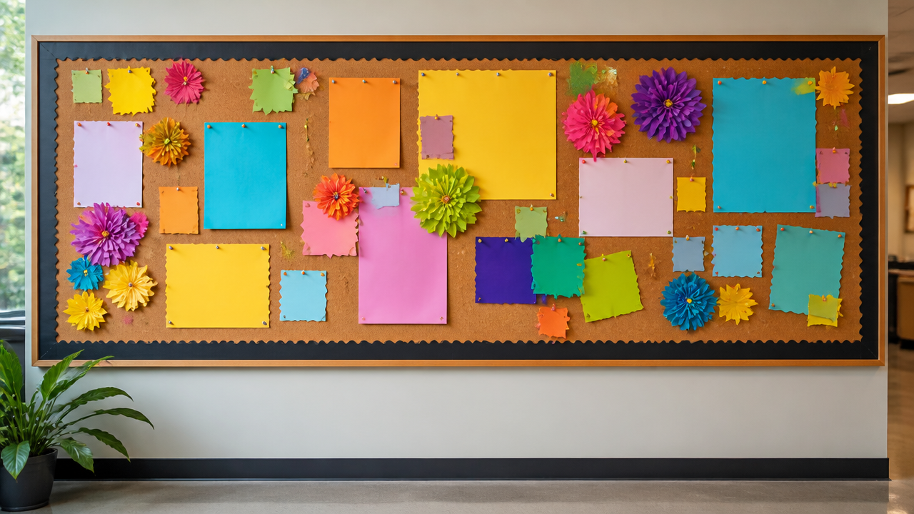
What makes a truly great bulletin board design stand out from every other wall display you have tried? Whether you are prepping for back-to-school rush or refreshing a busy spring workspace, the right layout changes daily routines. You need ideas that balance clear visuals with actual function. Educators often struggle to keep materials visible without creating visual noise. These curated selections solve that problem completely. Pick a style that fits your room, then watch how much easier organization becomes.
Quick Questions and Answers
Question: What are the best bulletin board designs for classrooms?
Answer: The best classroom bulletin board designs usually balance visual interest with clarity. Mrs Learning Bee recommends leaving plenty of white space, sticking to a consistent colour theme, and using calming shades like blues and greens. This approach keeps the board attractive while preventing students from feeling overstimulated by too many competing colors and shapes.
Question: How do you make a bulletin board look attractive?
Answer: A bulletin board looks attractive when it has a clear focal point, enough white space, and a limited colour palette. SplashLearn notes that even a simple board can start with cardboard or wood covered in plain fabric. That clean base immediately removes visual clutter and lets your pinned messages take center stage.
Question: Can bulletin board designs be used all year?
Answer: Yes. Mrs Learning Bee’s post specifically says the bulletin board displays are favourites that you will want to keep up the entire school year. That suggests durable themes and reusable elements work best. You can swap out paper insertions while keeping the underlying structure intact to save time and money.
Key Takeaways
Clarity beats decoration. Leave empty areas so readers actually notice your pins.
Stick to two or three colours maximum for a calm, professional feel.
Basic materials like cardboard, wood, and fabric create sturdy, low-cost foundations.
Reusable structures let you change seasonal graphics without rebuilding the whole board.
1. Minimalist White-Space Display
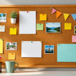
Follow the less-is-more principle to avoid overstimulating anyone who walks past the wall. Keep at least thirty percent of the surface area completely clear. Empty space acts as a visual rest stop. Your most important announcements will sit right next to it and demand attention immediately.
Start with a solid backing board and attach only essential papers. Skip the heavy decorative borders. Instead, use thin masking tape or small blue tack to secure documents flat against the surface. That technique prevents peeling corners and keeps everything looking crisp. According to Teachers Pay Teachers educators prefer this style because students read posted schedules faster without fighting background distractions.
Best for: Busy hallways, library checkout counters, and administrative offices where quick reading matters.
Pros: Low cost, easy to update, reduces eye strain.
Cons: Might feel too sparse for creative workshops that thrive on color.
2. Calming Blue and Green Themed Board
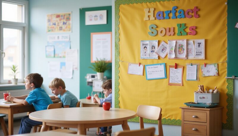
Utilize a base color palette of soft blues and greens to promote a tranquil atmosphere in high-traffic workspaces. Earth tones naturally slow down rapid eye movement. Add only one or two small pops of a contrasting color like mustard yellow or coral to guide the eye toward important announcements. That subtle shift draws attention without shouting.
Place lighter shades near the top and gradually darken them as you move downward. People read left to right and top to bottom, so darker weights anchor the bottom edge nicely. Pair those colors with natural fiber textures like burlap or kraft paper inserts. The combination creates a steady, grounding environment that works well during long testing periods or quiet study hours.
Best for: Reading corners, counseling rooms, and math centers focused on concentration.
Pros: Reduces anxiety, visually cohesive, highly adaptable to seasonal paper swaps.
Cons: Requires careful paint or fabric selection to avoid looking dull rather than soft.
3. DIY Fabric-Wrapped Cardboard Board
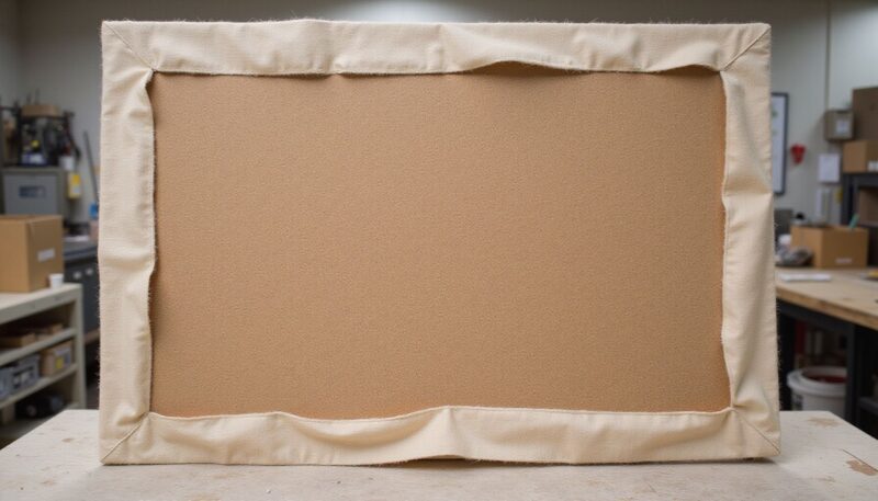
Build a custom foundation by securing a sturdy piece of cardboard or wood as the primary backing structure. Cut foam insulation to the exact dimensions and sandwich it between two fabric panels. Wrap the edges neatly and staple them on the reverse side. This creates a smooth, professional surface that hides hardware marks completely.
A basic setup costs almost nothing if you grab scrap materials. You simply need a large cardboard sheet, some leftover upholstery fabric, and basic sewing supplies. The finished product feels lightweight but rigid enough to hold push pins and cork-style fasteners. SplashLearn highlights this method because it turns trash into a polished teaching aid in under two hours.
Best for: Budget-conscious teachers, homeschool setups, and temporary pop-up classrooms.
Pros: Extremely affordable, customizable sizes, hides staples cleanly.
Cons: Takes time to wrap edges perfectly, fabric attracts dust over years.
4. Professional Quatrefoil Poster Board
This specific design features a decorative quatrefoil pattern, offering a sophisticated look for home office or professional settings. You buy it ready-made if you want instant elegance. The board arrives with pre-printed geometric motifs and reinforced mounting holes. It sits flush against drywall without needing extra framing.
Commercial retailers list options like the Quatrefoil Poster Board around $61.81. That price covers durability and a built-in visual hook. You skip the measuring, cutting, and painting steps entirely. Pin your charts, weekly schedules, or project timelines directly onto the printed background. The repeating shape naturally frames your attachments so everything stays aligned.
Best for: Career centers, parent teacher association rooms, and remote work hubs.
Pros: Instantly polished, requires zero construction skills, highly durable.
Cons: Higher upfront cost, limits customization once purchased.
5. STEM-Focused Instructional Layout
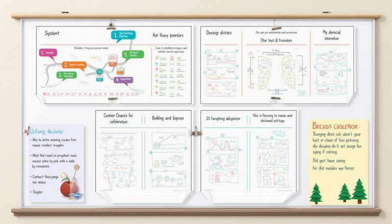
Treat the board as an interactive teaching tool rather than just a decorative background to boost engagement. Attach movable strips of velcro or magnetic tape so students can physically rearrange information. Include modular sections for problem-solving steps, prototype sketches, or data tracking related to ongoing projects. Hands-on manipulation keeps young learners invested longer than static posters ever could.
The Lemelson-MIT Invent Team emphasizes treating displays as working labs. Map out a flowchart that moves from observation to hypothesis, then to experiment results. Let pupils drag and drop sticky notes into the correct stages. Add clear plastic sleeves for reusable worksheets so kids practice graphing or vocabulary building without destroying the board itself.
Best for: Science labs, coding clubs, and elementary engineering challenges.
Pros: Encourages participation, supports iterative learning, highly interactive.
Cons: Needs frequent reorganization by students, requires velcro or magnets.
6. Nature-Inspired Texture Collage
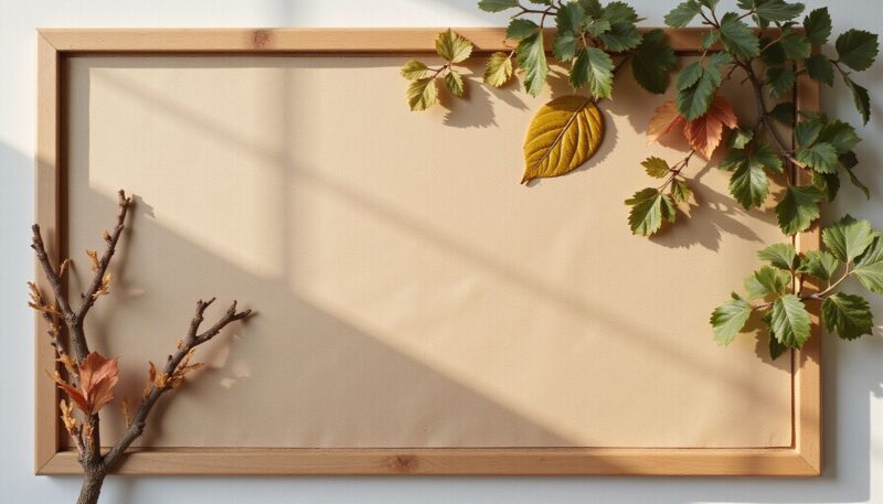
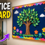
Integrate organic elements such as pressed leaves, twigs, or wood-grain accents to bring a sense of warmth to the wall space. These items add physical depth that standard paper simply cannot achieve. Balance these textured items with neutral-colored mounting paper to ensure the display remains orderly. Too much natural clutter overwhelms small fonts.
Collect fallen branches and press them flat before gluing. Seal dried foliage with clear contact paper so moisture does not curl the edges. Hang tiny wooden tags handwritten with student names or reading goals. The tactile contrast catches attention immediately. Natural materials also signal a relaxed classroom culture where creativity takes priority over rigid uniformity.
Best for: Art studios, outdoor science clubs, and early childhood playrooms.
Pros: Adds unique texture, encourages nature scavenger hunts, highly thematic.
Cons: Organic matter can collect dust, may require lamination to preserve longevity.
7. Grade-Specific Subject Catalog
Utilize large-scale databases like the 700-plus ideas compiled by We Are Teachers to select a layout pre-optimized for specific age groups. Filter concepts by grade level first, then drill down into subject matter. Choose layouts that prioritize high-contrast typography for younger students or dense information grids for older grade levels. Matching content density to developmental readiness prevents confusion.
A kindergarten math board uses giant numerals, bright shapes, and large picture cues. A high school history timeline shifts to narrow columns, smaller print, and color-coded decade markers. You borrow proven structures instead of guessing what works. That saves hours of trial and error and guarantees your wall matches curriculum pacing.
Best for: Standardized classroom rotation, subject-switching corridors, departmental halls.
Pros: Developmentally appropriate, saves planning time, proven readability.
Cons: Generic templates sometimes lack personal flair, requires careful printing scaling.
8. Portfolio-Style Modern Grid
Draw layout inspiration from professional design platforms like Dribbble to incorporate high-level typography and balanced negative space. Use a geometric alignment system to manage multiple documents or photos. Give every attachment equal breathing room. The result looks intentional rather than slapped together haphazardly.
Grid systems rely on invisible lines. Align the tops of your folders, center captions horizontally, and maintain identical spacing between rows. Swap standard clipboards for thin metal rails that slide along the board face. That hardware standardizes height automatically. Modern grids communicate efficiency and respect for the reader’s time.
Best for: University departments, design portfolios, and college admissions offices.
Pros: Highly organized, professional appearance, scales well to dozens of files.
Cons: Requires precise measurement, less forgiving of uneven paper sizes.
9. Pre-Assembled Decor Kits
Leverage specialized commercial kits from retailers like Teacher Created Resources to save time on manual cutting and board lettering. These packages include coordinated borders, themed cutouts, and matching headers. They ship ready to peel and stick. You assemble the scene in minutes instead of spending weekends hunting for matching fonts.
Themed bundles eliminate decision fatigue. Open a box, arrange the pieces according to the included mockup image, and adhere them firmly. The cohesive color scheme ensures nothing clashes accidentally. Those kits shine brightest during seasonal transitions or welcome weeks when you need immediate impact. Time spent assembling translates directly back to lesson planning.
Best for: Substitute teachers, rushed orientation days, and staff lounges.
Pros: Guaranteed coordination, rapid setup, minimal crafting skill needed.
Cons: Less flexible for custom messages, recurring purchase costs add up.
Design Type
Cost Level
Setup Time
Best Audience
Customization
Minimalist White-Space
Low
15 mins
General staff
High
Calming Blue/Green Theme
Medium
45 mins
Quiet study zones
Medium
DIY Fabric-Wrapped
Very Low
2 hours
Budget classrooms
Very High
Quatrefoil Poster Board
High
5 mins
Professional offices
Low
STEM Instructional
Medium
30 mins
Science/math classes
Medium
Nature Texture Collage
Low
40 mins
Early childhood
High
Grade-Specific Catalog
Variable
20 mins
Age-based subjects
Medium
Portfolio Grid System
Medium
25 mins
Academic departments
Low
Pre-Assembled Kits
High
10 mins
Rushed transitions
Low
Common Mistakes
Cramming every single worksheet onto one wall destroys readability. Students stop scanning when their eyes bounce between fifty overlapping images. Reserve dedicated zones for distinct purposes. One corner handles weekly schedules. Another corner showcases student writing. A third corner holds reference charts. Physical separation forces mental clarity.
Ignoring material quality causes rapid degradation. Thin poster paper curls within weeks. Weak adhesive strips fail after temperature shifts. Invest in heavier cardstock or laminate critical documents. Reinforce hanging points with wide painter’s tape or heavy-duty clips so valuable papers never tear loose mid-year.
Mismatching typography confuses readers instantly. Pairing cursive script with block sans-serif letters creates visual friction. Stick to two typefaces maximum. Use bold caps for headings and a clean serif or sans-serif for body text. Consistency signals professionalism and helps quick scanning become automatic.
FAQ
Q: Do bulletin boards need a theme?
A theme strongly recommended because it helps the board feel coherent rather than cluttered. Sticking with a unified colour theme anchors every added element. Organizers group ideas by grade and subject so the theme matches the audience properly. A clear direction keeps decorative pieces from drifting into random patterns.
Q: What materials are used for bulletin board designs?
Common materials include cardboard or wooden backing and plain fabric for the surface. A basic build relies on readily available craft supplies. Many teachers also buy pre-made decor sets and printable sheets. Those options streamline assembly while maintaining a polished look across multiple classrooms.
Q: Which bulletin board ideas are best for teachers?
The best ideas for teachers match a specific teaching goal. Welcome displays greet families efficiently. Subject displays reinforce current units clearly. Skill-building boards give students constant practice references. Educational creators emphasize that effective boards serve both decorative charm and direct instructional utility simultaneously.
Q: Why is white space important on bulletin boards?
White space keeps a bulletin board from feeling crowded or visually exhausting. Leaving clear areas prevents sensory overload. Teachers explicitly advise reserving empty zones because a good board never gets too cluttered. Readers process pinned information significantly faster when unmarked borders frame each section.
Q: How much does a bulletin board cost?
Costs vary widely depending on whether you build one yourself or buy a finished product. Low-cost DIY options rely on recycled boxes and surplus fabric. Retail ready-made boards run much higher. Specific consumer products like decorative poster boards often retail near sixty dollars for premium construction and printed patterns.
Q: What makes a bulletin board design calming?
Calming designs usually rely on softer colours and natural elements. Experts recommend blues and greens as main colours. Adding leaves and branches reinforces a grounded aesthetic. Those choices lower ambient stress and support sustained reading or testing sessions without triggering nervous energy.
Q: Where can I find bulletin board design ideas?
Large idea collections live on Teachers Pay Teachers and We Are Teachers. Visual designers share layout inspiration on Dribbble. Those sources help when you want either classroom-ready printables or polished composition techniques. Bookmark whichever platform aligns with your current project scale.
My Experience With 12 Creative Bulletin Board Designs for Every Classroom
I spent three years watching teachers transform blank walls into functioning command centers. Some boards looked stunning but held zero useful information. Others were packed with schedules but felt like visual speed bumps. The sweet spot always landed somewhere in between. I learned quickly that leaving breathing room does not mean abandoning decoration. It means choosing decoration that supports the message instead of drowning it.
My biggest mistake came during October. I layered five different border patterns, triple-stacked paper clips, and used neon yellow headers against a lime green backdrop. Kids stopped looking at it after Tuesday. The lesson stuck hard. Contrast matters more than quantity. I switched to a single deep navy base, paired it with cream paper, and added one orange accent strip. Attendance charts suddenly got updated daily again.
If you walk away with one tip, let it be this. Test your board from twenty feet away. If you squint to read the smallest heading, scale it up or simplify the layout. What wall space are you planning to tackle first this week?
Conclusion
The most effective bulletin boards are those that balance aesthetics with purpose. You can mix structural simplicity with strategic color placement to meet specific classroom goals. Pick a layout that matches your routine, gather the right materials, and commit to regular updates. Clean walls make clearer communication possible. Start small, measure results, and adjust your approach based on actual traffic flow.
References
Mrs Learning Bee. (2024). 15 Inspiring Teacher Bulletin Board Ideas for Your Classroom. Mrs Learning Bee. https://mrslearningbee.com/learn/blog/5-free-classroom-welcome-displays
We Are Teachers. (2024). 700+ Brilliant Bulletin Board Ideas for Every Grade and Subject. We Are Teachers. https://www.weareteachers.com/bulletin-board-ideas/
Real Homes. (2024). Best Bulletin Boards. Real Homes. https://www.realhomes.com/buying-guides/bulletin-boards
The Lemelson-MIT Invent Team. (2024). Creative Bulletin Board Ideas for Your Classroom. Invent.org. https://www.invent.org/blog/trends-stem/classroom-bulletin-board-ideas
Teacher Created Resources. (n.d.). Bulletin Boards « Classroom Decor. Teacher Created Resources. https://www.teachercreated.com/classroom-decor/bulletin-boards
A Teacher with 5 years of experience. Our Expertise, is reliable to meet your full Academic development needs . Worked on many crafts and construction projects offering services from design to development to deployment over the years. You will find many of my works in my business portfolio on request.