
Tote bags are the easiest way to turn “everyday carry” into something people actually notice. I love how a great tote design can make my brand (or my personal style) feel bold, thoughtful, and ready to show up anywhere. The best part? I can design with intention—then choose a print method that matches my artwork instead of fighting the process. That means fewer surprises at the final step, cleaner results, and a finish that looks right in real life, not just on a screen. Whether I’m making one custom bag for myself or a whole batch for an event, these ideas help me build designs that are easier to produce and more likely to impress. Let’s get into 10 tote bag design ideas you can use right away.
Quick Answer
If I want durable, bold branding, I go with screen-print friendly designs (simple, 1–2 colors). If I want detailed artwork, gradients, or near-photo effects, I plan for DTG (direct-to-fabric) or heat transfer. If I want a premium, tactile look, I use embroidery for small, simple icons or wordmarks.
Key Takeaways
- I design best when I match the concept to the production method (not the other way around).
- Screen printing shines with bold logos, solid colors, and repeatable batches.
- Heat transfer and DTG handle complex, full-color, and gradient-heavy artwork.
- Embroidery adds texture and “premium feel,” but it works best on simplified shapes.
- Before I finalize, I do quick checks for readability, placement, and output limits to avoid printing problems.
1. Bold logo in 1–2 colors (screen-print friendly)
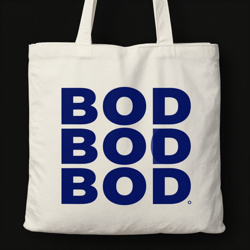
This idea is the “no excuses” option for brands that want instant recognition. If my logo can stand on its own in solid color—especially from a distance—screen printing is usually the easiest path to a clean, durable result.
I like using a strong, high-contrast layout: a centered mark, a front-facing wordmark, or a small icon on the bottom corner. Solid fills tend to stay sharp and consistent across multiple bags, which is great if I’m doing bulk orders for events, schools, or retail launches.
Design tips I use:
- Keep the palette to one or two strong colors.
- Use simple shapes and bold typography (avoid ultra-thin lines).
- Make sure the logo still looks good when it’s smaller, like on a tote side panel.
Production angle: Screen printing is known for durable results in bulk and works especially well for bold, simple designs on cotton canvas tote bags.
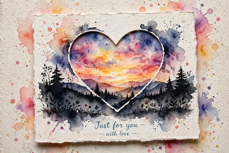
2. Multi-color gradient poster art (heat transfer optimized)
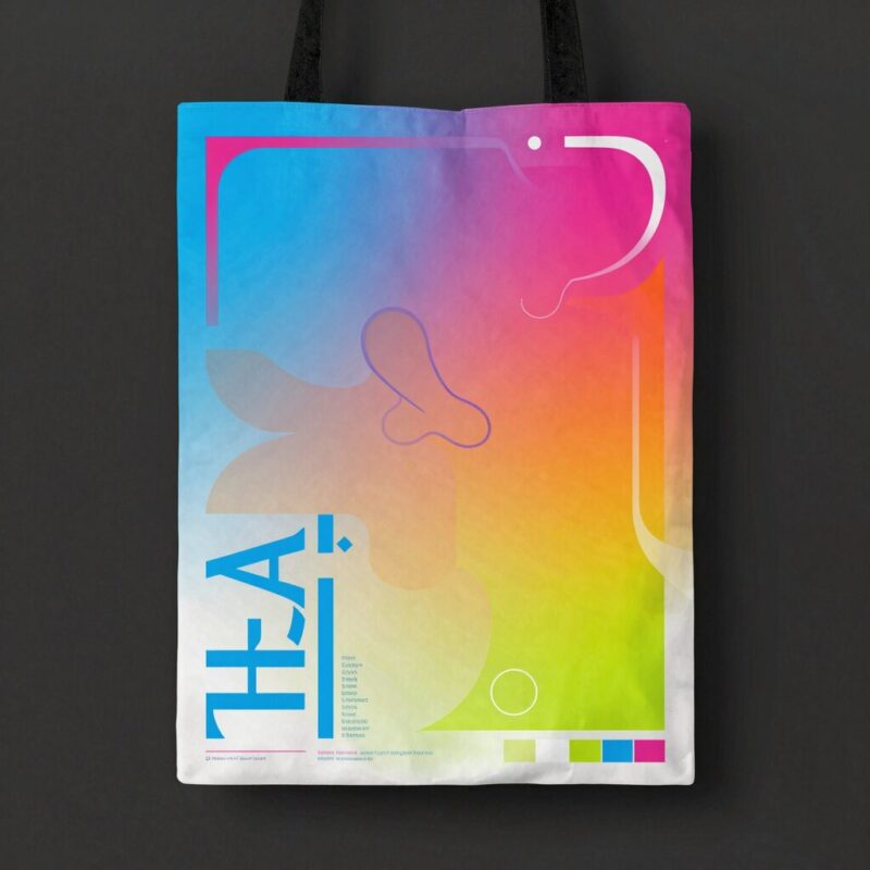
If I want my tote to look like a mini poster, multi-color gradients are where the magic happens. I love this style for music events, art collabs, travel themes, or any design that needs smooth color transitions.
Gradient-heavy designs can be tricky for methods that rely on solid, stencil-like color layers. Heat transfer approaches are often a better fit when my artwork needs lots of color detail and blends.
Design tips I use:
- Plan your layout so the gradient sits where it won’t look stretched or oddly cropped.
- Use high-quality artwork with clean edges for better coverage.
- Consider a “hero graphic” placement: big front print, smaller back print, or a band across the top.
Production angle: Heat transfer is often the go-to for intricate, multi-color designs and gradients because it can reproduce complex details more effectively.
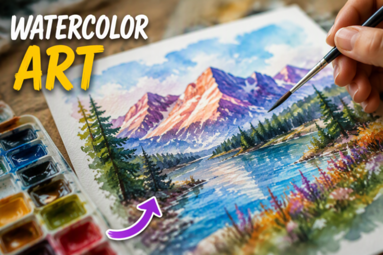
3. Photorealistic scene or product image (DTG look)
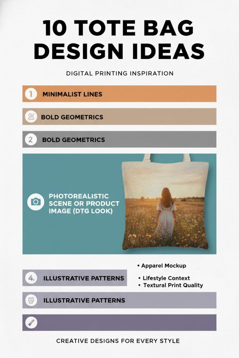
Sometimes I want the tote to feel like a wearable photograph. That’s when I go for full-color scenes, detailed product shots, or near-photo realism—like a city skyline, a portrait illustration, or a nature moment.
DTG (direct-to-fabric) is a great match for complex images because it prints artwork directly onto fabric with high visual fidelity. If my design has lots of tiny details, subtle shading, or lots of color variation, DTG can help it look more “complete” than simpler print methods.
Design tips I use:
- Use image files designed for direct-to-fabric output (resolution and clarity matter).
- Test contrast: make sure the subject stands out against the tote color.
- Avoid super-faint elements that may disappear on fabric.
Production angle: DTG is well-suited for complex full-color art and photorealistic designs.
4. Premium textured branding with embroidery
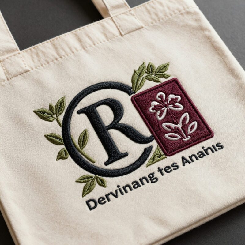
If I want my tote to feel special, embroidery is hard to beat. It gives that tactile, premium look—like a small stitched badge or a wordmark that you can literally feel.
This style works best when I keep the design relatively simple. Embroidery involves stitching, so ultra-complicated illustrations can become messy or too detailed to reproduce cleanly.
Design tips I use:
- Use embroidery for small icons, short slogans, or single-line wordmarks.
- Choose bold shapes that can be stitched without turning into tiny knots.
- Think “minimalist premium,” not “full illustration.”
Production angle: Embroidery is positioned as a premium option for simple logos and textured stitching, with practical limits based on stitch complexity.
5. Layered typographic campaign (repeatable stencil-based approach)
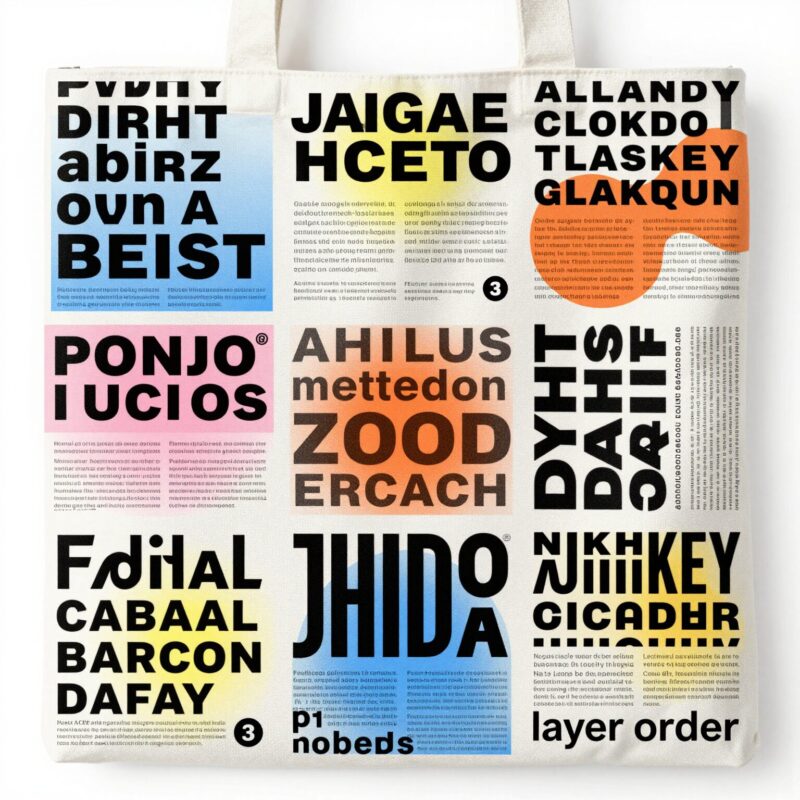
I’m a big fan of typographic tote designs because they’re flexible and feel like real campaign branding. My go-to concept here is stacked text: a slogan line, an event name, and a date—sometimes with small location details.
This idea is especially useful when I’m making multiple batches (like different cities or seasonal drops) because the layout system can stay consistent while I swap the variable parts.
Design tips I use:
- Use a modular grid: top line, center message, bottom details.
- Keep the fonts bold and legible.
- Limit color count to match stencil-based printing strengths.
Production angle: Screen printing tends to be a great fit for consistent logo/typography campaigns, especially when I want repeatable results across many totes.
6. Seasonal or theme artwork with modular colorways (method-by-color strategy)
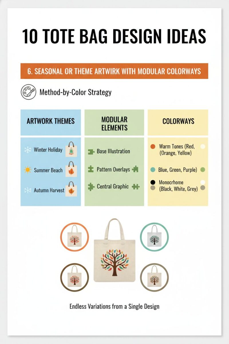
This idea is about building a “design family.” I keep the core layout the same (like the same mascot, shape, or emblem), then I create seasonal colorways—fall, winter, summer, back-to-school, pride month, and so on.
The smart part: I can pair the complexity of each version with the best printing route. For example, a simple seasonal logo version can use screen printing, while a more detailed seasonal artwork version can switch to DTG or heat transfer.
Design tips I use:
- Define a core layout that never changes (so every tote feels part of the same collection).
- Create 3–5 palette options that still read well on the tote base color.
- For “full art” seasonal drops, plan for complex color printing methods.
Production angle: I choose the method based on design complexity and color count—simple color swaps for screen printing, more detailed artwork for DTG/heat transfer.
7. Mixed-tech “brand + art” concept (print plus texture)
Generating image 7…