
A calendar sits on your wall or desk for weeks at a time, so it might as well look good. Plain grid calendars do the job, but they blend into the background fast. An aesthetic calendar gives you the same function with a layout, color story, or hand-touch that makes checking the date feel like a small treat. Instead of one style repeated twelve times, this list gives every month of the year its own design, built around that month’s season, colors, and holidays, so the whole set feels like a real collection instead of a copy-paste job.
Quick answer: The most aesthetic way to design a 12-month calendar is to give each month its own color palette and motif tied to the season, like icy blue for January, soft pink for February, and warm orange for October, instead of repeating one design all year. Small touches like watercolor washes, pressed flowers, or hand lettering carry the theme without needing real art training.
| Season | Months Covered | Palette Type |
| Winter | January, February, December | Cool tones |
| Spring | March, April, May | Fresh pastels |
| Summer | June, July, August | Warm brights |
| Fall | September, October, November | Earthy warm |
| # | Month | Design Style | Main Material |
| 1 | January | Icy minimalist color-block | Cardstock, blue marker |
| 2 | February | Soft pink watercolor hearts | Watercolor paper, pink paint |
| 3 | March | Pressed green sprig botanical | Fresh sprigs, parchment paper |
| 4 | April | Pastel photo grid | Printed photos, glue |
| 5 | May | Pressed flower border | Dried flowers, clear tape |
| 6 | June | Citrus washi tape grid | Yellow/orange washi tape |
| 7 | July | Bold red-white-blue collage | Magazine cutouts, glue stick |
| 8 | August | Sunflower hand-lettered | Brush pens, colored pencil |
| 9 | September | Digital moodboard, amber tones | Goodnotes or Notion app |
| 10 | October | Chalkboard pumpkin sketch | Chalkboard paint, chalk marker |
| 11 | November | Felt harvest wall calendar | Felt, embroidery thread |
| 12 | December | Sticker snowflake habit grid | Silver/white stickers |
Rough time investment by month’s design (hours)
1. January: Icy Minimalist Color-Block
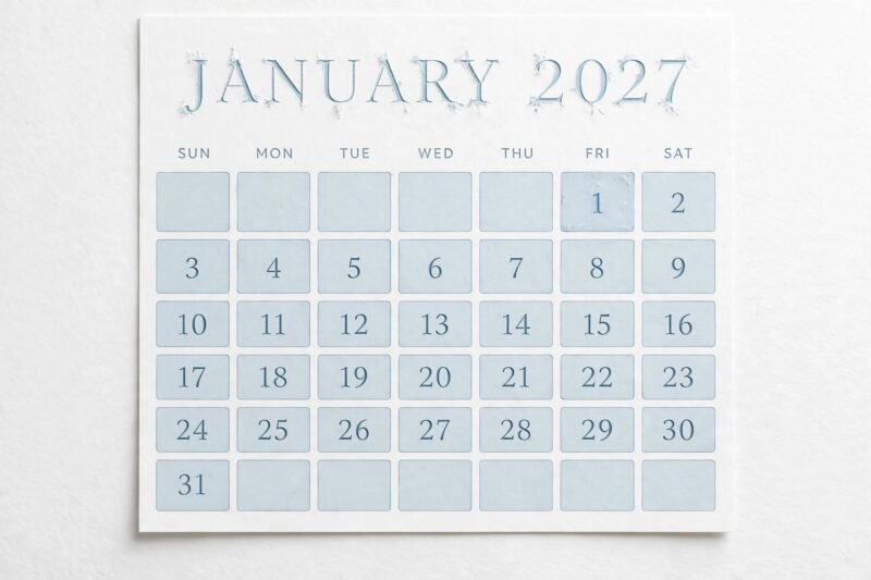
January gets a cold, clean color-block design using one icy blue accent square per week and a mostly white page, matching the quiet, reset feeling of the start of the year. Draw a simple grid, then fill in only the Sundays or a chosen weekly marker with a solid pale blue block instead of adding lines everywhere. Keep the month title in a thin, tall font to echo the sharp look of frost or icicles. This is the easiest design on the list to start with, since it needs only a ruler and one marker, which makes it a good warm-up before the more detailed months later in the set.
2. February: Soft Pink Watercolor Hearts
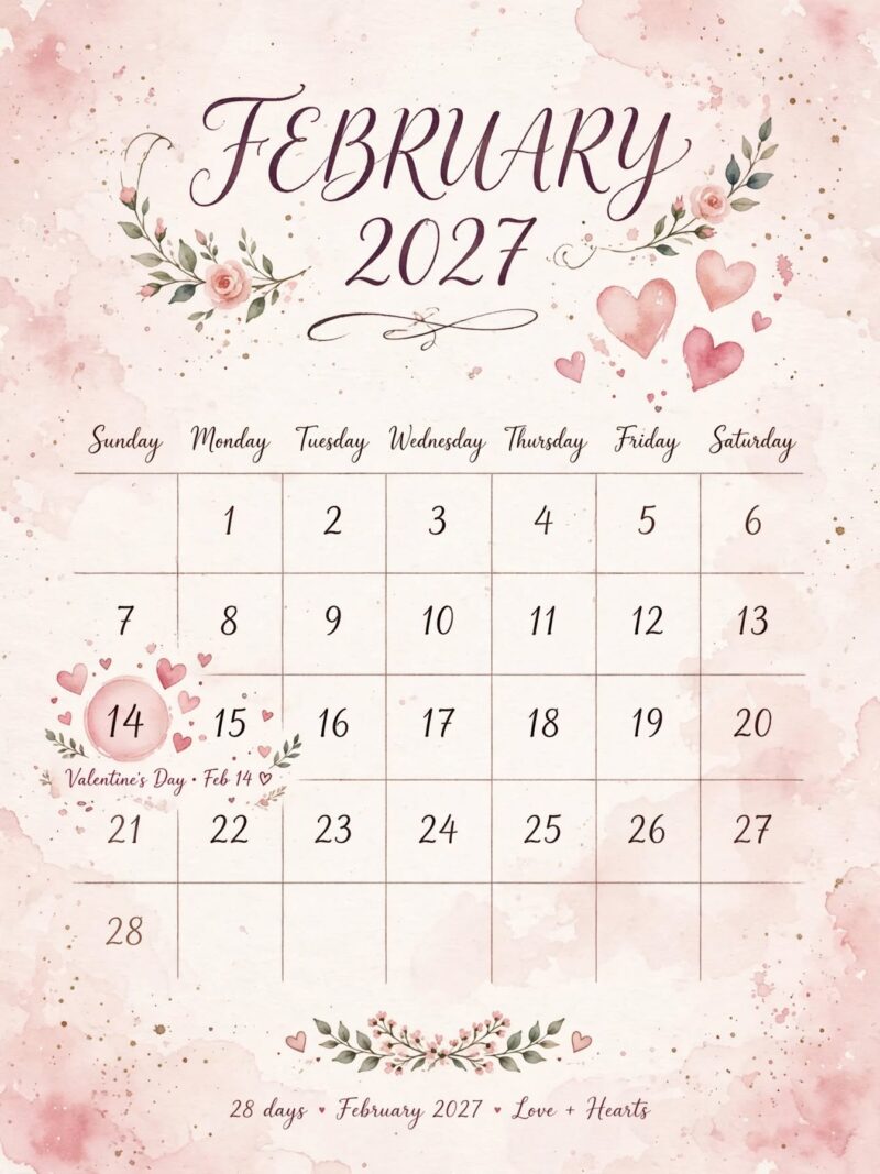
February leans into a soft pink watercolor wash with a few loose, painted heart shapes scattered near Valentine’s Day, tying the page directly to the month’s best-known holiday. Paint the wash first on real watercolor paper and let it dry completely, then add the grid lines and small hearts in a deeper rose pen once the page is flat again. Keep the hearts small and imperfect rather than uniform, since a slightly wobbly hand-painted look reads as more charming than a stiff, traced shape. This page pairs well with the January design since both use a wash-and-grid method, so you can reuse the same technique while switching only the color and motif.
3. March: Pressed Green Sprig Botanical
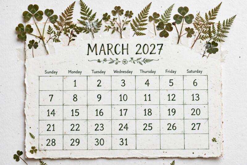
March uses pressed green sprigs, like clover, small ferns, or early herb cuttings, arranged along the top border to mark the first real signs of new growth after winter. Press the sprigs flat between parchment paper inside a heavy book for one to two weeks before the page is ready, so plan this one ahead of time rather than the week you need it. Once dry, tape or laminate the sprigs along the border so they stay flat and don’t crumble as the month goes on. Because pressing takes real drying time, March is a good month to start the process for both March and the pressed flower page coming up in May, so you’re not waiting twice.
4. April: Pastel Photo Grid
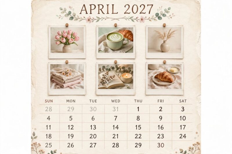
April works well as a pastel photo grid, using small printed photos with soft, overcast lighting to match the in-between feel of early spring weather. Sort through your camera roll for images with a similar pale, muted tone rather than bright saturated colors, then print them small and uniform in size. Arrange the photos in a neat row above the date grid instead of scattering them, so the page stays organized and easy to read at a glance. This design is a nice change of pace after three drawn or painted months, and it works well if you want an easy month using only a printer and glue.
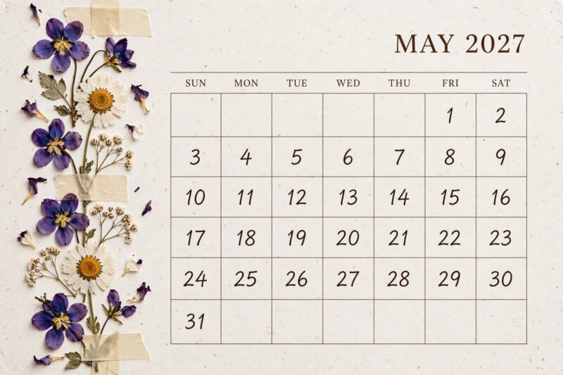
5. May: Pressed Flower Border
May is the strongest month for a full pressed flower border, since this is when thin, colorful blooms like violas, pansies, and small daisies are easiest to find and press. Choose thin, flat flowers over thick ones, since fleshy blooms like roses tend to mold before they finish drying properly. Lay the flowers along one or two edges of the page rather than covering the whole thing, leaving the date grid clear and easy to read. Seal the finished page with a layer of clear tape or lamination so the dried petals don’t crumble or shift out of place as the month is handled day to day.
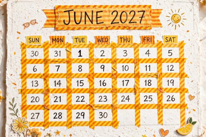
6. June: Citrus Washi Tape Grid
June switches to a bright citrus washi tape grid, using yellow and orange striped or patterned tape to build the date lines instead of drawn ink lines. Stick to one or two tape patterns for the whole page so the grid reads as clean and coordinated rather than mismatched. Because washi tape peels off cleanly, it’s easy to fix a crooked line without starting the page over, which makes June a low-stress design to knock out quickly at the start of summer. This is also a good month to make with kids, since there’s no wet paint, marker bleed, or drying time involved.
7. July: Bold Red-White-Blue Collage
July calls for a bold red, white, and blue collage built from cut magazine clippings, tying the page to the mid-summer holiday season without leaning on any specific logo or flag graphic. Sort your paper scraps by color before gluing so you’re not searching through a random pile mid-project, and group the colors into blocks rather than mixing them randomly across the page. Leave the center of the page clear so the date numbers stay easy to read once the collage is framing the edges. This is one of the more time-intensive designs on the list, so set aside a full afternoon rather than trying to finish it in a rush.
8. August: Sunflower Hand-Lettered
August pairs a hand-drawn sunflower in one corner with a large hand-lettered month title, matching the peak-summer, late-harvest feeling this month carries in a lot of home gardens. Pencil in the sunflower outline first if freehand drawing feels intimidating, then color it in with warm yellow and brown colored pencil once you’re happy with the shape. For the lettering, write the month name lightly in pencil, then trace over it with a brush pen for the classic thick-and-thin look, which covers up a lot of small mistakes in the line work. Keeping the day numbers themselves small and simple balances out the larger illustration so the page still reads clearly at a glance.
9. September: Digital Moodboard, Amber Tones
September moves onto a tablet with a digital moodboard calendar built in an app like Goodnotes or Notion, using an amber and warm-brown color palette to mark the shift out of summer. Import a plain monthly grid template, then layer in amber-toned stickers and a few soft images that match the early-fall mood, keeping your own handwritten notes in a single consistent pen color. Because it’s digital, September is one of the fastest designs on the list to put together once your template is set up, and you can reuse the same base file for other months later. It also suits anyone who’s been away over summer and wants a lower-effort design to ease back into planning.
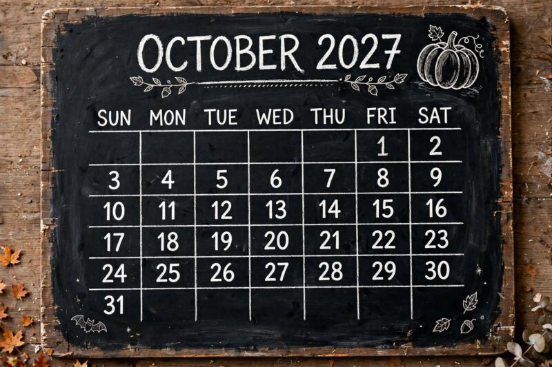
10. October: Chalkboard Pumpkin Sketch
October works best as a small chalk-drawn pumpkin sketch in one corner of a chalkboard-painted calendar board, matching the month’s strongest seasonal symbol without needing a full detailed scene. Paint the board with chalkboard paint ahead of time and let it cure fully before drawing on it, since a fresh coat can smudge or resist chalk if used too soon. Use a white or orange chalk marker for clean, solid lines rather than traditional chalk, which tends to smudge the moment you brush past the board. Because the board is reusable, October’s design can be wiped and redrawn each year, so you only need to paint the base board once and refresh the pumpkin sketch annually.
11. November: Felt Harvest Wall Calendar
November suits a felt harvest-themed wall calendar, using deep orange, brown, and cream felt squares stitched into a reusable date grid for the last full month before winter sets in. Cut a felt backing board, sew or glue on numbered pockets, and add a small felt leaf or acorn shape as the date marker you move each day. Because this design is stitched rather than printed, it holds up for years and can be reused every November without remaking it, which makes it one of the more durable pieces in the set. Set aside a longer working session for this one, since sewing or careful cutting takes more time than any drawn or painted page on the list.
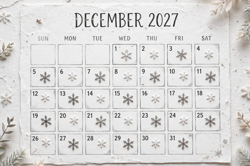
12. December: Sticker Snowflake Habit Grid
December closes out the year with a silver and white snowflake sticker grid, doubling as a simple habit or countdown tracker through the busiest month of the year. Pick one small snowflake or star sticker design and place one per completed day or task, keeping the sticker style limited to two colors so the finished page reads as a coordinated pattern rather than a random mix. This design takes the least time of any month on the list, so it fits well into a busy December schedule when a longer painted or sewn page isn’t realistic. It also gives you a visual countdown you can watch build across the page as the year wraps up.
FAQ
Do I need matching supplies for every month, or can each one be different?
Each month can use completely different supplies, since the whole idea of this layout is letting the design change with the season. A shared page size or border style is enough to make the set feel connected.
Which month’s design is easiest to start with?
January’s icy color-block grid and June’s washi tape grid are the simplest, since both need almost no drawing skill and use forgiving, low-mess materials.
Can I press flowers ahead of time for more than one month?
Yes, pressing extra flowers or sprigs at once and storing them flat in a book saves time later. It’s worth pressing March’s greenery and May’s blooms in the same batch since both need the same one to two week drying period.
What if I don’t want to make all 12 designs at once?
You can make each month’s page a few weeks before it starts instead of doing all 12 in one sitting. Spreading the work out also means each design will look fresh, since you’re not repeating a technique twelve times in a row.
How do I keep 12 different designs feeling like one cohesive calendar?
Keep one shared element constant across every month, like the same page size, the same font for the month title, or the same placement for the date grid. That one repeated detail ties twelve different designs together into a single set.
References
- Printerpix Blog, “25+ Creative Custom Calendar Themes & Ideas for Your 2026 Photo Calendar” (2025)
- FaveCrafts, “2026 Calendar” paper-craft printable feature (2025)
- Monday Mandala, “10 Uses For Printable 2026 Calendars” (2025)
- Gumroad, “2026 Aesthetic Printable Calendar – Soft Pink Cute Theme” listing (2025)

A Teacher with 5 years of experience. Our Expertise, is reliable to meet your full Academic development needs . Worked on many crafts and construction projects offering services from design to development to deployment over the years. You will find many of my works in my business portfolio on request.